How we made Cicada stand out among Web3 clones
Translating brand value into trust
Cicada runs custom market-making bots that keep markets breathing—posting bids nonstop, tightening spreads, and keeping liquidity awake. They lead the whole operation (from setup to 24/7 monitoring) and execute advanced token strategies.
Their dope solutions needed dope web appearance—that's why we entered the game.
Seal the deal: a site where leads say “yes”
Since the audience came pre-warmed (referrals, conference run-ins, and word-of-mouth), the main task was to capture that traffic.
We aimed for conversion: create a landing page that removes hesitation, answers key questions fast, and helps qualified prospects make decisions.
Defining visual signals that match Cicada's brand personality
We began by aligning on who Cicada is—and who they are not. The goal was to attract serious builders focused on infrastructure, scale, and long-term value.
We scanned the Web3 market-maker space and pulled references from brands that already feel trustworthy. Then, packaged it into one moodboard session with three clean directions for Cicada’s new digital space.
Concept #1
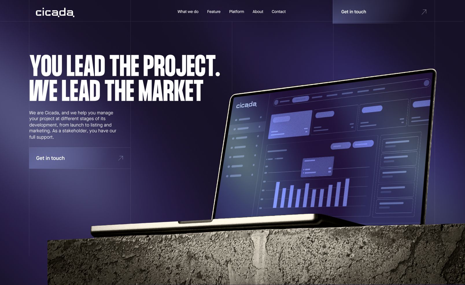
Clear leadership you can see
The dashboard on an elevated laptop makes expertise feel physical—calm, controlled, and built to give founders peace of mind. It’s like a product proof on a pedestal: interface first, confidence follows.
Concept #2
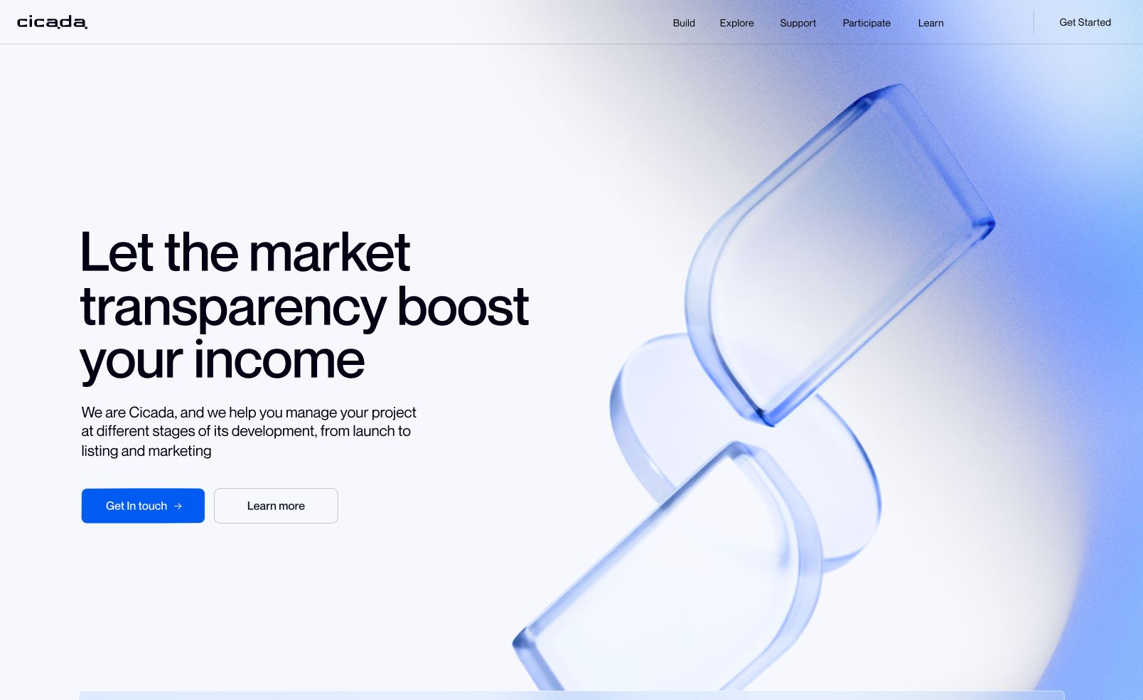
Transparency you can feel
Light UI, heavy credibility. Transparency becomes the aesthetic: open space, calm blues, and glass-like 3D that signals layered data and clean logic. A site that feels weightless—but you can still measure trust.
Concept #3
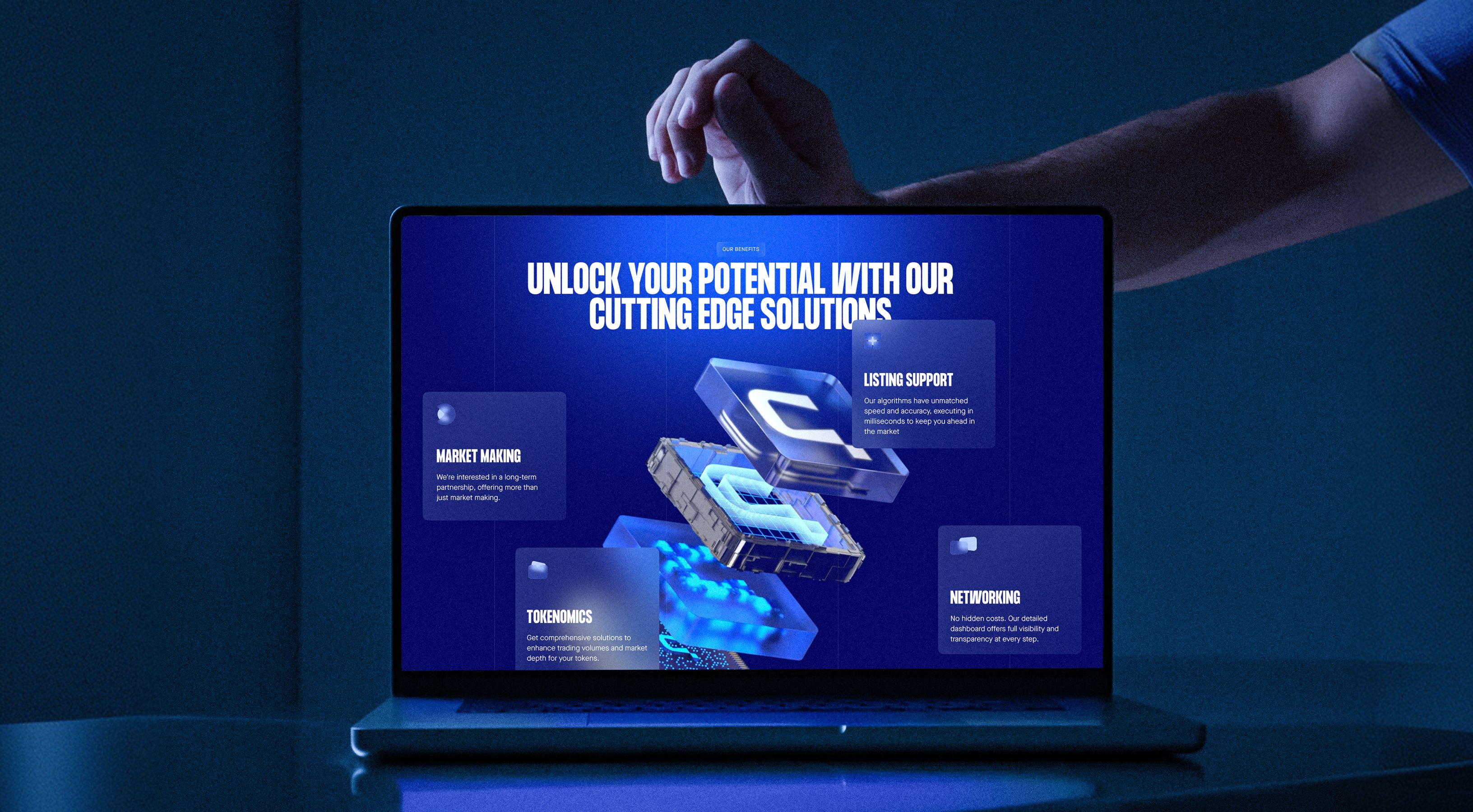
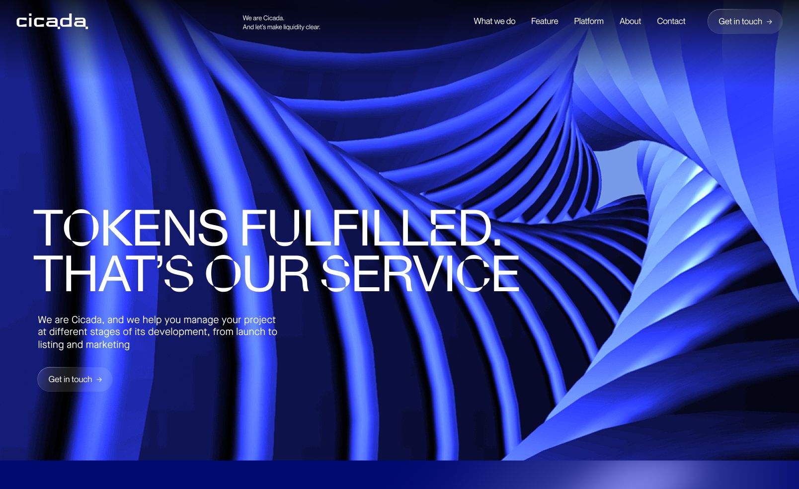
Order inside the crypto chaos
Deep-navy gradients, electric-blue highlights, glossy 3D, and oversized type. It feels technical, controlled, and a bit cinematic—like liquidity, turned into branding.
This concept hit the client’s brief without sliding into meme mode. Memecoins are a loud season, not a forever market, so we built a look that stays credible when the hype cools.
Sticking to the concept that sets the difference in the sea of Web3 sameness
Key product blocks were built to demonstrate how Cicada works. The 3D-animated section makes the product feel like real Web3 infrastructure, not just another crypto promise in a glossy wrapper.
It works because both visuals and copy move in sync: one explains, the other proves. This reduces cognitive load and helps users quickly get how the system functions.
The final result: a confident digital presence
The new website positions Cicada as a consistent, professional counterpart to a highly variable market.
Clear hierarchy, focused messaging, and disciplined UI create an environment built for decision-making. Every element supports one outcome: helping the right clients move forward.
Built for speed and flexibility
We developed the site on Webflow—allowing for fast launch and easy content updates without ongoing developer support. This setup is built to move quickly and adapt as the business scales.
Lightweight animations also guide attention, supporting the information without getting in the way.
Extending the brand offline: conference mode
To support Cicada’s presence at industry events, we designed a compact conference booth.
On a tiny footprint and a very mortal budget, we built a compact piece of brand gravity: sharp geometry and materials chosen like chess moves, so it looked premium without paying premium.
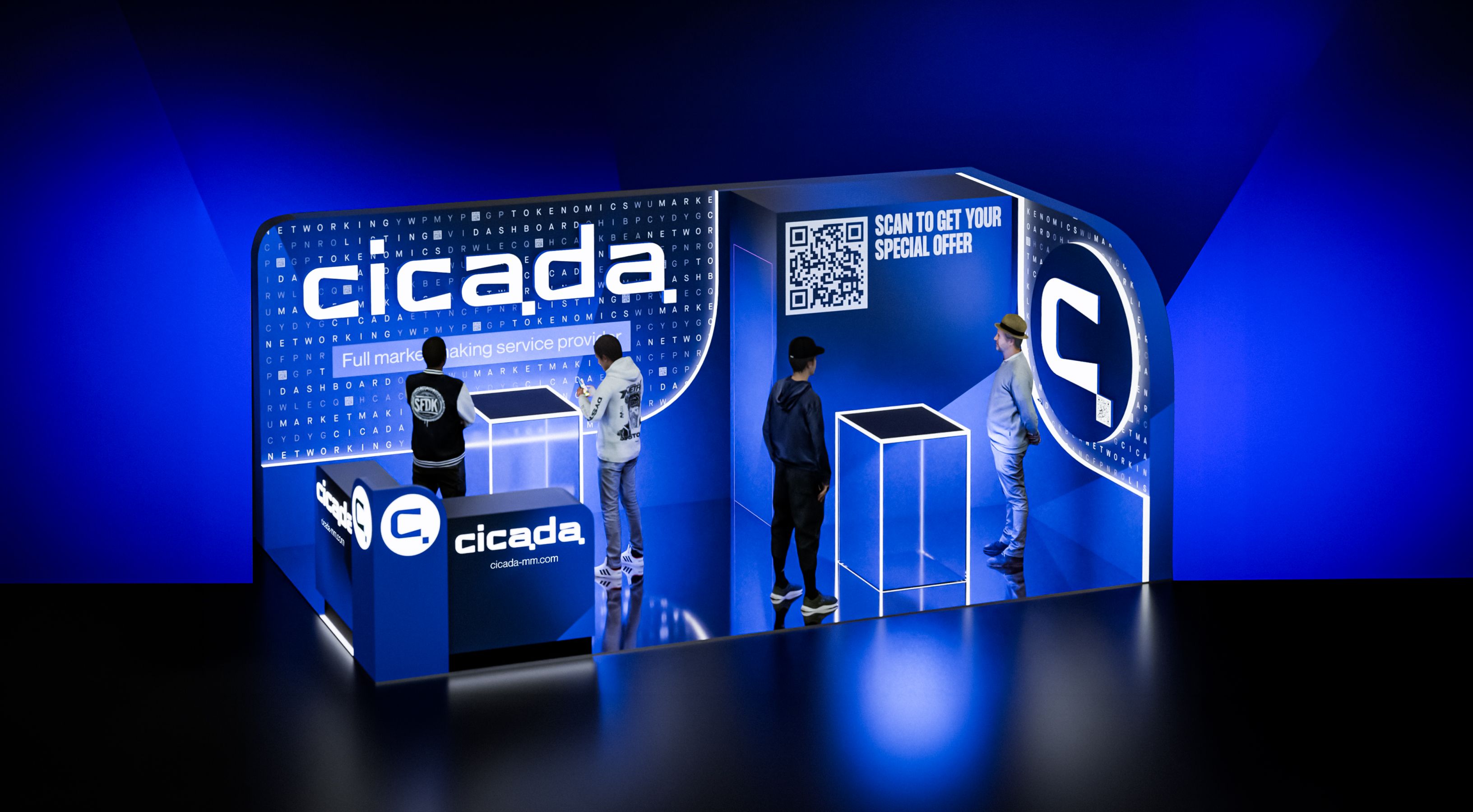
Execution under constraints
It was a wowzer 3-day sprint, powered by night-shift coordination with production in Singapore and near-24/7 support to keep the build moving.
And then it did what good design should do: it traveled, showed up, and kept working across crypto conferences—including Token2049.
Awesome deliverables
Global edge
Boosted the brand’s perception.
Deal-sealing website
Smooth flow that turns warm traffic into action.
Conference sprint
Compact stand making a splash on Token2049.