
5 not obvious things where bare minimum can turn into princess treatment
Sometimes design looks like a Canva template someone threw together in a hurry (bare minimum), and sometimes it looks like a Vogue cover that screams money, taste, and “damn, who did THAT?” (princess treatment). Guess which one brings you clients?
Here at Qream, we live and breathe design that says “crème de la crème”. We see what works, what doesn’t, and what makes a brand truly stand out. In this article, we’ll walk you through everything from motion-first visuals to dynamic brand ecosystems—showing you how to create experiences that aren’t just seen, they’re remembered.
AI usage
Bare minimum
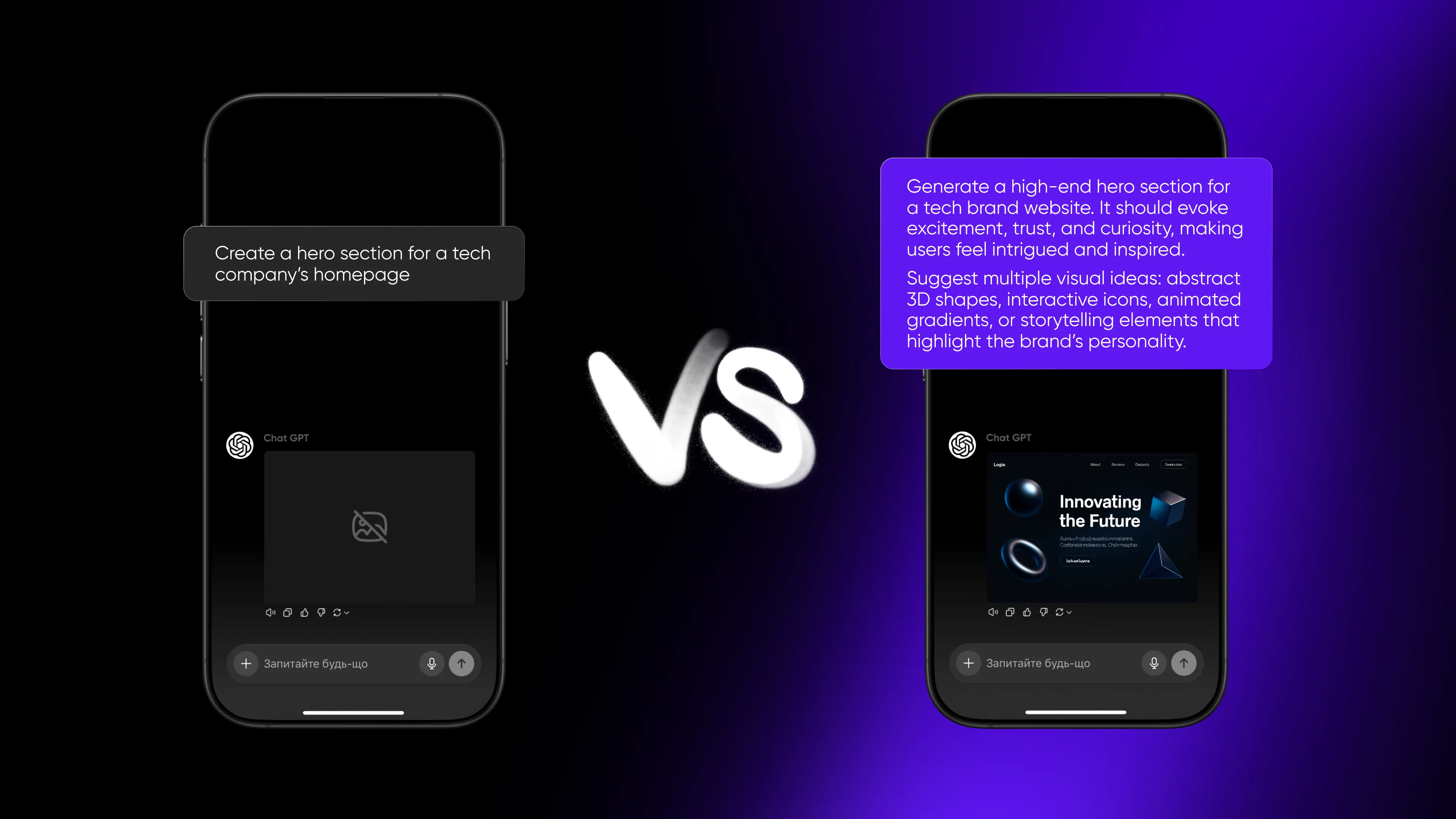
AI is the intern who works for free: you ask it to generate a basic illustration, a paragraph of copy, or a background. It’s quick and disposable. Many teams stop here: “We need a LinkedIn post, let’s prompt ChatGPT and move on.”
Then, you end up with visuals that look AI, text that reads AI, and nothing that feels uniquely yours. And seems different each time you generate a new type of content.
Princess treatment
AI becomes a co-pilot, not a vending machine. Brand guidelines are trained into prompts, so outputs always feel “on-brand.”
AI creates 50 variations, but designers curate, refine, and humanize ideas. Copy isn’t just generated—it’s fact-checked, rewritten, and infused with your tone of voice. AI streamlines production (resizing assets, translating content, prepping formats), freeing humans for actual creative or strategic thinking.
Design system
Bare minimum
A visual system that works in one environment: a static logo, a few fonts, and a fixed palette—to keep things consistent, you know. This system might work for one channel—e.g., a website—but breaks if you try to use it on TikTok or an app.
It’s a toolbox, but a very small one. Every time it’s scaled, many questions arise: how to adapt the logo, how it can work with different backgrounds, and so on. You feel the risk of brand inconsistency when everything seems to become messy.
Princess treatment
It’s when brand identity isn’t static but dynamic. It shifts and changes with context, audience, or even mood.
For example, variable logos that adapt to screen size, color palettes that change based on user interaction, typography that flexes between print, digital, and motion.
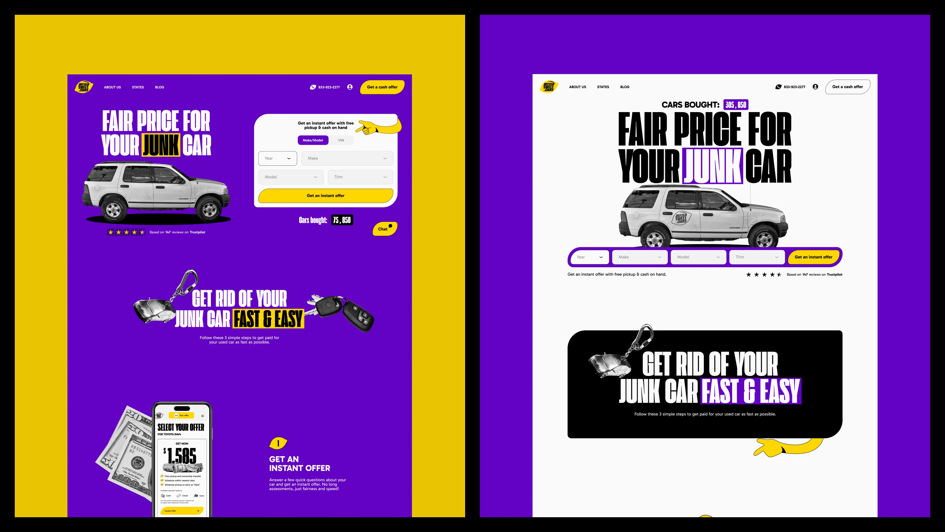
You think in advance of possible changes and become flexible right away. For Bittersweet.cars, we understood that as their marketing scaled, they might require additional layouts and website themes for A/B testing. We created two site options for such scenarios, both in accordance with the brand guidelines—just different approaches.
Website storytelling
Bare minimum
Standard structure: header, hero image, scroll, footer, a few fade-in animations as you move down the page. It’s fine, but it doesn’t create an emotional connection or a lasting impression.
90% of websites on the internet look like that. The story doesn’t unfold; it just sits there, so users scan, grab info, and leave. Will they come back? Maybe, if they really need your service. But will it make them fall in love with your brand? Fewer chances.
Princess treatment
A page that turns into storytelling. Content appears in chapters with scrolls, like scenes in a movie. Micro-interactions react to user speed or intent. Animations pair with copy to create rhythm and flow.
The site adapts: the faster you scroll, the more you get into the story; the longer you scroll, the deeper the details.
Example: for the Hunters Point website (an agency for events and experiential marketing), we built an experience that felt like their events—emotional and impossible to ignore. Every scroll is an act of discovery: projects burst onto the screen like a show reel in motion, with complex animations swooping in from every angle.
Even micro-interactions are elevated, a falcon—the brand’s symbol—comes alive on screen, partners' logos play back with user input, and every element feels alive. This UX mirrors the brand character, making the user not just watch but feel.
Micro-interactions
Bare minimum
It’s choosing something causal, basic, and “common practices”. In copy, it’ll sound like “404: Page not found,” “Oops, it’s not working,” “Error: something went wrong.” Visually, it’s also the same plain approach: static text on a white background, maybe an icon of a sad face or a broken link, and a predictable button, always saying “Back to home.”
Yes, it’s functional, safe, and achieves the goal. It gets the job done but adds zero personality.
Princess treatment
Microcopy becomes an opportunity for delight. A 404 page that makes you laugh instead of groan. Basically, any micro interaction becomes something where a brand can wink at its users.
For our 404 page, we didn’t want it to be a dead end, as is usually the case. Instead, we added a link straight to a call with our CBDO, Yaro, turning a potential lost lead into a business opportunity.
The design is something you couldn’t guess to see: a playful animation of Yaro running to generate trails of light (and ideas). It’s fun, unexpected, and brand-aligned as we like to surprise. Instead of feeling stuck, users feel entertained—and even guided to the next step.
Visual techniques
Bare minimum
Static, 2D layouts are good visuals on a screen. Feels safe and familiar, doesn’t require specialist skills, so can be done in time. But here’s a catch: it won’t surprise anyone.
In 2025, audiences are overstimulated by feeds full of TikToks, Reels, and immersive ads. Static visuals don’t cut through anymore; they fade into the background. If your brand still leans on flat graphics with zero motion, users will scroll past in half a second.
Princess treatment
Go all in: motion-first design, interactive layers, 3D visuals, and animations that explain instead of decorate. Instead of a flat infographic, imagine a scroll-triggered 3D diagram that moves as you explore.
Subtle animations can even guide behavior: internal HubSpot research found that animated call-to-action buttons increased click-through rates by 15%. Motion isn’t eye candy—it’s a conversion tool.
Take a look at how it can be done: for Snowbit, a cybersecurity company, we created sleek 3D icons and paired them with chic animations. The icons added personality and energy, while the animations created smooth, engaging interactions that kept users hooked.
The thing isn’t just about advanced skills—it’s the approach
Bare minimum design means following the brief, no questions asked. It solves the task but doesn’t go further to make an impression, win attention, or boost conversion.
Princess treatment means digging deeper, asking why, and finding unexpected solutions—not just execution. That’s the biggest benefit of hiring a design agency: you don’t just get what you asked for, you get what you didn’t even know you needed.
