TL;DR
The best cybersecurity websites stand out because they explain complex concepts quickly and simply, immediately addressing the main barrier—mistrust. They clearly outline exactly which threats they protect against (ransomware, data breaches, cloud risks) and how this impacts the business, not just the infrastructure. All strong examples follow key patterns: powerful trust signals (case studies, certifications, compliance with standards), a clear product structure, and distinct differentiation from other security solutions.
Check your website: if your website doesn't make it clear within 5 seconds what risks you mitigate, for whom, and why you can be trusted with critical data—this list will show you how the best ones do it.
Best cybersecurity websites in 2026 often still look like they were cloned from the same template: dark background, shield icon, and vague “protecting your digital assets” messaging. But there are exceptions, and they all share a few fundamental "pillars" of cybersecurity that win customers’ trust.
We reviewed dozens of top cybersecurity websites and selected the ones that truly break the mold. The logic was simple: we analyzed design + messaging + trust signals + conversion + differentiation and identified the common denominator.
How we selected these websites:
Вased on our experience designing for cybersecurity clients including Snowbit, the best-performing sites consistently excel in these five areas:
Design quality—modern, structured, and visually clearMessaging clarity—immediate understanding of the productTrust signals—proof through logos, data, and case studiesConversion UX—clear and intentional user journeysDifferentiation—breaking away from category clichés
10 Cybersecurity websites setting the standard
Here, we’ve put together a cheat sheet of cybersecurity website examples. Each one has standout features that can help you create a successful website.
1. CrowdStrike—the labyrinth of credibility
What they do:
Enterprise-grade cybersecurity platform.
What works:
The whole logic of the site rotates around the platform, not specific tasks.
CrowdStrike leads with a trump card: with the entire Falcon ecosystem, not just a single product. For experienced enterprise customers, it feels like, “Oh, finally, everything in one place.” But for a newcomer, it’s a bit like walking into a supermarket without a shopping list: there seems to be plenty of everything, but it’s not entirely clear what you actually need.
They first “switch on their authority mode” and only then explain the product.
CrowdStrike actively showcases its major clients, awards, and leadership in rankings (Gartner and others). As a result, before you’ve even had a chance to figure out exactly what they’re selling, you’re already thinking, “Okay, these guys are trustworthy.”
What could be better:
The structure seems clear, but finding your way around is quite a challenge.
CrowdStrike has it all: products, industries, use cases, resources. It looks impressive and comprehensive. But in practice, users often find themselves thinking, “Okay… but where do I go from here?”
As a result, you click here and there, get a little lost, and lose your train of thought. There are plenty of options, but there’s a lack of tips like “this is exactly what you need”.
Takeaway:
When you lead with scale and authority like CrowdStrike does, you instantly build trust but without clear guidance, users can feel lost.
What they do:
Global cybersecurity leader.
What works:
Sharp positioning as a market leader.
The website clearly conveys that this is not “just another security vendor,” but one of the industry’s key players. A sense of scale and significance is evident throughout, thereby building trust.
The platform as an ecosystem approach.
The company effectively positions itself as an ecosystem rather than a collection of separate solutions. This supports the idea of a “single cybersecurity hub” offering a suite of solutions for practically any scenario.
Strong trust through social proof.
The best cybersecurity company websites instantly earn trust by demonstrating that their solutions actually work in real-world scenarios. Palo Alto is no exception. Clients, case studies, industry reports, analytics, and mentions of market leadership all systematically reinforce the brand’s credibility.
What could be better:
Complex navigation.
On the one hand, this highlights the scale of the product and the company, but on the other, it can overwhelm the average user. The vast array of options can be so confusing that it’s hard to tell where to start.
Takeaway:
Clarity beats creativity when the product is complex.
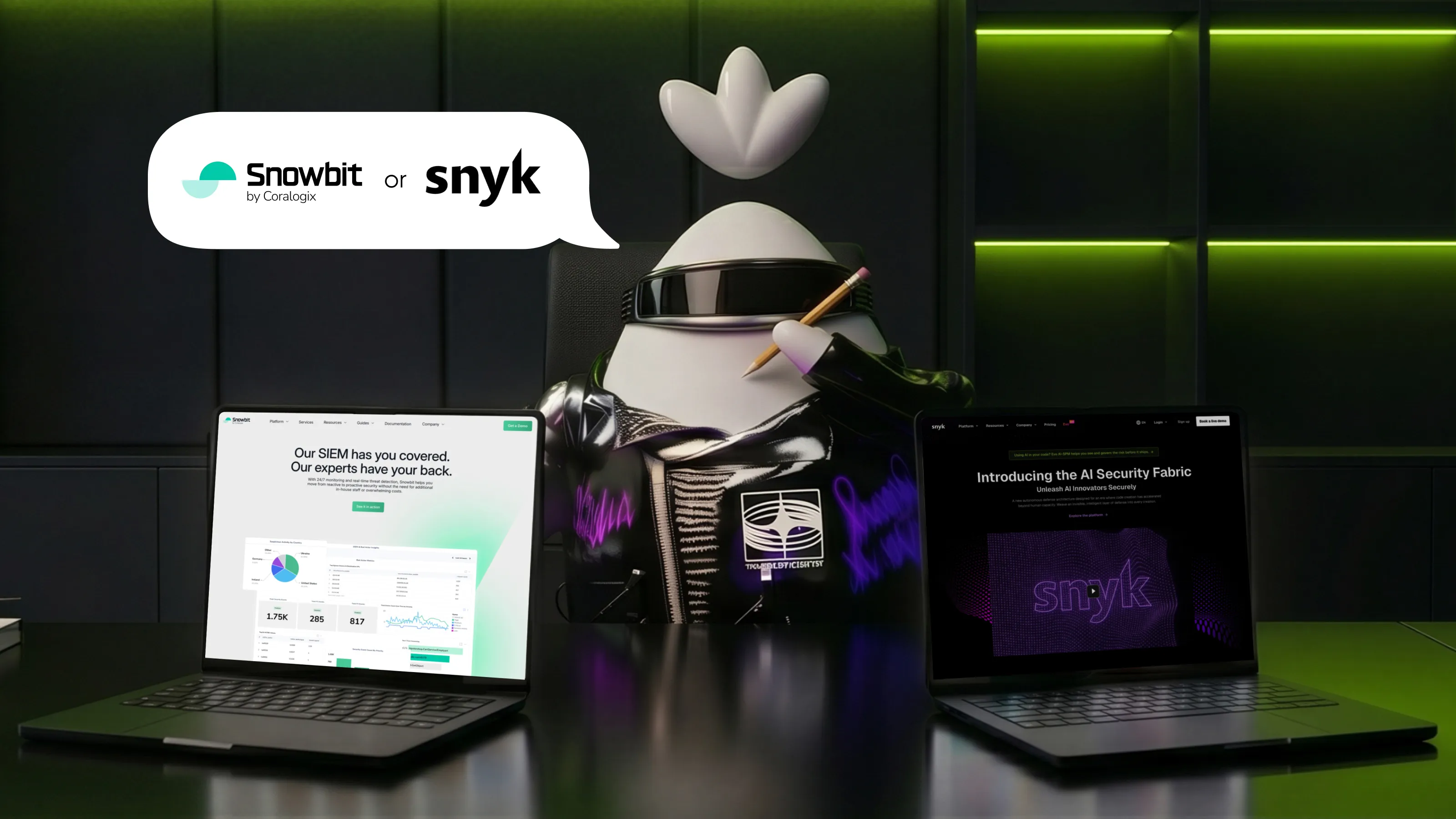
What they do:
Snowbit is the cybersecurity division of Coralogix, which specializes in solutions for cloud environments.
What works:
Strong visual identity that differentiates from the parent brand.
Snowbit effectively distinguishes itself from its parent brand through its visual identity, even though it partially draws inspiration from it. This was precisely the goal Qream pursued while working on Snowbit’s design. When a product looks different with its own colors, style, and tone it is perceived as a fully-fledged standalone solution rather than a simple feature of another platform. This reduces confusion, reinforces the product’s sense of maturity, and allows for more precise engagement with a distinct audience.
Clear storytelling and positioning.
On the Snowbit website, you aren’t forced to wade through an endless list of features like “yet another button, yet another dashboard.” Instead, they gently guide you step by step: first, they show you the familiar pain when security is complicated, there aren’t enough people, and threats are already nearby, and then they logically lead you to a solution and real results.
Balanced product explanation and branding.
The website doesn’t overwhelm visitors with technical details, but it also doesn’t rely purely on abstract language. Information is presented in stages: first, the core value; then, use cases; and finally, more in-depth technical aspects. This approach allows the site to effectively engage both a business audience and technical specialists without compromising on credibility or clarity.
What could be better:
Two competing CTAs.
The header currently features both “Get a Demo” and “Book a Meeting.” Both essentially lead to the same thing. This can dilute the focus and reduce conversion rates.
Takeaway:
Even within a larger company, a distinct brand can stand out when it builds its own visual identity, guides users through a clear and relatable story, and presents information step by step.
What they do:
AI-powered cybersecurity platform.
What works:
A clear focus on AI and autonomy.
It’s clear from the very first screen: this is about “smart” cybersecurity that operates on its own, and that’s its major advantage. The message comes across quickly and without any extra explanations.
A modern, tech-forward look.
The “cozy” design, combined with easy-to-understand animations and effects, gives everything a fresh look and creates a sense of innovation.
A balance between marketing and content.
There are clear messages, as well as enough details for those who want to dive deeper into the technical aspects. It’s both visually appealing and to the point.
What could be better:
Technological sophistication and human-centricity.
Currently, the website does an excellent job of highlighting its power, complexity, and technological sophistication. However, the “human + AI” scenario isn’t always clearly demonstrated: specifically, how exactly a person interacts with the system, and where exactly the person retains control, rather than just the AI.
Takeaway:
Showcase innovation, but keep it understandable.
What they do:
Cloud security platform.
What works:
The clearest possible positioning of “cloud-native security”.
You won’t have to spend much time figuring it out. The website tells you right away: “We help you identify risks in your cloud.” This immediately sets it apart from traditional security vendors.
Strong UX and visual “lightness”.
The interface and website have a clean, minimalist, and dynamic look. Plenty of white space, smooth visual transitions, and minimal clutter. The website is literally as light as a cloud, with no unnecessary noise.
Clear visualizations of complex topics.
Risks, infrastructure, and security are presented through easy-to-understand charts and maps. There are no confusing technical terms here, and everything is easily accessible to the average user.
What could be better:
Less depth for technical users.
The site does a great job of explaining “what it’s all about,” but it doesn’t go into much detail about “how exactly it works.” Technical specialists may find it lacking in detail.
Takeaway:
Lightness and simplicity make a product instantly understandable, but if you stop there, you risk losing more advanced users.
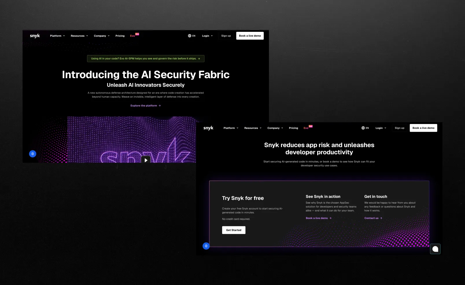
What they do:
Developer-first security platform.
What works:
A developer-first approach.
Snyk integrates directly into the developer's workflow IDE, CI/CD, CLI. So security isn't treated as a separate step but becomes part of the development process from the start.
Covering the entire stack in a single product.
In addition to code, Snyk also checks open-source dependencies, containers, and infrastructure as code. In other words, it’s not just a standalone tool, but a full-fledged platform for the entire software supply chain.
Focus on Prioritization.
Snyk aims to filter out the “noise” and display only those vulnerabilities that actually impact the business. This is very similar to Orca’s approach, but in the context of code.
What could be better:
Overload
Sometimes it feels like there are too many features. Snyk covers a wide range of areas (code, open source, containers, IaC), but it can come across as “just another complex platform.” The presentation could be simplified a bit.
Takeaway:
A developer-first approach only really works when security lives inside the everyday workflow and covers the whole stack.
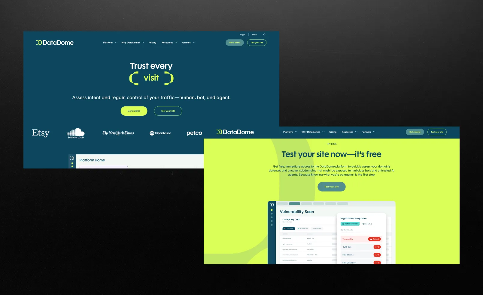
What they do:
Analyzes every visit to the site, separates bots from real users, and blocks bad traffic in real time without affecting the experience of legitimate users.
What works:
Instant reaction.
They analyze every request in real time, so bots are stopped before they can cause any damage. This creates a sense of control “right here, right now,” rather than after the fact.
Clear specialization.
They don’t try to cover “everything,” but focus specifically on bots and fraud, which makes them appear professional and easy to understand.
Free of clichés.
Plenty of light, air, and simplicity, creating a sense of control. The entire visual style is centered around a single idea: you’re in control of the traffic and know exactly what’s going on. Instead of decorative elements, clear diagrams and logic are used to explain the product, making even complex concepts easy to grasp.
What could be better:
Minimalism can make the technology seem less powerful.
When everything looks simple and “clean,” the scale and seriousness of the technology are less visible, which is often important in cybersecurity, especially for an enterprise audience.
Takeaway:
A strong, minimalist design makes a complex product easy to understand and appealing, but if you overdo the simplicity, you risk losing a sense of depth, power, and authority.
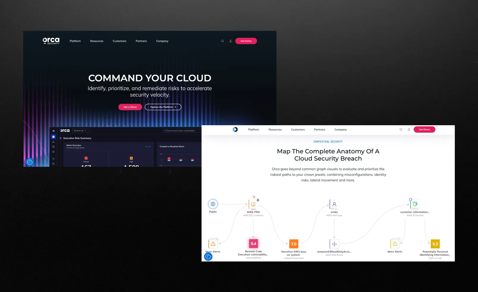
What they do:
Cloud-native security.
What works:
Approach to attack paths.
They don’t just show a list of vulnerabilities, they visually explain which ones a hacker could actually exploit and exactly how. This really changes your perspective: instead of seeing “1,000 problems,” you see a specific attack scenario. And this is clearly reflected on the website itself through the interface and examples.
Understanding and control.
At Orca Security, the interface looks like a risk map or a network of connections where everything is connected. The product presents a clear picture of how issues are related to each other. Instead of seeing hundreds of individual risks and not being able to understand where to start, the user gets a logical chain showing where an attack might begin and how it develops from there. This reinforces their core idea: security isn’t a list of problems, but understanding and control.
Communication features.
Overall, the website conveys a very clear message: not “we find more vulnerabilities,” but “we help you understand what really matters.” This is their main, rather unique communication strategy.
What could be better:
What you risk without Orca.
In some places, the differentiation sounds a bit like a “market standard.” They explain complex concepts well and have distinctive features, but they could make the point even more forcefully: “Why you’ll really lose out without us.”
Takeaway:
Show the context and substance of the product, and it will seem more understandable and valuable.
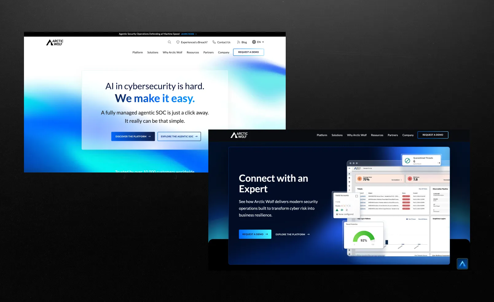
What they do:
Take full responsibility for your company’s cybersecurity: they automatically detect threats, analyze them, and respond to attacks without requiring your intervention, making things as easy as possible for you.
What works:
Trust is built into the site's structure, not just a superficial visual "just to tick a box."
Most cybersecurity websites include trust signals as a separate section. Arctic Wolf builds its entire user experience around them. The homepage immediately positions the company as a partner, not a tool.
“Human-led security” - a strong positioning layer.
While competitors focus on artificial intelligence, automation, and platforms, Arctic Wolf place a bet on human expertise and a management approach centered on a team you can trust.
A subtile but confident conversion strategy.
CTAs are strategically placed, like chess pieces: “Get a demo” appears at key decision-making points. The site is designed for both highly engaged users and those who are still in the information-gathering phase.
What could be better:
Visually, the site seems stuck somewhere in the 2000s:
Compared to newer players (like Wiz), the interface lacks a bit of modernity and dynamism. Animations, depth, and interactivity—they’re there, but very modestly. It inspires trust right away, but the design doesn’t shout, “We’re the most innovative here,” but rather calmly says, “We’re reliable, honestly.”
Takeaway:
Trust is not a section, but a system. Build credibility across every touchpoint: messaging, structure, tone, and content depth, not just logos on the homepage.
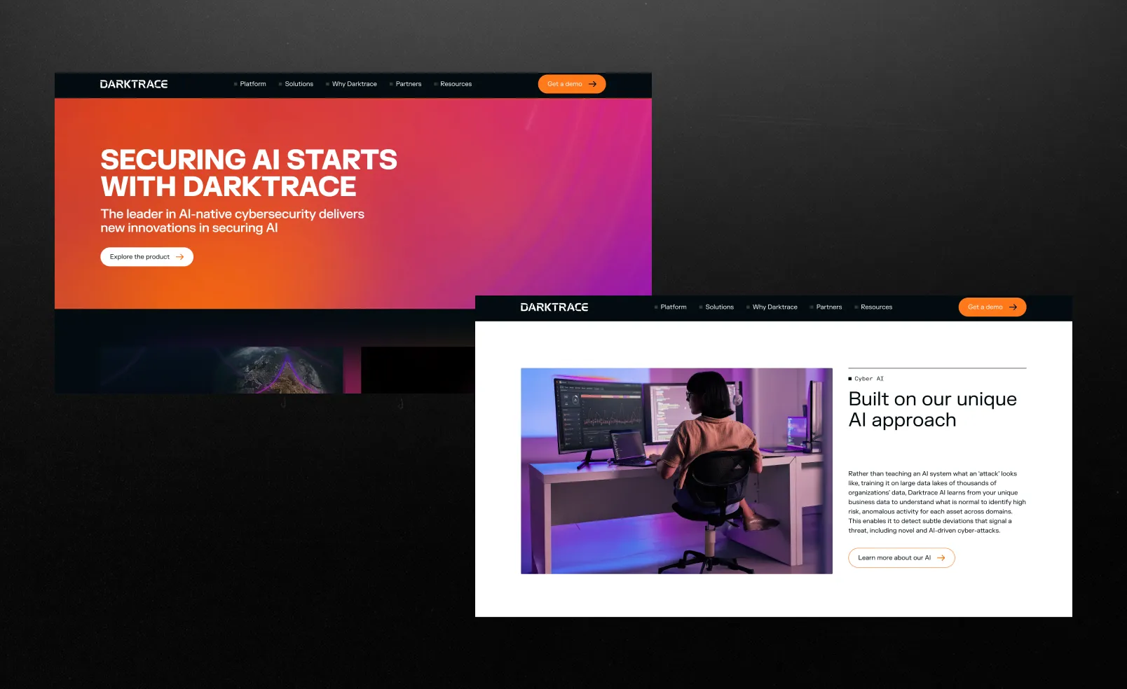
What they do:
AI cybersecurity platform.
What works:
AI that works on its own.
Darktrace is powered by self-learning AI. The system operates autonomously, detecting and responding to threats on its own. Literally a system designed to make data protection as simple as possible.
The visuals and concept basically say: “the more complex the tech, the more premium the product.”
Altogether, it builds a strong expert image: AI storytelling, cutting-edge tech, and a futuristic look. It feels serious, sounds smart, and is backed by awards and real-world cases. In the end, it gives you that sense you’re looking at something genuinely top-tier.
What could be better:
Is AI automation sufficiently under control?
At some point, a natural question arises: “Is this level of automation fully safe, and how much human oversight is actually involved?” The site strongly promotes automation, but provides very little detail on how it is controlled in practice.
Takeaway:
AI-driven, autonomous security creates a strong sense of cutting-edge protection and premium innovation, but the more you emphasize “it works on its own,” the more users start wondering who’s actually in control.
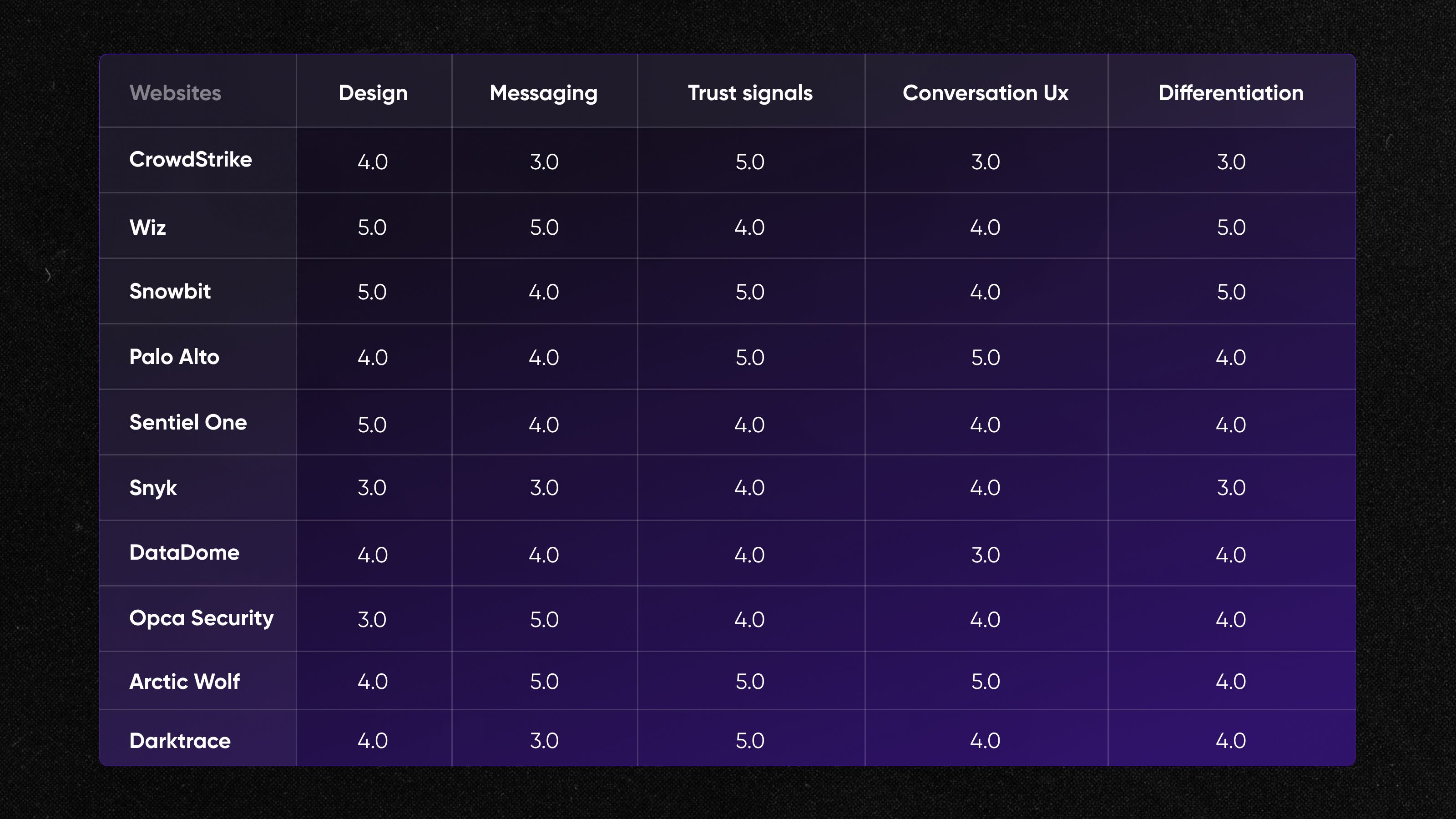
Here are the ratings from our team
What the best cybersecurity websites have in common
Five patterns the best cybersecurity company websites share:
1. AI as the core concept, not just a feature
Across SentinelOne, Darktrace, and Palo Alto Networks, AI is positioned as the brain of the system. The story is consistently about autonomy and intelligence, though the clarity of how it actually works varies.
2. A battle between simplicity and complexity
If you’re looking for strong cybersecurity website design examples, focus on platforms that simplify complex ideas through clean layouts and clear messaging. Sites like Wiz actively simplify information, while others, such as CrowdStrike and SentinelOne, accept complexity and present it in an aesthetically pleasing way. The best of them achieve a balance: they make complex systems understandable without oversimplifying them.
3. Trust is built before the product is fully explained
At CrowdStrike and Palo Alto Networks, they start with the big guns: major clients, reports, and bold claims. Before you’ve even fully grasped what they actually do, you find yourself thinking, “Okay, these guys clearly know what they’re doing”.
4. Platform thinking over single-product messaging
Many sites like CrowdStrike and Palo Alto Networks, frame themselves as ecosystems rather than tools. This works well for enterprise buyers but can make it harder for new users to quickly map their specific use case.
5. Visual design communicates product positioning
Wiz focuses on clean lines and minimalism, while SentinelOne and Darktrace take the opposite approach: dark interfaces, depth, and an immediate sense that “this is serious technology that definitely does something complex and high-quality.”
As a result, the design itself tells you whether you’re looking at a “simple and quick tool” or “powerful heavy artillery for the enterprise.”
Ready to build a cybersecurity website that belongs on this list?

A good cybersecurity website clearly communicates its value within seconds. It’s important to combine clear positioning with credibility: case studies, client logos, and certifications. An easy-to-use UX helps visitors stay on track and move toward taking action whether that’s trying a demo or getting in touch. In the end, a website shouldn’t just provide information; it should address any doubts and encourage visitors to make a decision. For a deeper breakdown, see our article.
The process begins not with design, but with a clear understanding of the audience and positioning: who the product is for and what problem it solves. Next, a structure is built that guides the user from the problem to the solution through clear sections and logical flow. A key factor is the balance between technical complexity and simplicity, where the website must be understandable to both the business and the engineers. Branding completes the picture, creating a sense of reliability and professionalism.
A clear value proposition that explains the product without overly complex language is essential. Next, include case studies or use examples to demonstrate real results, not just promises. Trust signals are also important: partners, certifications, and reviews that reduce skepticism. And, of course, strong CTAs that make the next step obvious and simple.
In 2026, design is moving more toward minimalism: less clutter, more clarity and structure. Data visualizations are being actively used to explain complex concepts in a simpler and more intuitive way. There is an increase in AI-driven storytelling, where content appears personalized and adaptive. Brands are also moving away from “classic dark cyberpunk” and seeking more unique, recognizable styles.