TL;DR
Healthcare website design is unique in that it must balance strict regulatory compliance, complex products, and the need to instantly build trust. The most effective sites don’t separate compliance from UX. Instead, they sew it right into the experience. They also use powerful trust signals and simplify complex decisions through clear structure. Rather than overwhelming users with legal jargon, they guide them step by step, showing what matters and why they should trust this specific company.
Healthcare website design is one of the few areas where UX decisions can have quite real legal consequences. Here, there is no room for confusion, exaggeration, or “creativity for creativity’s sake.”
And what do most websites do? They dive headfirst into explaining the technology but completely forget to build trust. As a result, you see a complex product but don’t feel like you can trust it. And that’s exactly where they fail.
Why healthcare web design is uniquely hard to get right
Compliance constraints
Healthcare websites live under strict HIPAA and FDA regulations. This immediately sets limits on what can be said, shown, and promised. This especially affects testimonials and product claims, where every word counts. As a result, many websites play “too safe” game, instead of clarity, end up with vague, careful wording that explains nothing.
Risk-averse buyers
In healthcare, no one evaluates a product in a vacuum. Risks are always assessed together with the website. Hospitals, insurance companies, and MedTech firms look not only at the medical web design, but also at whether you can be trusted. And if the website looks blurred, exaggerated, or self-contradictory, it immediately raises red flags.
Product complexity
Healthcare and medical technology decisions are rarely easy. So one of the most challenging tasks in design is to explain workflows, integration, and outcomes without overwhelming the user with complex medical and legal terminology.
Visual clichés
Many healthcare web designs still look as if they were created using “Ctrl C” and “Ctrl V.” Stock photos of smiling doctors, a safe blue-and-white color scheme, and a clinically “sterile” design. Everything seems right, but it’s completely lacking in character. And the problem is that this monotony doesn’t inspire trust; it makes the brand invisible among others.
The compliance question: HIPAA, FDA, and design
Compliance is the baseline, but it’s not an excuse for bad UX. The problem is that many teams take it too literally: more text, more disclaimers, more “legal safety.” The result is a website that’s hard to read and even harder to trust.
In reality, it works the other way around. Compliance should be sewn into the experience.
Strong healthcare websites don’t hide HIPAA or FDA somewhere in the footer or overwhelm users with legal details. They show it where it actually matters, at the moment a decision is being made.
Which strategy will work better:
- compliance badges placed right next to key decision points (pricing, demos, contact forms)
- short, human language instead of legal-heavy explanations
- targeted reassurance exactly where users start to hesitate
For example:
- instead of long disclaimers about security, use: “HIPAA-compliant infrastructure with encrypted data storage”
- place certifications next to CTAs, not buried at the bottom of the page
- avoid vague claims like “secure platform”. Only concrete specifics and standards.
What doesn’t work:
- a homepage overloaded with legal text
- no mention of compliance at all (this reduces trust)
- trying to sell only through “we’re compliant”. Сompliance shouldn’t be the core value
In the end, it's all as clear as day: in good healthcare UX design, compliance is proof you can be trusted, but not a barrier to design.
What the best healthcare websites have in common
1. Clear product explanation above the fold
The user needs to understand what you do in just a few seconds, without any build-up or corporate jargon. No jargon, no long introductions, and no phrases like “we are the leading provider…” A strong value proposition right at the very top is a little moment of truth: either the user stays, or they close the tab.
2. Strong trust signals
This includes compliance badges, certificates, partner logos, and real reviews—these are your key arguments. They instantly reduce the sense of risk, especially for an enterprise audience that values reliability over design. The key is to show them where the customer has doubts, not to hide them somewhere at the bottom of the site.
3. Progressive disclosure for complexity
The worst thing you can do is dump everything at once. The best websites guide users step by step: first the main idea, then the details, then the depth. This prevents overwhelming the user while still giving them control over how deeply they want to dive in.
4. Separate paths for different buyers
A clinician, procurement, and a CEO view a product in totally different ways. If you speak to everyone the same way, you’re not really speaking to anyone. Strong design separates these streams and gives each one its own scenario, tailored to its specific goals and context.
5. Mobile-first experience
The reality is this: many decisions are made on the fly—between patients, meetings, and phone calls. If your website crashes or looks unpolished on mobile, you’ll lose the user before they even have a chance to understand what’s going on. A mobile-first approach is essential here.
6. Clear CTAs tied to intent
Users go through a whole journey: first they understand, then they verify, and finally they trust. Strong CTAs tap into this mindset, offering a logical next step without pushing everyone into the same script.
7. Visual clarity over decoration
Medical website design is more about accessibility and clarity than just aesthetics. Diagrams, charts, and visuals should explain, not just fill space. Every element should add clarity and avoid creating unnecessary visual clutter.

Real healthcare UX design. Real decisions. Real impact
Want the lowdown on healthcare website best practices? Diving into real-life case studies.
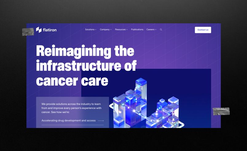
What Works:
Grand-scale positioning
Flatiron doesn’t sell a product—it positions itself as essential oncology infrastructure. From the first screen, it sets a system-level vision, connecting treatment, research, data, and outcomes into one ecosystem. This narrative runs throughout the site, making Flatiron feel less like a service provider and more like a foundational part of how modern oncology works.
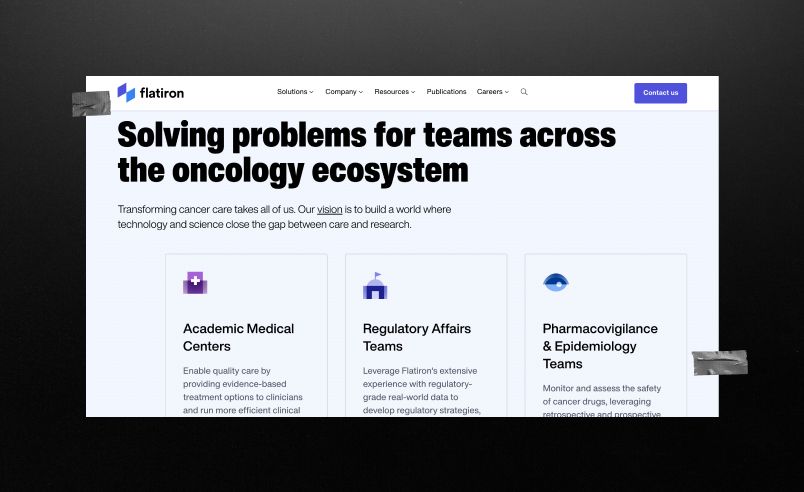
Strong “scientific credibility” based on concrete facts, not marketing
Flatiron builds trust not through buzzwords like “secure” or “leading,” but through structured evidence:
- Over 5 million patient records
- Collaboration with the FDA, publications, and research
- Real-world use cases (trial optimization, real-world evidence, patient identification)
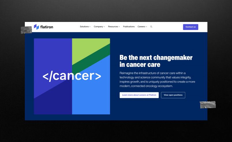
What could be better:
A scale that’s impossible to grasp?
Flatiron’s broad focus on “infrastructure” and “ecosystems” creates authority, but it can also make the offering harder to grasp. The value is there, yet it often requires extra effort to connect the dots and understand how the platform works in practice. The impression is clear: a powerful, sophisticated solution that expects users to invest time in understanding it.
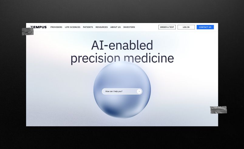
What Works:
Natural AI integration
Tempus goes beyond simply claiming to use AI—it shows exactly how it supports clinical decisions. Through real workflows like treatment selection and patient identification, the platform reveals the data behind every insight: EHRs, lab results, medical images, and physician notes. AI becomes a transparent engine that turns complex data into actionable outcomes.
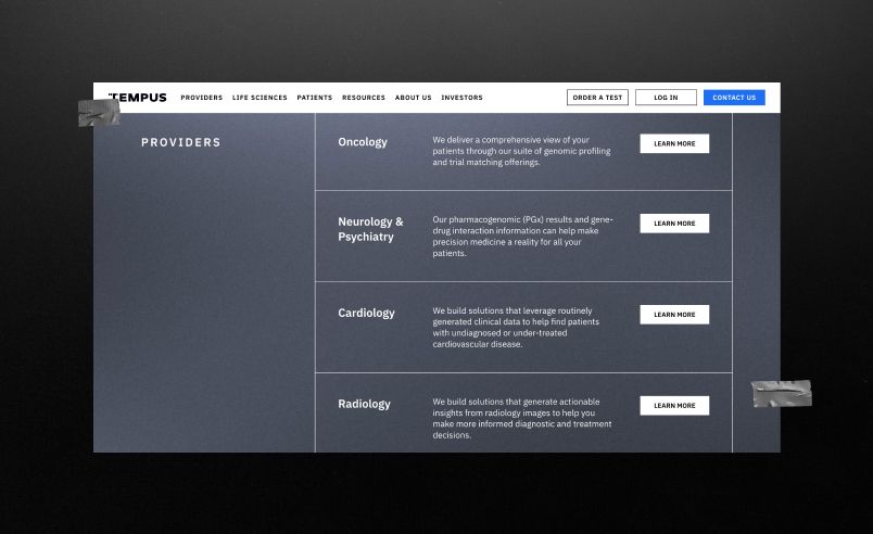
A tool or a system?
Rather than positioning itself as a standalone tool, the platform presents itself as part of the clinician’s existing workflow. Repeated messaging around “in your system,” “in your workflow,” and EHR integration reinforces that insights appear exactly when decisions are made. This subtle focus on seamless adoption makes the value proposition especially credible to healthcare professionals.

What could be better:
Human element
The site feels highly technical, focused on systems, data, and AI, but lacks a clear human center. Patients and doctors rarely appear as the main focus, making it feel precise yet emotionally distant. It convinces through logic and evidence, but the real human impact is less visible across the narrative.
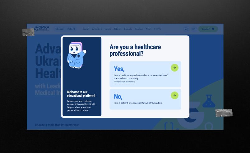
What Works:
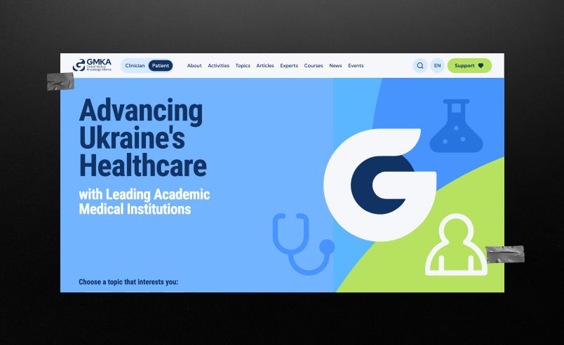
The Clinician/Patient split
A key UX strength is tailoring communication to different healthcare audiences. Clinicians receive detailed, evidence-based depth, while patients get simplified, reassuring explanations. This clear separation shows an understanding that these groups have different needs, reflecting a mature, intentional communication strategy rather than a one-size-fits-all approach.
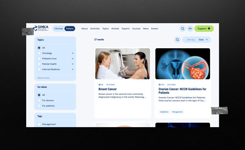
Knowledge institution
GMKA also wins because they behave like a knowledge institution rather than a commercial website. They build trust through expertise, make content the core of their value, and create a sense of a system that exists longer and runs deeper than any individual product.
What could be better:
The other side of the coin of division
The clinician–patient split reduces complexity, but it can leave other stakeholders—researchers, administrators, and partners—without a clear entry point. Positioned between two communication tracks, they may struggle to navigate the platform and must interpret how and where they fit within the system on their own.
How to audit your healthcare website
Use this quick checklist:
1. Can a new visitor understand what you do in 5 seconds?
Show your website to someone outside the field for five seconds and ask them what they got out of it. If their answer is vague, it means the main section isn’t working. Simplify the message and make it as clear as possible.
2. Are compliance signals visible at key decision points?
Make sure that compliance badges, certifications, or other trust signals are visible at key decision-making points (near prices, demos, or contact forms). If they’re somewhere at the bottom, move them up.
3. Does your site explain complex ideas step by step?
Check whether complex ideas on the website are presented step by step, starting with a simple concept and moving on to more detailed information. If everything is explained all at once in a single block, break the information down into several points and present them one by one.
4. Are there clear paths for different user types?
Check to see if the website offers separate pathways for different audiences (clinician, procurement teams, and clinic administrators). If everyone is stuck following the same path, you’re speaking to everyone and, at the same time, to no one. Change your approach.
5. Is your mobile experience seamless?
Ask someone to visit your website on their phone. If users find it difficult to navigate the site on the go, optimize it for mobile.
6. Do you rely on clichés instead of real differentiation?
Open a few of your competitors' websites. If yours doesn't stand out, change your design strategy.
7. Are your claims specific and credible?
Vague statements like “secure” or “leading platform” don’t build real trust. Specific proof, standards, and measurable claims make the message believable.
Is your website building trust or quietly killing it?
Let’s check it out

Developing a healthcare website typically costs between $10,000 and $150,000+.
For simple websites for clinics or doctors (a few pages, basic forms, no complex systems), the price usually starts at around $3,000–$10,000. At this level, the main challenge is to explain services simply and clearly and provide the ability to schedule an appointment.
If you add things like online booking, personal accounts, integration with medical systems, or a more sophisticated UX, the budget usually falls into the $10,000–$50,000 range.
And for complex platforms at the level of hospitals, MedTech, or systems with EHR/AI integrations, prices often rise to $50,000–$150,000+, sometimes even higher, because these projects involve requirements for security, scalability, and complex data architecture.
A strong healthcare branding is built on trust, clarity, and risk reduction. First, users must be able to understand within a few seconds exactly what you do, whether it’s a clinic, a medical platform, or a MedTech solution, and who it’s intended for (patients, doctors, hospitals).
Next, trust signals specific to the medical field are critical: real clinical cases, partnerships with medical institutions, certifications, and mentions of regulatory compliance.
And one more important thing: good healthcare websites don’t speak to everyone the same way, they provide basic ground for patients and more in-depth content for doctors or procurement teams. This allows you to avoid overwhelming new users while not losing your expert audience.
HIPAA compliance on healthcare websites should serve as a springboard for building trust. It’s not something that should be buried at the bottom of a page, but it certainly shouldn’t overwhelm the interface or the user either.
Strong healthcare websites use compliance as part of the experience and don’t explain it in abstract terms; they highlight it where the user makes decisions. Near appointment forms, demo requests, contact pages, or any points where risk and doubt arise. At that moment, even a small clarification like “HIPAA-compliant infrastructure” is more effective than any separate section on security.
Choosing an agency in the healthcare sector should start with the question of whether the team understands the regulatory and clinical context of the product. If an agency doesn’t know the difference between a clinic’s website and a MedTech platform, that’s a bit of a red flag.
Strong partners typically have experience working with:
- medical products or clinics
- regulations such as HIPAA/FDA or their equivalents
- complex user journeys (doctor ↔ patient ↔ administrator)
Another critical criterion is the ability to explain complex concepts simply, without oversimplifying the essence. Finally, a good agency in this field understands how data flows, how decisions are made, and how UX impacts trust and safety.
Written by

Qream co-founder | Business growth and strategy
Leads Qream's business development and commercial strategy, bringing experience across sales, customer support, and complex digital projects. Reviews topics around project scoping, agency engagement, strategic partnerships, and growth.