TL;DR
We see many manufacturing brands settle for generic design, not because they prefer it, but because they convinced themselves it’s the professional choice. It isn’t, though. Generic design is the invisible one, and bold design in industrial B2B has nothing to do with visual loudness. Qream treats bold website design as specific, confident, restrained, and authoritative visual language tailored to the industry & product so precisely that a competitor could never borrow it. The companies that understand this distinction outgrow their category and enter every buyer conversation from a stronger position than other companies that don’t.
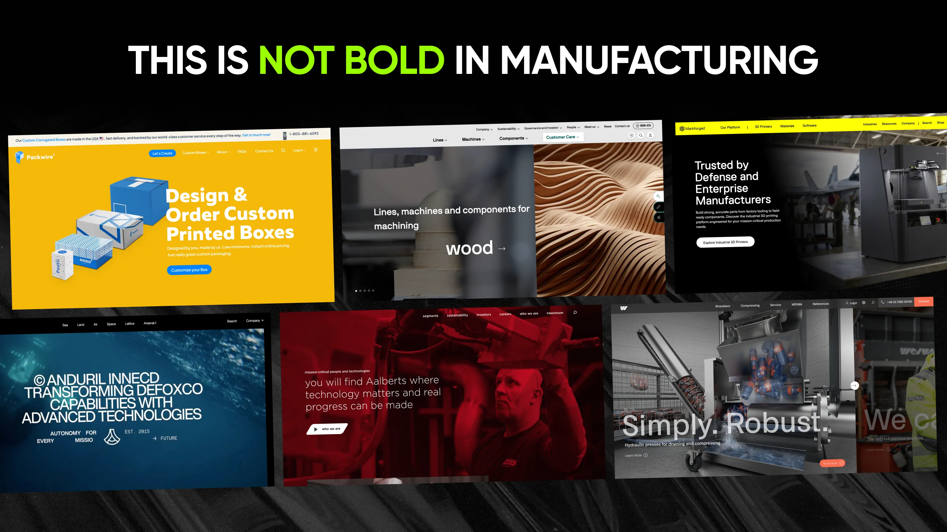
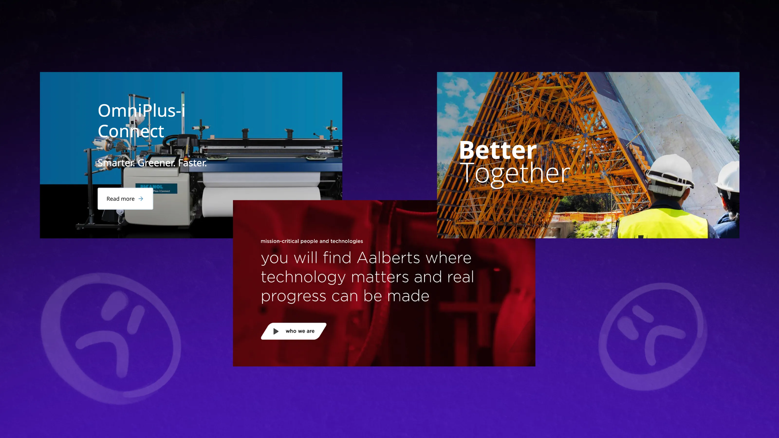
At some point in the last two decades, the same version of the industrial B2B website became so widespread that it became a genre. You know it on sight: a blue palette selected because it felt serious, stock photography of someone in a hard hat gesturing toward equipment they didn’t build, a tagline assembled from three abstract nouns (e.g., “Solutions. Reliability. Quality.”). And on top of that, the navigation structure is so disorganized that even the internal team doesn’t know where each category leads.
Sounds real? Well, Qream’s been paying attention to what’s going on in the manufacturing market. Let’s bust some myths about generic vs bold design—and uncover opportunities for your brand upgrade.
Why “safe” design is the riskiest choice
The same homepage hero section proclaiming “Engineering Excellence Since 1987,” and a footer listing certifications that procurement teams stopped reading 3 websites ago, weren’t built for a big idea.
Nobody built these things because they highlight the brand RTBs. They accumulated because each of those choices felt like the professionally safe decision. The blue felt credible, the stock image felt polished, the tagline felt inoffensive, and the certifications felt like proof. What’s more needed?
Well, taken together, they felt like a website that would not embarrass anyone—and that is the actual standard that most industrial marketing teams optimize for. Standard doesn’t mean taking a risk on something different, right?
The challenge is also that updating the website often feels bigger than a marketing project. To leadership, it can feel like erasing part of what was built. But heritage is rarely the problem. The problem is that the brand no longer communicates the scale, expertise, or capability that heritage created in the first place. (Check why the most successful industrial rebrands aren’t about replacing the past.)
And yet, be sure that the buyer who lands on your website has already looked at your 3 closest competitors (and your category is full of making the same safe design choices). So you end up shaping the buyer’s experience through the shortlist with companies that look & sound the same. In that comparison, generic is not a neutral position.
The cost of looking like everyone else
You know that digital presence matters. But you might underestimate how early in the evaluation it starts to matter.
Most buyers form an opinion about your company long before they evaluate a specification sheet, submit an RFP, or speak to sales. They land on your website and make a fast judgment if your company looks as capable as it claims.
The answer isn’t usually based on technical details of products—it’s based on signals. A brand that feels intentional enters the conversation with credibility already established. A brand that feels generic enters the conversation needing to prove itself. That’s the hidden cost of sameness.
When every company on a shortlist uses the same visual language, buyers stop seeing distinctions. Your expertise becomes harder to notice, and your scale becomes harder to perceive—so if buyers can’t easily see the difference, they start looking for it elsewhere. Usually, in price.
Most manufacturing brands know their company has evolved faster than their website has. They know the business has outgrown the brand or that the digital experience doesn’t reflect the hardcore tech behind it. What stops them is the belief that fixing it requires taking a creative risk.
But the real risk isn’t looking different. It’s spending years looking exactly like everyone else.
Redefining bold across four dimensions
The resistance to bold design in manufacturing usually springs from a specific mental image. When CEOs are told, “We want to make a bold website,” they think about a neon type on a dark background, scroll animations popping up everywhere, and the kind of typography that a creative agency could do for an award. That’s not bold, though.
Bold design in industrial B2B is a strategic property, not an aesthetic category. It describes visual language that reflects decisions specific to this company, industry, and level of technical capability (which a competitor could never replicate). At Qream, we break down that quality across 4 dimensions for manufacturing website design.
Specificity as the core
What makes industrial B2B design specific rather than generic?
A design is specific when its visual language belongs only to one company—built from real products and technical capabilities, not borrowed stock. A competitor can’t lift it; stock imagery, they can.
A specific design doesn’t mean more expensive production. The difference is in visual materials such as real product photography in its actual operating environment or, in some cases, 3D visualization. The distinguishing feature of all of these is that a competitor can’t take them and apply them to their own brand. With the stock images, they can.
Confidence in the structural choices
How is confidence built in manufacturing websites?
Confidence shows up in what you choose not to say. Most industrial websites try to communicate everything at once. The result is usually the opposite: buyers remember nothing. The real confidence governs how information is presented across the site.
There is also a pitfall with how industrial websites get built. Development managed by internal teams, each representing their own priorities, produces a predictable result: a page that tries to communicate everything simultaneously. The site ends up structured around the company’s internal logic rather than the customer decision journey. Eventually, a website serves the team that built it and not the people it’s supposed to convert.
Restraint (and minimalism)
What is restraint in industrial website design?
Restraint means every element earns its place by carrying information the buyer needs—not decoration added to make the page feel complete. Anything that only slows the buyer down gets cut.
The elements that fail this test are easy to identify—they accumulate over time in response to stakeholder requests rather than user needs. We bet you’ve seen many section dividers with no structural function, random icon sets and banners, or numbers that are only important for the HR department.
Individually, none of these elements is catastrophic, but cumulatively, they slow the buyer down at the moment of deciding whether this company is worth a longer look.
Authority that is felt before it’s measured
How do you add authority to the manufacturing website design?
For manufacturing brands, showing power isn’t about adding as many certificates as possible. It lives in typographic decisions, in the consistency of spacing and hierarchy across the site, and in the compositional logic that determines how users move from the most important information to the next most important.
When a buyer encounters a site with visible authority, they feel that someone was genuinely in charge of this. Inconsistent web design signals that the design was assembled rather than arranged.
What bold is not
We feel it’s worth naming the things that get confused with boldness but have nothing to do with it in this context.
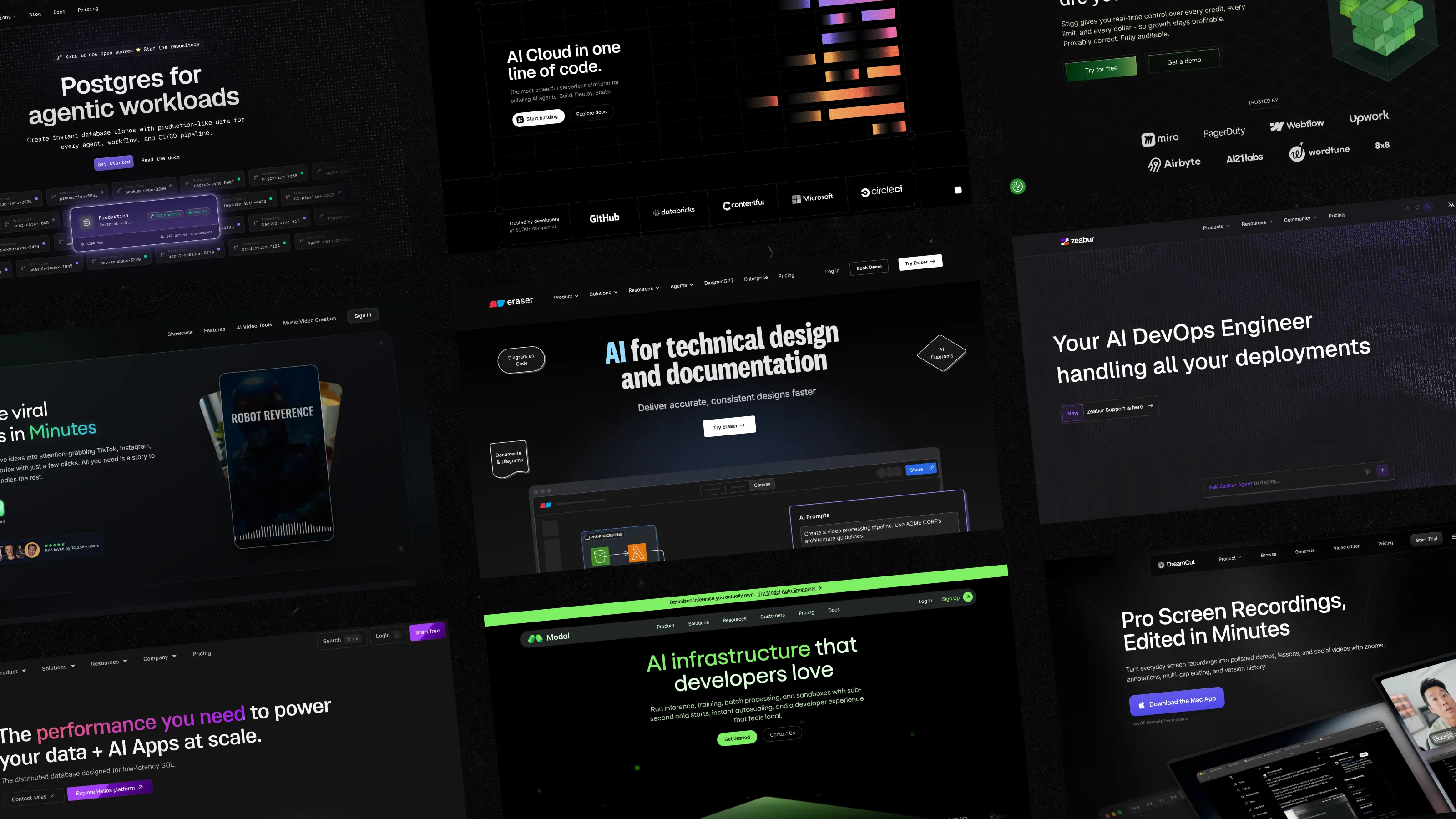
01 Bright colors on a dark background
They’re borrowed from other product categories (developer tools, tech, etc.), and they carry those categories’ cultural associations. Applying that aesthetic in a manufacturing context doesn’t convey boldness; it shows the company has looked at what’s happening in other industries and decided to imitate it. That flow is the opposite of the specificity and authority.
02 Animation layered across every scroll interaction
It reads less as sophistication and more as a company trying to hold attention it hasn’t earned through clarity. Some of the most authoritative industrial brands online use almost no motion at all, because the product and the positioning are strong enough to do the work without performance.
03 The startup kind of rebrand
It’s worth its own mention because it became a signal of modernity, only to now communicate the opposite. When a company changes its logotype to a geometric sans-serif, it is making the same design decision that hundreds of other companies have made in the last decade.
04 A dramatic hero video
Sparks flying, hands on machinery, extreme close-ups of metal surfaces—all edited to a cinematic soundtrack. Looks expensive, but communicates nothing specific. And also doesn’t work for conversion if it doesn’t speak of things buyers expect to hear.
05 Empty promises
When everyone claims to be a market leader, suspicion creeps in. When everyone is creating “a better world,” it starts sounding like bullshit. The same goes for buzzwording: “the best innovation,” “cutting-edge technology,” etc.
Companies chasing differentiation often end up copying the same reference and sound vague. Bold brands focus on what’s true about them that nobody else can claim.
How a manufacturing company can stand out
The easiest way to understand bold design is to stop thinking about aesthetics and start thinking about decisions. Every industrial company claims to be innovative—very few make design choices that visibly reinforce those claims.
That’s where boldness actually lives: choosing a visual language so specific to the company and the product that it couldn’t belong to anyone else.
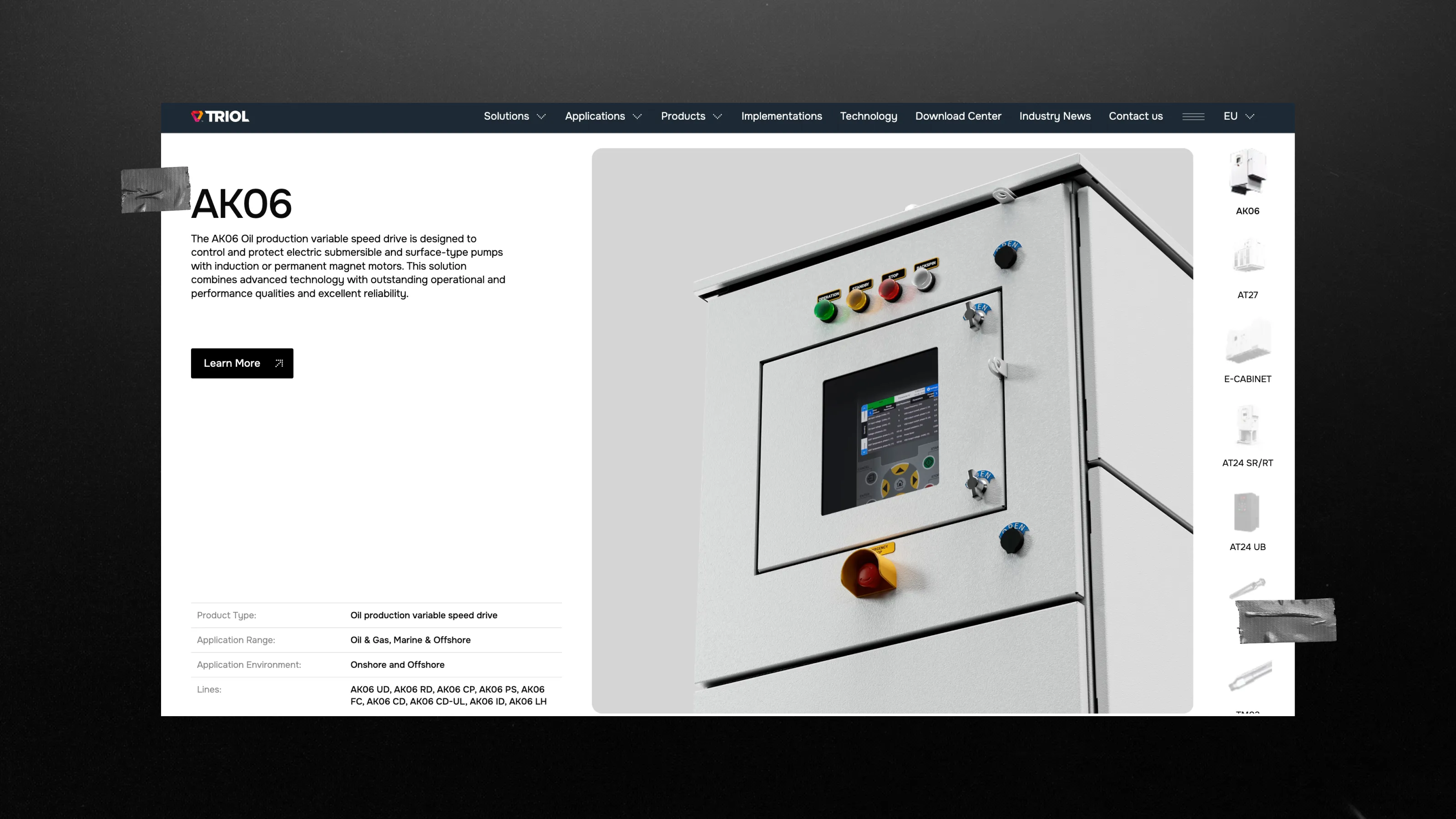
Let’s break it down with a real example. For Triol, the boldness meant rethinking how the company’s technology would be presented online. Their products are technically sophisticated, but, like many industrial products, they were reduced to flat, standard product photography.
To highlight their manufacturing power, Qream used custom 3D visualization to bring the devices forward and reveal the level of engineering behind them.
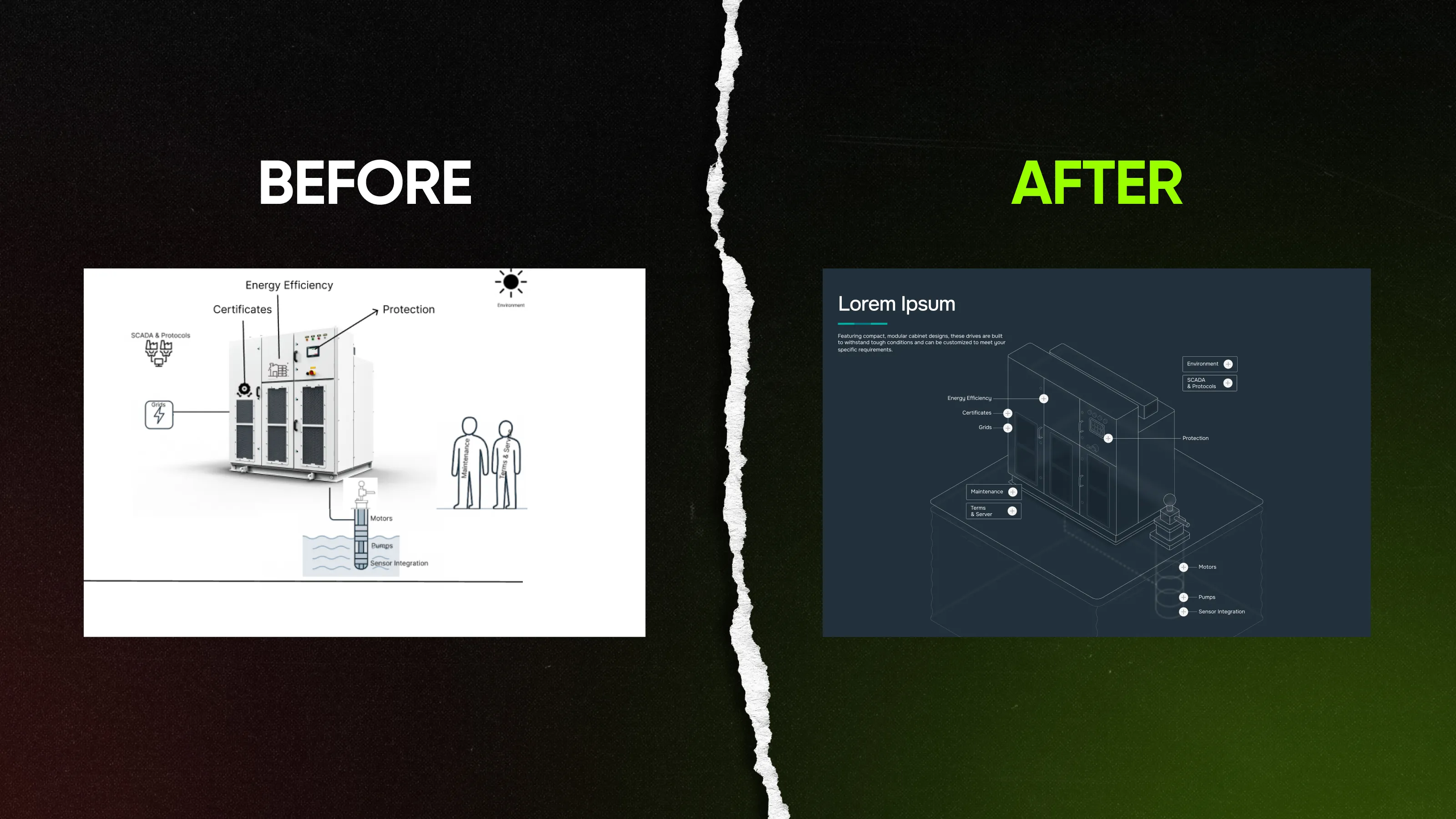
We applied the same thinking to complex industrial processes. Instead of relying on generic diagrams or stock visuals, we developed a custom illustration system that explains technical concepts clearly in a way that screams Triol.
Now, design-check your website
Before deciding whether you need to update something or not, answer this question: could your website belong to one of your competitors?
Let’s say someone replaced your logo with theirs. Would most of the visual language still make sense? Would the buyer still remember your brand after comparing 5 more from the shortlist?
If the answer is no, the problem is that your brand isn’t specific enough. The strongest industrial brands are memorable because they make it impossible to confuse them with anyone else: through positioning, visual language, typography, colors, etc.
So if you’re not sure where your brand sits today, start by looking at it the way your buyers do: side by side with the competition. The gaps become obvious really fast.
Generic is the risky choice. When every company on a shortlist looks the same, buyers fall back on price and whoever they already know. A brand specific enough to your company gives buyers a reason to remember you and shapes the commercial terms of every conversation that follows.
No. That’s a consumer tech aesthetic, and it doesn’t belong here. Bold in industrial B2B means specificity, confidence, restraint, and authority—visual language built around your product and technical capability that a competitor couldn’t apply to their own brand. It can be quiet, precise, and completely appropriate for a procurement audience.
Professionalism means credible, precise, and trustworthy. None of those requires stock photography or a tagline made of nouns (e.g., “Innovation. Power. Scale”). A brand built from real product visualizations and intentional typographic choices is more professional than a template. It signals that someone was in charge of the decisions and accountable for the results—templates communicate the opposite.
Traditional buyers are conservative in their procurement process but not in their aesthetic preferences. What they’re looking for is a supplier that looks competent and specific. That’s exactly what bold design communicates. The version of bold that would put them off—experimental typography, startup energy, neon-on-black—is the one this piece argues against.
Focus on this question: what on our website could not be copied by a competitor? If the answer is mostly your logo, you have a generic brand. Specific brands are built from assets competitors can’t borrow—your products, positioning, promises. Generic brands rely on assets anyone can buy.
First, identify where your website is underselling the business. What expertise isn’t visible? What capabilities feel generic? What makes you different that buyers can’t see?
Once you know the gap, the redesign becomes much easier to justify—and much harder to get wrong. A website audit is often the fastest way to find those answers.
Written by

Qream co-founder | Design and product direction
Leads Qream's creative and product direction, connecting brand strategy, experience design, and business goals. Reviews content where design strategy, UX/UI, customer experience, and brand execution are central.