TL;DR
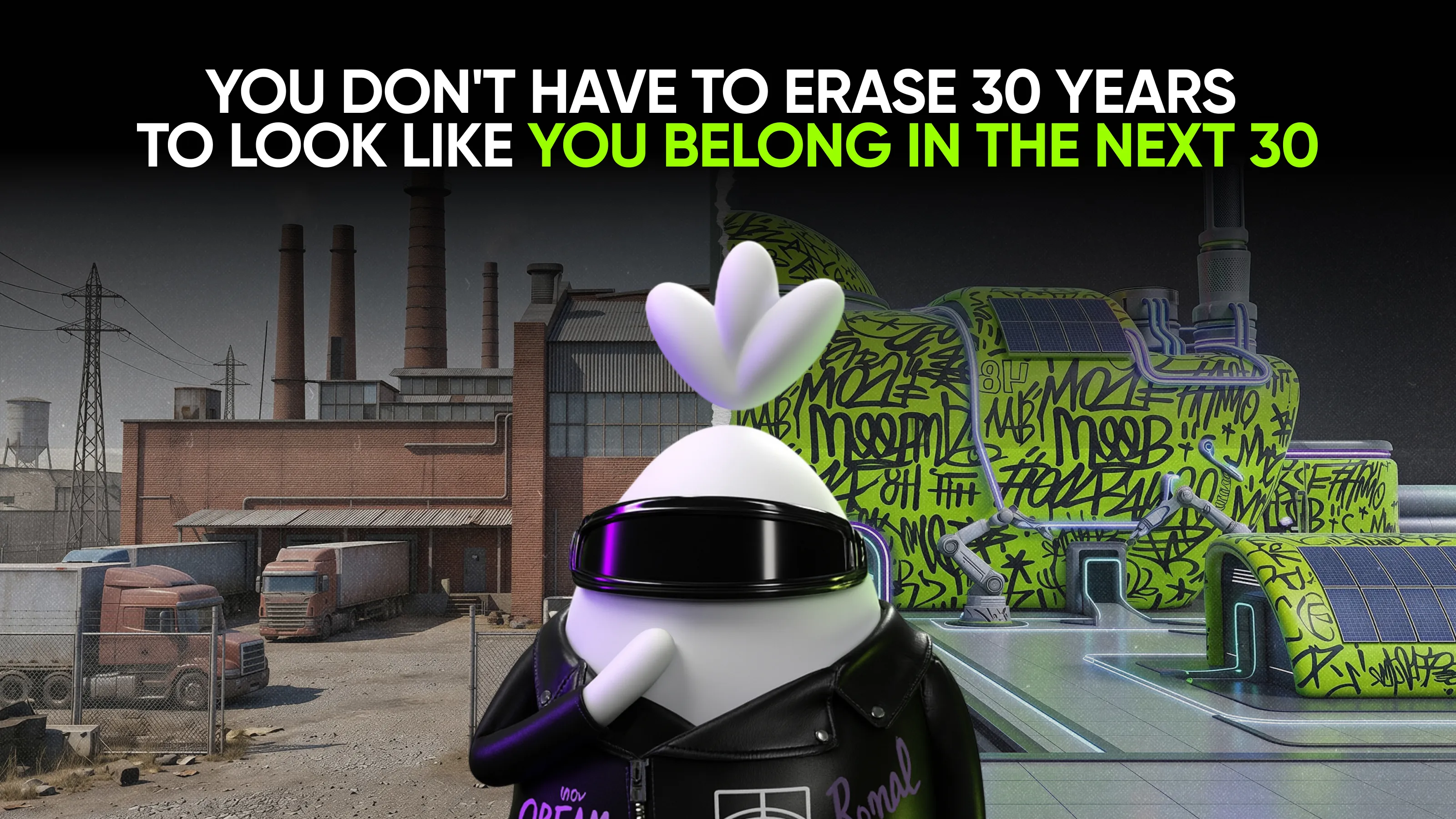
You don't have to erase 30 years of heritage to look modern—you have to translate it clearly. Many industrial rebrands fail internally: the CMO sees potential for a design update, while the founder hears a rewrite of their work and a loss of heritage. The fix is one simple question for every brand element: does this signal what we've built—or just when we were last updated? Keep the first, let go of the second. This piece shows how to frame the rebrand as something that finally makes the company visible, rather than reshaping it, so the founder becomes a partner in the work, not someone you have to win over.
The real obstacle isn't strategic
For a founder who built an industrial company from the ground up over a lifetime of work, the brand isn't just a marketing asset. It's physical proof of everything they went through to get here—every hard order they pulled off, every stretch when the company was barely holding on, every product that worked because they refused to cut corners. The logo, the colors, the tone of voice—to them, that's already proof of how far the company has come. In my experience, that's exactly why this conversation is so hard to start.
So when you walk in with a deck about "modernizing the brand," you're not having the conversation you think you're having. You're asking them to confirm that what they built isn't good enough anymore. And not every founder agrees to that—not because they're stubborn or don't understand the market, but because the brain doesn't immediately separate "update the logo" from "rewrite my legacy." It reads both as the same threat.
This isn't just a hunch. The pattern shows up again and again in conversations with founders: resistance isn't really about logic. It's a reaction to what feels like losing something irreplaceable. People don't fight change because they fail to see its value—they fight it because it feels like losing what they built.
Which means your job was never to win the design argument. It's to change what the conversation is about. Not "let's update what you built," but "let's finally show people what you actually built." One of those sentences threatens them. The other one hands them the win.
A brand that signals stagnation already tells new buyers the company stopped investing in itself. The harder part is fixing that without the founder feeling like they're losing what they built.
Keep the proof. Drop the habit.
For every brand element, there are two paths—proves something or just sits there—and one simple question that decides which one it takes.
Carry forward
Core proof points: the founding story, technical milestones, client longevity. This isn't just content for an "about us" page—it's material that proves competence faster than any creative marketing tagline. The plain fact that a company survived market downturns without cutting product quality says more than the word "reliable" ever could in a headline.
Any visual element with genuine equity also stays. A color customers recognize on a truck or a package before they read the name. A mark that's become a shortcut to trust in the industry over the years. Assessing existing equity here means one thing: some elements shouldn't be touched at all, because removing them entirely means starting trust from zero.
Here's the line that does the actual work in the room: "We're not changing what makes us trusted. We're making it clear." Say that before anything else gets shown. It tells the founder and the board that the things they're proud of aren't on the table. Once that's clear, the rest of the conversation gets a lot less defensive.
Let go
Not everything earns that kind of protection. For example, decisions made by whoever was cheapest at the time. These are almost always elements that came from circumstance, not strategy—someone hired twenty years ago, a template that happened to be on hand, a decision made in a rush before a trade show. It's fine to let go of something that was never a conscious choice in the first place.
A design can look dated and still carry real history—in that case, you don't remove it, you translate it into a modern form. But if the dated look carries nothing except the fact that an update is overdue, that's a clean candidate for letting go.
The reframe that works: "We're not rebuilding the brand. We're updating the choices that no longer reflect where the company is now." That sentence is easier to put in a board deck than "modernizing our visual identity," and it's harder to argue against.
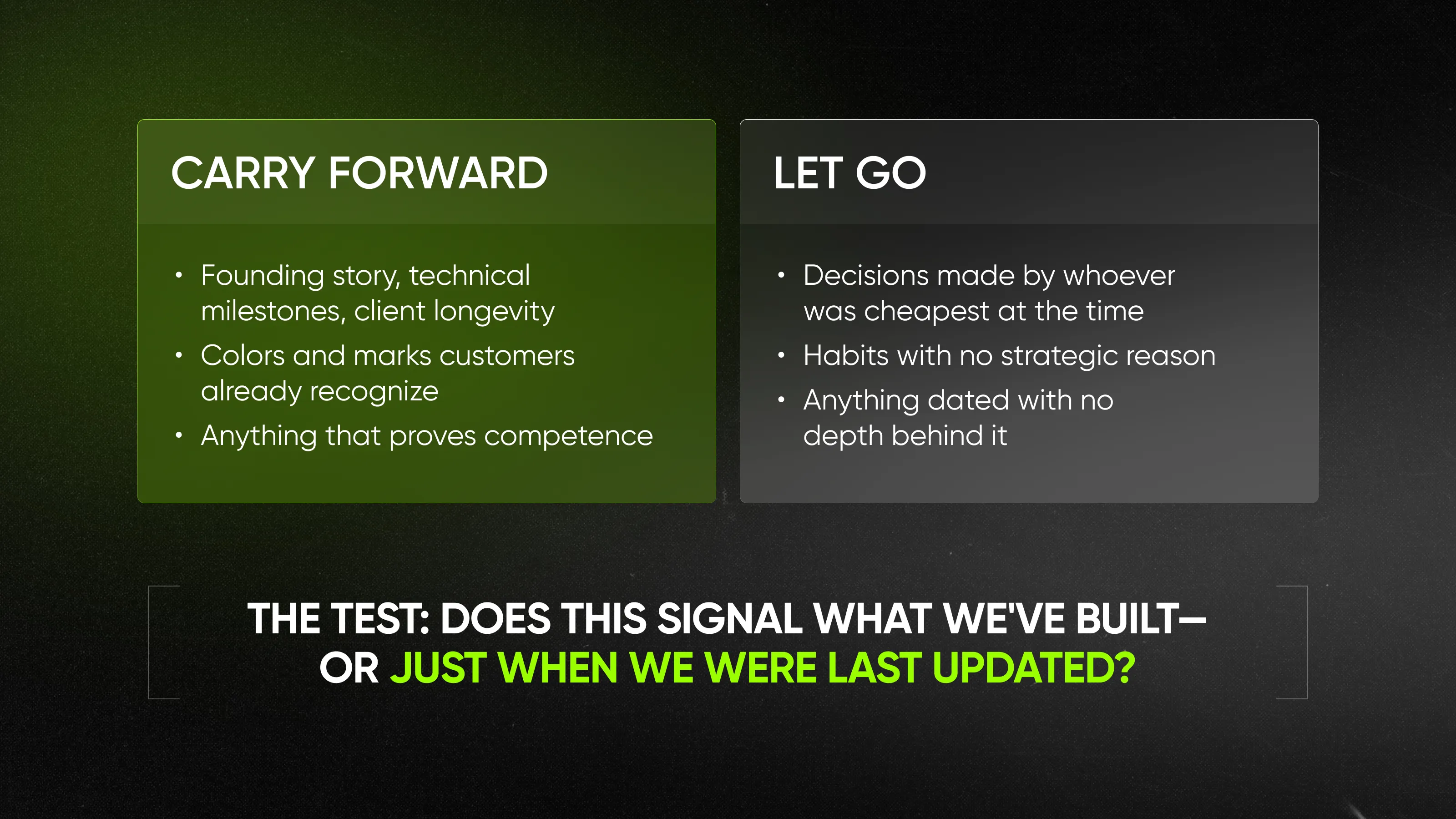
Run everything through one question
Does this signal what we've built, or just when we were last updated?
Run that question against any font, any product photo, any line of navigation copy. If the answer is "this shows our track record"—keep it. If it's "this was just easier to do in 2008, and nobody's revisited it since"—let it go. One question stops the taste debate—and turns the rebrand from an argument into an inventory.
How do you rebrand a legacy manufacturing company without alienating the founder?
Reframe it as translating what they built, not replacing it. That's the shift that makes the rest of this easier—though not effortless.
The hard part isn't knowing which elements to keep. It's getting the founder and the board to actually agree with you—and they don't resist for the same reasons, so the same pitch won't work on both.
The founder is the first conversation. The board is the second, and it needs a different language entirely.
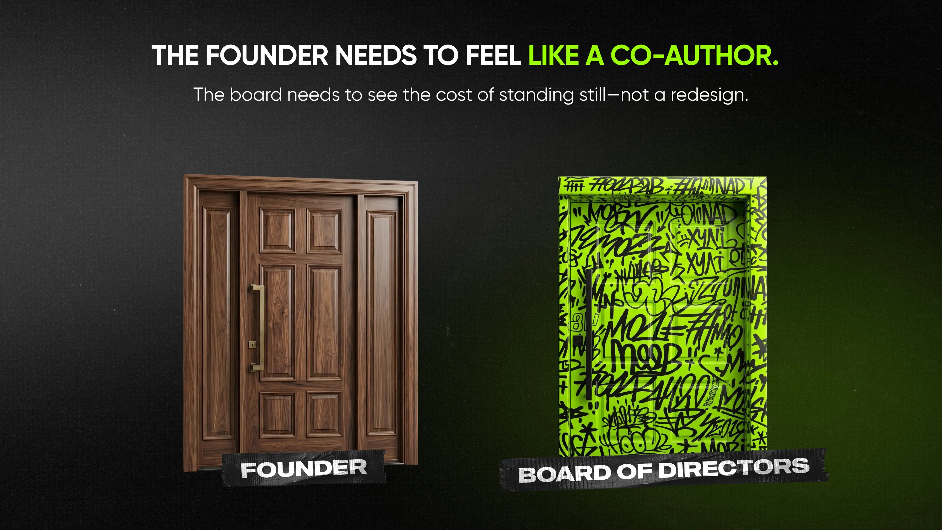
Make them a co-author, not a gatekeeper
I always recommend CMOs do the same thing before this kind of conversation: bring the founder in before there's anything to react to. Not a finished mockup, not a deck—a question. "What do you want people to feel when they land on the site? What should never change, no matter what we do?" Let them answer first. Everything you build afterward becomes their answer, refined—not your idea, imposed on them.
And it makes them a co-author of the brief, not someone reviewing your work after the fact. A reviewer can only say yes or no. A co-author has no reason to fight what they helped write.
When resistance shows up—and it will, in at least one detail—don't argue the point. Ask what it's protecting. "Help me understand what this represents for you." Most resistance isn't really about the font or the photo. It's about what that font or photo stands for. Find that, and the conversation stops being about pixels.
Reframe it as fixing what's bleeding money
The board doesn't fear change. It fears unaccountable spending. So don't bring them a rebrand—bring them a cost.
Every outdated brand element is already costing the company something: slower sales cycles because the site doesn't build trust fast enough, weaker margins because the brand can't support premium pricing, harder recruiting because candidates judge a company by its homepage before they judge anything else. Name the cost in the room. A rebrand framed as fixing what's bleeding money gets approved faster than one framed as refreshing the look.
Pair it with a number wherever you can get one—even a rough one. "Our close rate on enterprise deals is X. We're losing deals to competitors whose sites simply look more credible at first glance." That gap isn't talent—it's first impression. They approve investments, but resist expenses. The only difference between the two is whether you showed them the return.
What "modern" looks like for a legacy manufacturer
For some founders, "modern" sounds like a threat—like the company has to start looking like a tech startup to seem current. But it doesn't. Modern, for an industrial brand, means confident typography, real photography instead of stock images, navigation built around how a technical buyer actually searches, and a visual identity that looks intentional, not templated. It is not generic fonts or clip-art icons standing in for real products.
Triol builds variable speed drives, downhole telemetry, and automation platforms—deep technical product lines used across 30+ countries. The kind of catalog that's earned through decades, not assembled overnight.
That depth used to work against them online. Finding a single product meant navigating through layered menus organized by internal categories that made sense to engineers, not to the buyer trying to evaluate them. The fix wasn't to simplify the product—you can't simplify a downhole telemetry system.
Qream's approach was to simplify the path to it instead: one menu, organized by what the buyer is actually looking for, with the option to see an entire product series at a glance and go deeper only when they choose to.
The same logic shaped everything else. Dark mode and a tight grid instead of generic corporate templates. 3D renders of the actual machinery instead of stock photography or flat icons. Custom illustrations that walk a buyer through a complex process in seconds instead of paragraphs.
None of this came from a trend board. The dark mode wasn't chosen because dark mode is having a moment—it was chosen because it made the white space around each product render do more work, and that's what an engineer evaluating specs actually needs to see clearly. Every choice has to earn its place by making the product easier to understand, not by making the site look newer.
That's the only version of "modern" a founder needs to agree to. None of it is loud—and if "bold" is the word that worries you next, we go deeper into that in What "bold" actually means in industrial B2B.
The real value here is the moment the founder opens the updated site, points at the screen, and says: oh, now that's us. The same one—now showing up the way it always deserved to.
Qream works with industrial manufacturers on exactly this kind of transformation—turning decades of hard-earned expertise into a brand and website that finally reflect it.
Most fail not because of bad design, but because the CMO frames the change as a design update while the founder hears it as a rewrite of their life's work. The conflict is emotional before it's strategic.
Keep what proves competence and trust—the founding story, technical milestones, the colors and marks customers already recognize. Let go of decisions nobody actually made on purpose—old templates, dated habits, anything that was never a real choice in the first place.
Bring them in before there's anything to react to. Ask what they want people to feel and what should never change—and let that answer become the foundation of the brief.
Frame it as a cost, not a request. Every outdated brand element is already costing the company something—slower sales cycles, weaker margins, harder recruiting. Boards approve investments with a clear return; they resist expenses with none.
No. A rebrand can mean keeping everything that already carries trust and only updating the decisions that were never a real choice to begin with—old templates, dated habits, nothing strategic behind them.
Confident typography, real photography instead of stock images, navigation built for technical buyers, and a visual identity that looks intentional, not trend-chasing.