
TL; DR
The best healthcare websites of 2026 go far beyond just good aesthetics. They build trust from the very first click, offer clarity without the need for extra explanations, and provide a user experience that gently guides users toward conversion. They know how to explain complex medical products in simple language, help users feel confident right away, and create a modern digital experience by successfully integrating compliance. Does your healthcare website lack these features? You risk losing out to your competitors.
Best healthcare websites still seem stuck in a visual loop—blue gradients, smiling doctors from stock photos, and bland layouts that often resemble generic templates. While this approach used to inspire trust, today’s users are looking for something different: clarity, personality, and a digital experience that truly feels relatable and intuitive.
In this roundup, we break down what exactly sets the best healthcare websites apart in 2026. If your site isn’t on the list below, it’s worth taking a moment to reflect.
What we focused on when choosing websites:
Compliance and accessibility first
Every website must meet strict healthcare regulations while still being accessible and inclusive for all users.
Clarity of communication
Complex medical information is presented in a simple, understandable way without losing accuracy or depth.
Trust and credibility signals
Strong use of social proof, certifications, partnerships, and clear brand positioning that builds immediate confidence.
User experience and design quality
Smooth navigation, thoughtful UX patterns, and a design system that feels modern, consistent, and intentional.
Mobile-first performance
Fully responsive experiences optimized for speed, usability, and real-world mobile healthcare interactions.
10 Healthcare website design examples leading the way in 2026
Looking for inspiring healthcare website design examples? We’ve rounded up 10 healthcare and medtech websites that are redefining what great digital experience looks like in 2026.
1. Flatiron
What Works:
Global positioning
Flatiron doesn’t try to “sell a product” in the traditional sense, and that’s precisely where their strength lies. Instead, the company immediately sets a completely different scale, positioning itself as part of the infrastructure of the entire oncology ecosystem. This instantly creates a sense of scale, authority, and ambition. You immediately understand: this is a company that thinks systemically and globally.
Trust that doesn’t need to be earned
Flatiron doesn’t rely on marketing or flashy sales pitches like “we’re the market leaders.” Instead, it takes a different tactic: the website speaks for itself. With over 5 million patient medical records, partnerships with the FDA, scientific publications, and real-world studies, there’s no need to prove its competence. Moreover, the website immediately demonstrates how this data works in practice, from optimizing clinical trials to analyzing real-world data and finding patients faster.
What could be better:
A scale where it's easy to get lost
Flatiron talks so confidently about “infrastructure” and “ecosystem” that a new user might momentarily feel like a lost child in a crowd. The scale is truly impressive, but sometimes all you want is a simple answer to the question: “Okay, so where do I go from here?”
All the necessary information is on the site, but sometimes it’s a bit hard to “dig up.” For people who are already familiar with the market, this isn’t a problem. But for new visitors, the path to understanding can be longer.
Takeaway:
Showing scale can be a powerful trust signal, but great UX still needs clear entry points for first-time visitors.
2.Tempus

What Works:
Smooth integration of AI
Tempus has skillfully built its messaging around AI integration into the system. While other sites make a big fuss about AI, Tempus demonstrates how it actually works in practice: when a doctor chooses a treatment method, selects patients for research, or makes any decision. Another significant advantage is that it’s immediately clear exactly what the system works with (lab data, medical images, electronic health records). With this website, you’ll know exactly how this complex system works.
System or a component?
The system is fully integrated into the doctor’s workflow, and it is a system in its own right, not just a standalone tool. The website delicately but persistently emphasizes this aspect: “in your system,” “in your workflow,” “at the moment of decision-making.” Everything is built around the idea of seamless integration, from electronic medical records to analytics, which is always woven into the doctor’s work.
What could be better:
Overdose on technology
This site has everything: numbers, systems, artificial intelligence, integrations, a sort of technological all-inclusive package. But it’s a little short on people. Patients and doctors seem to be lurking somewhere between the lines and don’t take center stage in this story. And for healthcare, that’s important, because people are always at the heart of every decision here. This creates a slight imbalance: the site looks very powerful, smart, and convincing, but a little cold.
Takeaway:
Great healthcare websites make advanced technology feel understandable and practical, but they should never lose the human story behind it.
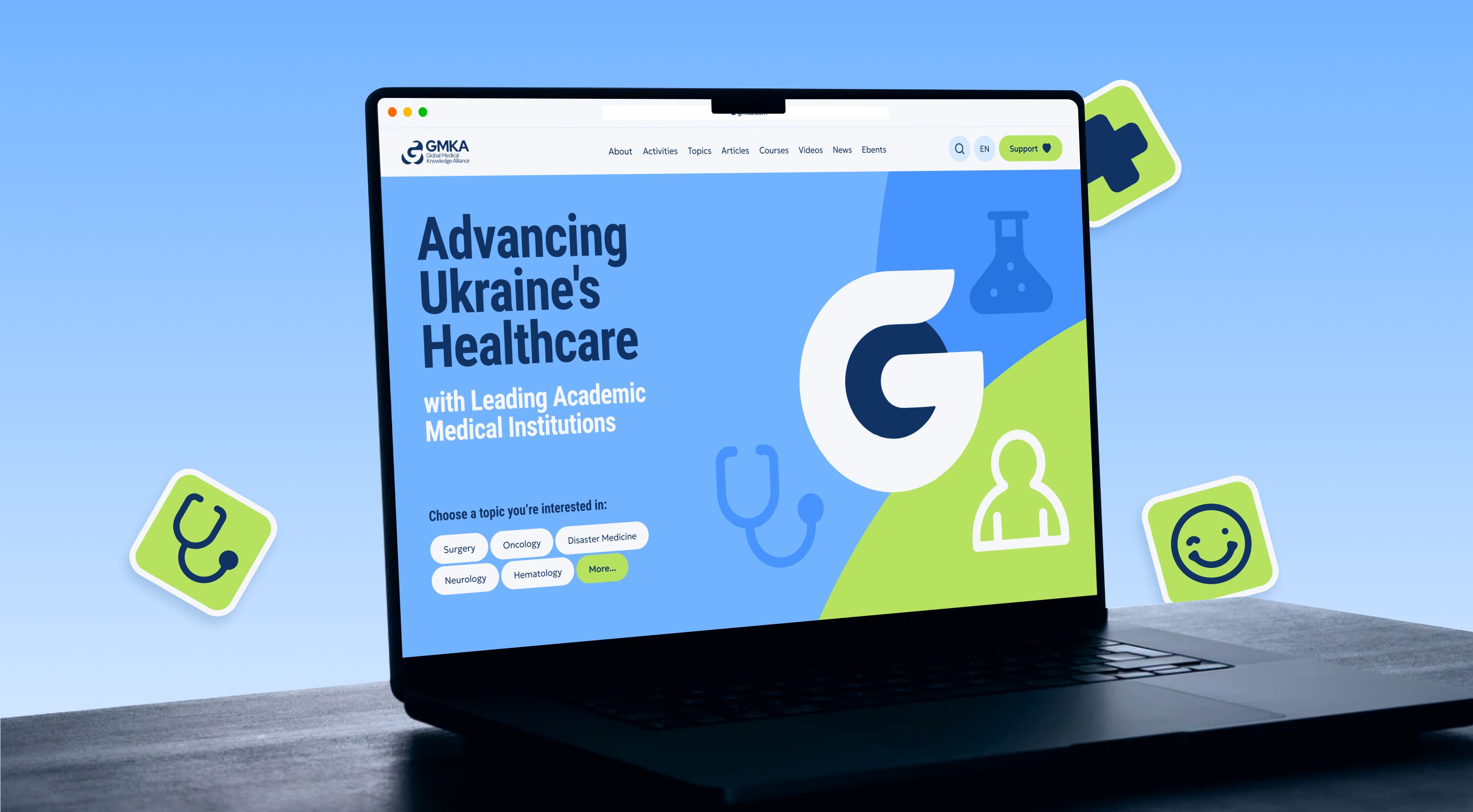
3. GMKA

What Works:
Boundaries between doctors and patients
In the healthcare sector, different audiences have different needs: medical professionals value evidence-based information, research, and in-depth expertise, while patients need simple explanations, clear context, and a sense of trust. It is precisely this clear distinction between audiences that demonstrates that GMKA has a deep understanding of its audience and does not try to address everyone in the same way.
House of knowledge
GMKA also stands out because it operates not as a typical commercial website, but rather as a knowledge institution. They build trust through expertise, place content at the center of their value proposition, and create a sense of an organization with deep roots, accumulated expertise, and significantly greater weight than any individual product or service.
What could be better:
The other side of division
Separating into “clinicians” and “patients” effectively solves the problem of content complexity, but at the same time creates a new challenge for those who don’t fit neatly into either of these categories, such as researchers, administrators, or partners. For them, the user journey becomes less obvious: they find themselves caught between two scenarios and are forced to figure out on their own which path on the site is right for them.
Takeaway:
Audience segmentation makes healthcare communication clearer and more relevant, but every user still needs an obvious path forward.
4. Hinge Health
What works:
Is the result more important?
Hinge Health immediately addresses the buyer’s pain points in every sense: less pain, better clinical outcomes, and lower costs for employers and health plans.
Instead of focusing on product features, it focuses primarily on outcomes: better musculoskeletal care, greater cost-effectiveness, and improved patient engagement. This approach makes the platform immediately relevant to corporate buyers.
Simplicity as the shortest path to understanding
Let’s be honest, digital musculoskeletal care isn’t the easiest concept to explain. But Hinge Health makes it very accessible nonetheless: through simple messages, effective product visuals, and a logical storytelling structure. You don’t feel like you’re reading a complex medical text where you have to google every word.
What could be better:
The “right” key doesn’t fit every door
What looks “right” isn’t always memorable. At Hinge Health, everything is polished, clean, and premium, but that’s exactly why the site sometimes feels very safe and generic. Yes, it’s professional, yes, it’s trustworthy, but is it instantly recognizable after you close the tab?
Takeaway:
The best healthcare websites make complex products easy to understand, and impossible to forget.
Want your healthcare website on a list like this?
What works:
Care above everything
The first thing you notice on the Maven website is definitely not complexity or technicality. The concept of “care” permeates absolutely everything, and that’s very appealing. Plus, it’s a smart strategy. Their categories—family health, women’s and family care, are inherently emotional.
How is this understood? Literally from everything: warm visuals, a soft color palette, plenty of photos of people, and a calm tone of voice. They’re closer to people than most healthcares.
A distinctive voice
Maven has a very distinctive brand language:
- warm colors,
- plenty of white space,
- editorial typography,
- premium photography.
This naturally inspires trust on an intuitive level. That’s likely why you’ll close the site and still remember what it looked like and what it communicated for some time to come.
What could be better:
Product depth
The first screens sell the brand and the experience. But the actual product mechanics: how the platform works, what exactly the employer gets, and how everything integrates, come into play later.
An enterprise buyer may want this information sooner.
Takeaway:
The best healthcare websites balance emotional connection with functional clarity from the very first screen.
6. Headspace Health

What works:
May I stick around a little longer?
Well… it seems all clear at first glance. It’s so chill!
The best healthcare website examples show that simplicity often works better than heavy medical terminology. Same here. The site’s landing page works brilliantly. Even before you read the copy, you already feel the brand. It’s calm and cozy here. The colors, illustrations, whitespace, and overall tone of voice, all of it makes you want to stay a little longer, and then a little longer… because there’s no stress or complexity here.
Goodbye to healthcare clichés
No blue gradients, scary doctors in white coats, or complicated medical jargon. This is something that’s really missing in healthcare, and here’s a refreshing, vibrant island that you don’t often come across. Headspace builds trust more through brand confidence than through “classical medical aesthetics,” and in Qream’s opinion, that’s a pretty winning strategy.
What could be better:
“Too soft” for enterprise buyers
The website has a warm and soft feel. It’s likely that enterprise stakeholders might sometimes think: “Okay, it’s pretty. But how serious of a healthcare platform is it?” And this can indeed undermine the site’s credibility to some extent, even though that credibility is built quite firmly on emotional appeal and a sense of safety.
Takeaway:
You don’t need traditional healthcare visuals to build trust, but you do need to clearly signal expertise.
7. Mayo Clinic

What works:
Trust right from the hero
Mayo broadcasts trust right from the hero section. There’s no sense that they’re trying to push you toward signing up or a quick conversion. Rather, the site is calm, understated, and very self-assured, even though it has quite a few CTAs. Nevertheless, everything is designed with the user’s comfort in mind, not just to grab attention mindlessly.
Navigation
For such a large-scale resource, the navigation is surprisingly easy to use. And that’s no small feat, given the scope: doctors, departments, treatments, research, educational materials, patient services, all of this had to be organized somehow. And they pulled it off. The site is built around people’s needs. Want to find a doctor? There’s a clear path. Want to make an appointment? Same thing. Looking for information about a disease? Everything is logical and accessible.
What could be better:
Design issues
According to Qream, visually, it doesn't look like a website production from 2026. It's good, clean, and functional, but not cutting-edge. It lacks a bit of boldness. It certainly inspires trust, but its design isn't particularly inspiring.
Takeaway:
Even the most well-structured healthcare websites can feel less impactful when design doesn’t evolve with the brand’s authority.
8. Cleveland Clinic

What works:
Educational Journey
Cleveland Clinic effectively uses educational content: symptom pages, disease guides, and health articles. On the website, this content integrates very naturally into the patient journey. This allows the site to function not only as an informational resource but also as a tool for building long-term trust: people come looking for answers and leave feeling that they have found a medical brand they can trust.
Patient-first UX
On the website, you feel like the center of the universe. The entire structure is built around what the patient needs right now: finding a doctor, making an appointment, understanding symptoms, learning about treatments, or finding a location. The question “How can we help you?” is literally in the air.
What could be better:
Where to go from here?
Information density can come into play as well. Some pages have an overwhelming amount of content, sections, and links, which can make them feel cluttered. While this isn’t a disaster for the user, it does require more cognitive effort.
Takeaway:
Great healthcare UX helps users find answers and take action, but too much information at once can still create friction.
9. Included Health

What works:
Humanity vs enterprise credibility
The site skillfully balances humanity and enterprise credibility. Most healthcare B2B websites quickly shift to the language of ROI, metrics, and platform capabilities, but Included Health starts with the human element. Through warm visuals, photos of real people, a gentle tone of voice, and copy that speaks to caring for health, the site immediately establishes an emotional connection. Yet at the same time, it doesn’t lose its enterprise seriousness.
Light TOV
This is one of the best medical websites example that knows how to simplify things where it matters most. The team does an excellent job of explaining complex healthcare topics in simple, everyday language. Included Health strikes a good balance between simplifying information and the language of complex theoretical manuals.
What could be better:
Authority matters
Because of its strong emotional appeal, the site sometimes falls a bit short on authority. You feel like you can trust them as people, but their clinical authority or category leadership could be emphasized even more clearly.
Takeaway:
The strongest healthcare brands balance warmth and empathy with strong indicators of clinical authority.
10. Abridge
What works:
No AI hype
Abridge has a clear positioning. From the very first screen, you understand what they’re all about: AI that helps doctors automate clinical documentation. And importantly, they don’t fall into the trap of using all those flashy claims like “the world’s best AI automation platform.” Everything is clear without the hype.
The balance between innovation and safety
If you push innovation too hard, you risk scaring off conservative healthcare buyers; if you push trust too hard, the brand starts to seem boring. Abridge balances these two polar opposites very effectively.
What could be better:
Who is the main character?
The website sometimes places a bit too much emphasis on AI. This makes sense, since it’s the core of the product. But at times, it feels like the main character is the AI, not the doctor. For a tech audience, that’s fine, but for a healthcare audience, it’s sometimes preferable for the technology to be seen as an enabler rather than the center of the universe.
Takeaway:
Even the most advanced AI products risk losing clarity when the technology overshadows the human story.
Here are the ratings from our team:

Patterns the best healthcare websites share
1. They build trust right from the get-go
In healthcare, trust is a must-have from the very first second. Maximum 5 seconds to earn it. That’s exactly why strong healthcare websites don’t play hide-and-seek with trust and immediately show their trump cards: clear positioning, understandable messages, real evidence, partnerships, case studies, and a tone of voice that says, “We know what we’re doing.”
2. They interpret complex concepts into everyday language
Healthcare is one of the most challenging topics for digital communication. There are tons of terms, complex processes, and technologies that can easily confuse users. But the best medical websites don’t let that happen. They know how to “translate” medical and technical jargon into plain language, simply, clearly, and without making you feel like you’re reading a textbook. As a result, users don’t have to struggle to make sense of a bunch of confusing words; instead, they move easily through the sections of your website.
3. They're breaking the mold
Most healthcares are still playing by the old script: a blue color palette, stock photos of smiling doctors, and a design that seems to be “correct” but is forgotten five seconds after you close the tab. Good healthcare companies have broken free from this template. They stand out first and foremost through their character, a confident visual language, and a tone of voice that sounds distinctive and sometimes even rebellious. You wouldn’t mistake their website for ten others; on the opposite, they leave a lasting aftertaste.
4. They anticipate and map out the user's journey
The top websites seem to read your mind. They predict what a person needs right now: a patient urgently looking for a doctor, a CMO evaluating a potential partner, or a designer in search of inspiration. They gently guide the user step by step, removing all unnecessary friction and making the next action so obvious that you want to click the CTA without a second thought.
5. They combine compliance with modern UX
Compliance and a great UX can definitely go hand in hand. Good healthcare providers know this and don’t sacrifice usability for the sake of rules. So they remain intuitive, mobile-friendly, accessible, and modern even within very strict limits, and that’s often the difference between an average healthcare website design and one that is truly cool.
Ready to build a healthcare website that belongs here?

A good healthcare website immediately inspires trust, clearly explains complex services, and indicates the next step. It must also balance regulatory compliance requirements with modern expectations for user experience. Furthermore, it should inspire confidence, allowing users to feel informed, supported, and confident in their decision, whether they are patients, healthcare professionals, or corporate clients.
The biggest healthcare website design trends in 2026 are personalization, stronger visual branding, accessibility-first UX, interactive storytelling, and AI-supported user journeys. At the same time, healthcare brands are moving away from generic “stock doctor” aesthetics toward more distinctive, emotionally resonant identities that feel more human and memorable. The strongest websites are also becoming more adaptive,using smarter content pathways and dynamic experiences to better serve different audiences, from patients to providers to enterprise buyers.
A medical website should include clear positioning, trust indicators, intuitive navigation, accessible design, compliant forms, and conversion-focused user flows. Most importantly, it should guide users effortlessly from their first question to their next action—whether that’s booking an appointment, requesting a demo, or simply feeling confident that they’ve found the right healthcare provider or solution.
Too many healthcare brands still hide behind old, familiar clichés: blue gradients, smiling doctors from stock photos, and designs we’ve seen a hundred times before. As a result, websites blend into one big “medical mass”—lacking character, emotion, and clear distinction. And that means a missed opportunity to stand out, make a lasting impression, and convincingly demonstrate why your brand deserves trust.
The best healthcare website inspiration comes from brands that can quickly build trust and make complex concepts easy to understand. Look for sites that skillfully combine strong design, thoughtful UX, clear positioning, and a logical user journey. A truly strong healthcare website not only looks good but also instills a sense of confidence and literally encourages people to take the next step.
