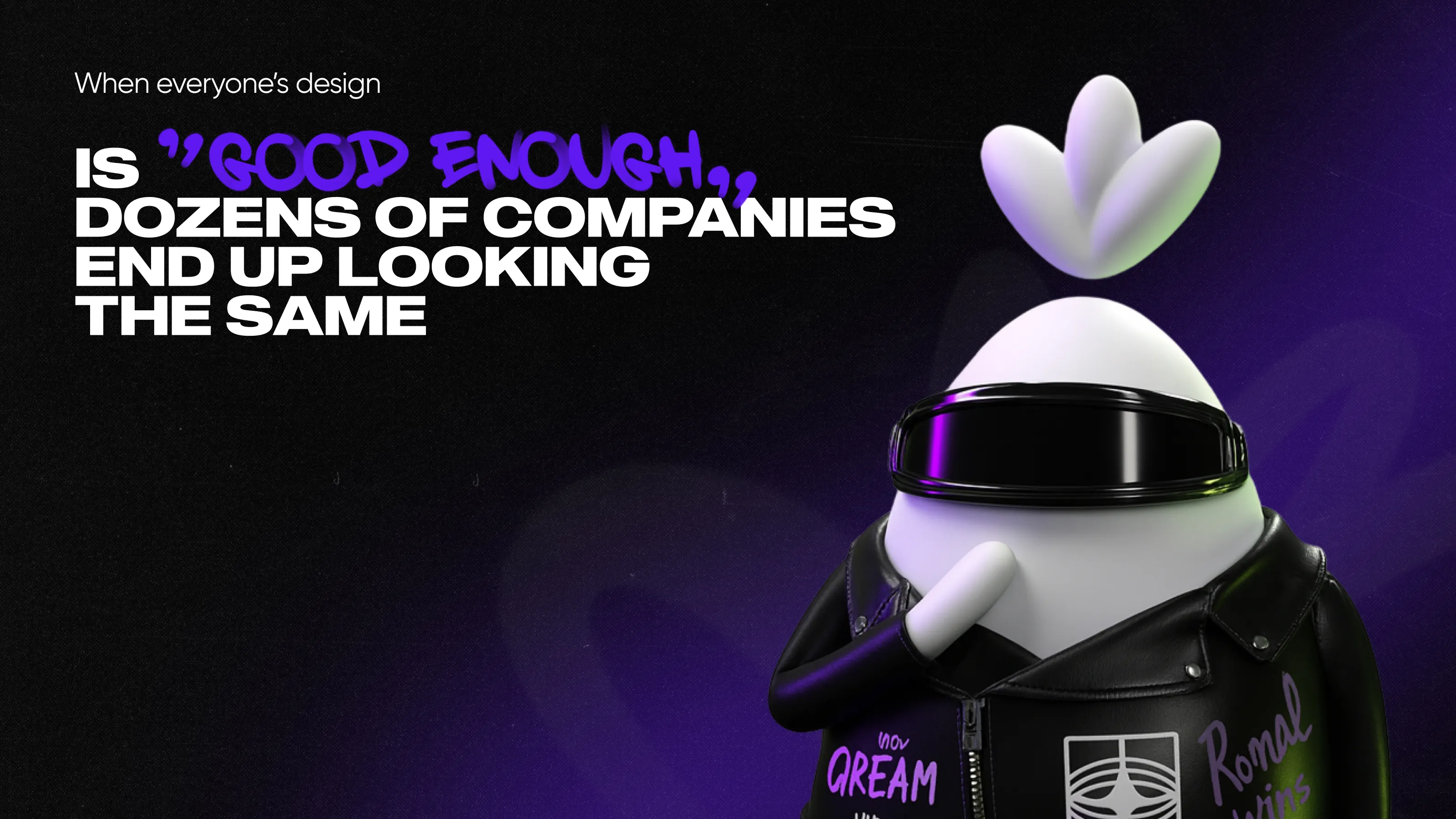
Most SaaS websites are designed to blend in, and we’re ready for this talk.
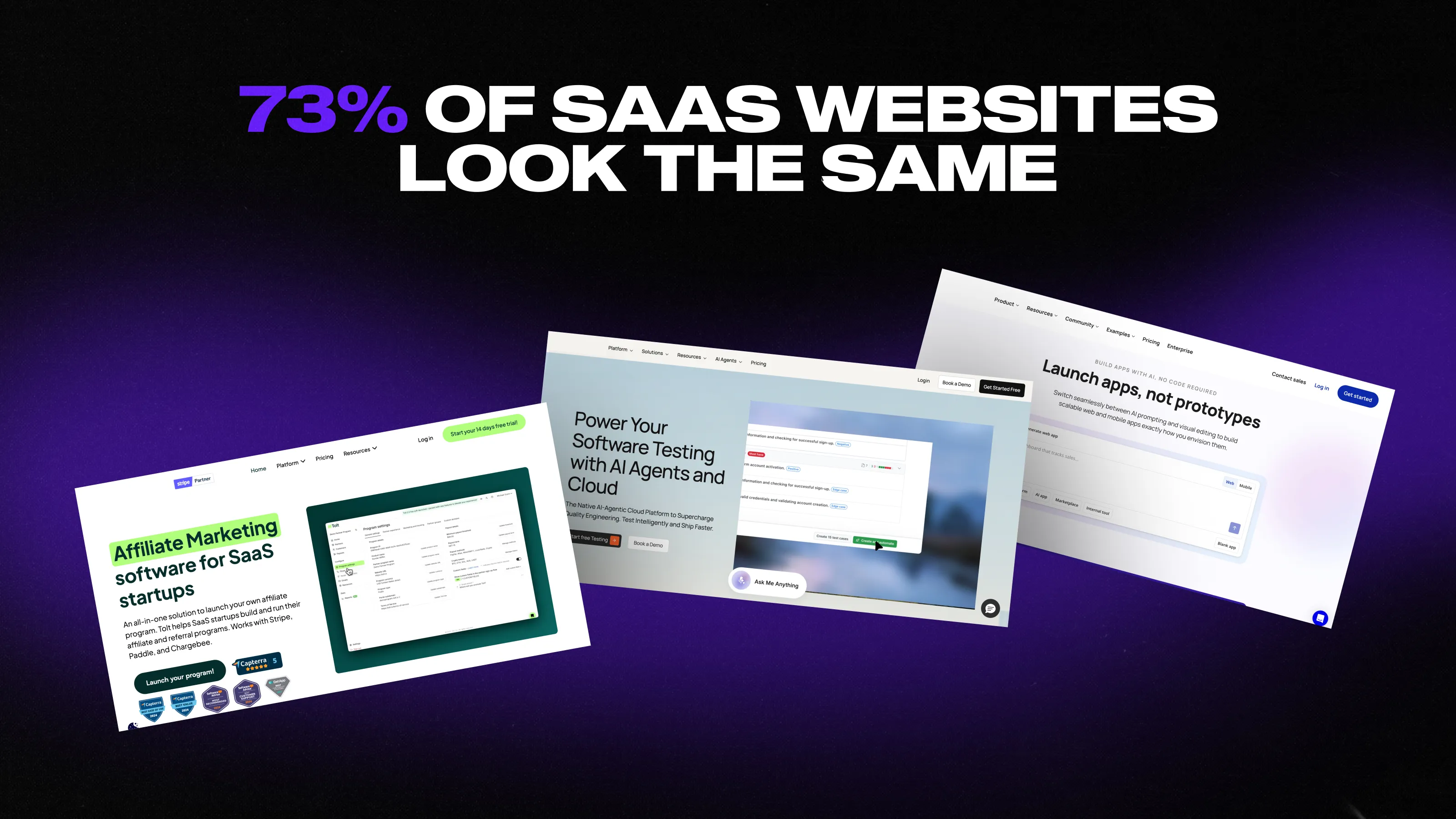
The Qream team looked at 100 SaaS websites: some launched on Product Hunt and some found through random Google searches. Different categories, stages, and markets—yet 73 of them were complete lookalikes. Indistinguishable to the point where you could swap logos, headlines, even product screenshots—and nothing would feel off.
It felt like SaaS design stopped being a competitive advantage. In this article, we’ll explain why copycat designs happen and what lessons you should learn to make a website that stands out.
Design patterns that make sites look like they were built from the same Lego set
After reviewing 100 SaaS websites, the strangest insight was that they make the same decisions for the same reasons.
These aren’t poorly made websites. Most are well executed and designed to look modern. But they feel like they’re all solving the same imaginary problem: how to look like a SaaS company in 2026 without upsetting anyone.
And that’s exactly why they start to blur together. Instead of building around a sharp POV, many teams build around safety and familiarity. The result is a visual language that feels fine but is rarely memorable. If you strip away the logos, all these sites become indistinguishable within seconds and look just like a fitting template.
Here are the recurring patterns that explain why.
Visual anonymity disguised as “modern design”
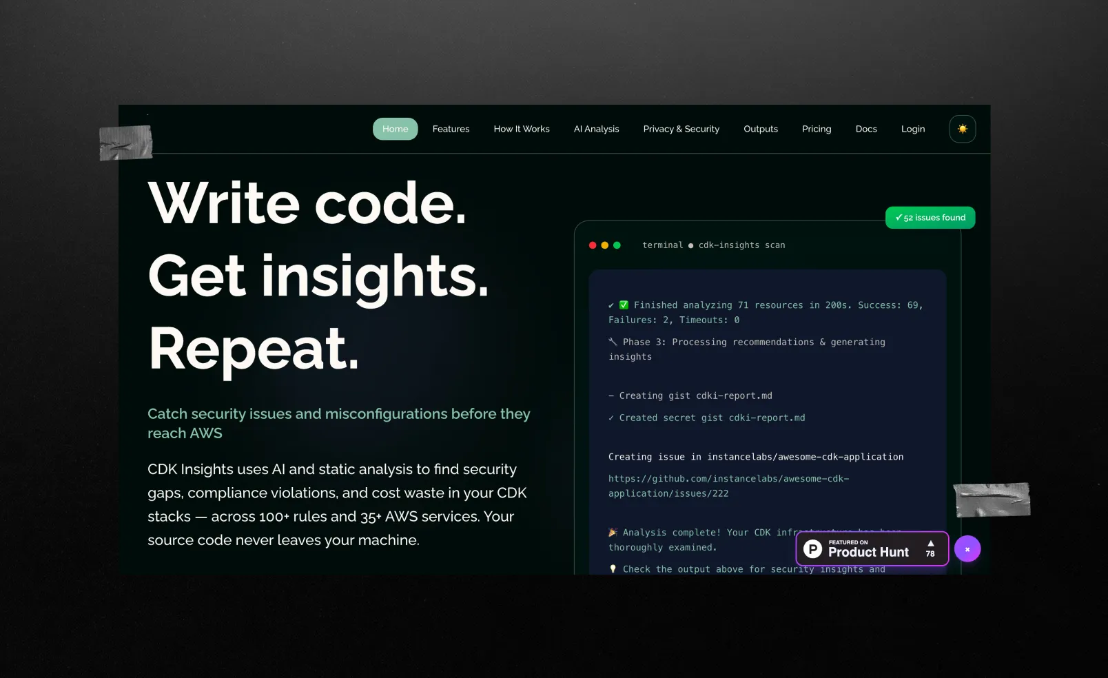
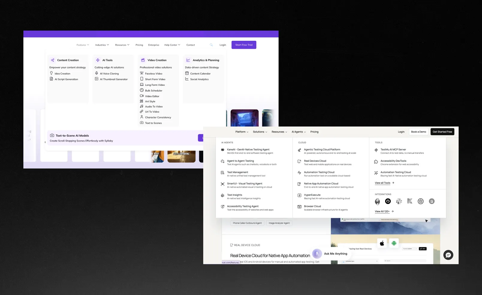
Most SaaS sites rely on the same visual toolkit: Inter or Sora typography, soft blue-to-purple gradients, and Bento-style grids that look structured but don’t actually create hierarchy. Individually, these choices make sense. Together, they create a kind of visual fog where nothing stands out long enough to be remembered.
Text-heavy pages with no visual breathing room
We saw lots of storytelling built almost entirely from text blocks: feature descriptions, “how it works” sections, testimonials, comparisons, and FAQs stacked one after another. It happens when landing pages try to explain everything instead of prioritizing what matters.
By the third or fourth section, the user is no longer evaluating value. What’s missing is contrast: larger visual blocks, illustrations and photos, or generous spacing.
Unbounce’s research explains why it matters. Text-heavy landing pages convert worse (with a rate of 11.10%), while websites that focus on word count have a 14.30% rate.
Emoji and icons as visual language
In an attempt to feel friendly and approachable, many SaaS sites lean on emoji-style icons or overly simplified illustrations. But instead of creating a distinctive brand tone, it reduces quality. Everything starts to feel casual, generic, and less premium than the product is. This shortcut to personality ends up removing personality altogether.
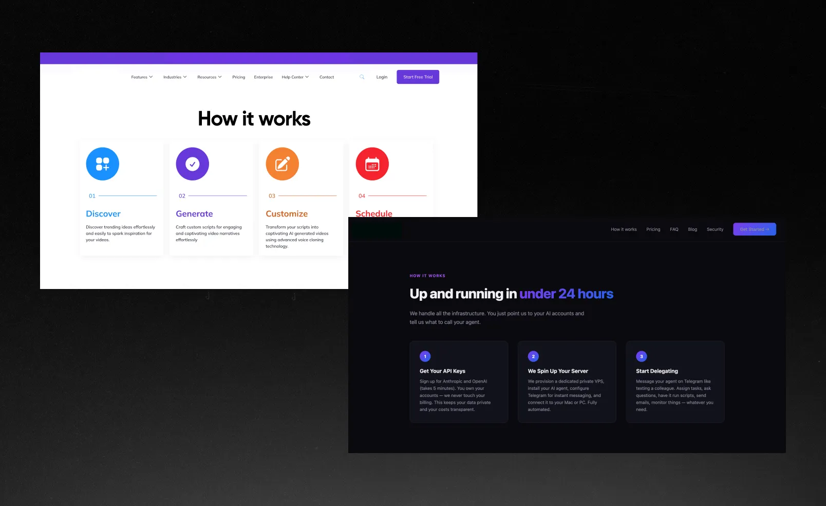
Template thinking instead of product thinking
Most websites feel assembled from known solutions: layouts, headlines, sections, and even tone of voice are variations on what already exists in the category. Not because teams lack creativity, but because templates reduce perceived risk.
Passive experiences with almost no interaction
There’s very little to explore, test, or experience directly. No micro-interactions that reveal product behavior, playful surfaces that invite curiosity, or a live sense of the product in action. The site becomes a brochure instead of a preview of the product itself.
Long scrolls and overwhelming navigation
Many LPs are designed as continuous vertical narratives without anchors or sticky navigation. The user scrolls, but never knows where they are in the story or how much is left. Will they scroll till the right CTA hits them? We can’t tell that.
The same goes for overloaded navigation instead of focusing on the value proposition. If you don’t give people what they want, they’ll just leave.
Why sameness in SaaS keeps happening
If 73% of SaaS websites look the same, that seems like a pattern rather than a coincidence. Usually, there is one of these reasons that stands behind it:
01 The risk-aversion trap
Especially in B2B, the stereotype that being corporate = being successful still exists. So going too bold and brave feels like a risk.
No one wants to be the person who approved the “weird” vendor. No one wants to explain to their boss why they chose the bold, unconventional option if something goes wrong. So teams default to what feels familiar, predictable, and kinda safe.
The logic goes: “If we look like a serious SaaS company, we’ll be trusted.” But now, everyone is using the same playbook to signal trust.
Risk aversion slowly transforms into creative paralysis. Designers are told to push boundaries, but not too much. Marketers want differentiation, but within the limits of what already exists. Founders say we want to stand out, and then reference 5 competitors who all look basic.
You end up with something that’s technically correct, aesthetically clean, but completely forgettable. And we get it—too brave feels risky. Though too safe is actually worse: you just don’t notice the loss immediately.
02 “We need to launch now”
When your startup raises money, speed becomes non-negotiable. You need a new site fast, and it needs to look like a real company. There’s no time to explore visual territory or develop a distinctive language from scratch. So what do teams do?
They use what already works: templates, same layouts and storytelling, familiar sections and visuals, etc. It makes total sense in the short term—if you get something clean and launch-ready, investors will be happy.
But here’s the catch: templates are not enough to build a brand. You assembled one just like those IKEA closets. The result is the speed aesthetic—a look optimized for immediate validation, not long-term differentiation.
03 Designing for trends, not differentiation
A huge chunk of SaaS design today is driven by references. Designers scroll Dribbble, collect what looks “modern,” remix a few moves, and ship the website. The problem is that everyone is looking at the same trends. And then we see similar icons and identical hero sections—just in different domains.
There is nothing wrong with looking up to someone. Top players like Salesforce or Notion create a visual language that works for them—deeply tied to their brand, product philosophy, and timing. And when startups copy the surface without the underlying thinking, you get aesthetic mimicry without strategic grounding.
Design becomes a game of “what looks right” instead of “what will be remembered.” And what looks right today becomes invisible tomorrow if it’s not built on a strategic foundation.
Brands erase themselves by blending in
What you think is a visual issue is actually a positioning failure. You can’t reinforce your place in the market if you look like a copycat.
Users don’t have the time or motivation to analyze every product they encounter. They rely on shortcuts: recognizable visual elements, first impressions, bold statements. If you look like 5 other tools they’ve seen this week, you don’t get evaluated—you get skipped.
In the short term, you might get away with it. Your product might still convert—paid acquisition can mask the problem.
But in the long run, you start paying the price in subtle ways. Your brand recall stays weak, so every new interaction feels like starting from zero. Your CAC (Customer Acquisition Cost) keeps growing because you have to reintroduce yourself constantly. Your pricing stays at the same level because, without a distinct identity, you’re easier to compare and replace.
You become another item in a market that values perception as much as performance. And if your visual identity doesn’t claim a recognizable space in people’s minds, someone else will.
How to stand out without looking unhinged
If most SaaS websites are moving toward sameness, you get the chance to break the patterns that make you invisible while still feeling credible. We picked up 4 fresh web design moves that will help your SaaS look more memorable.
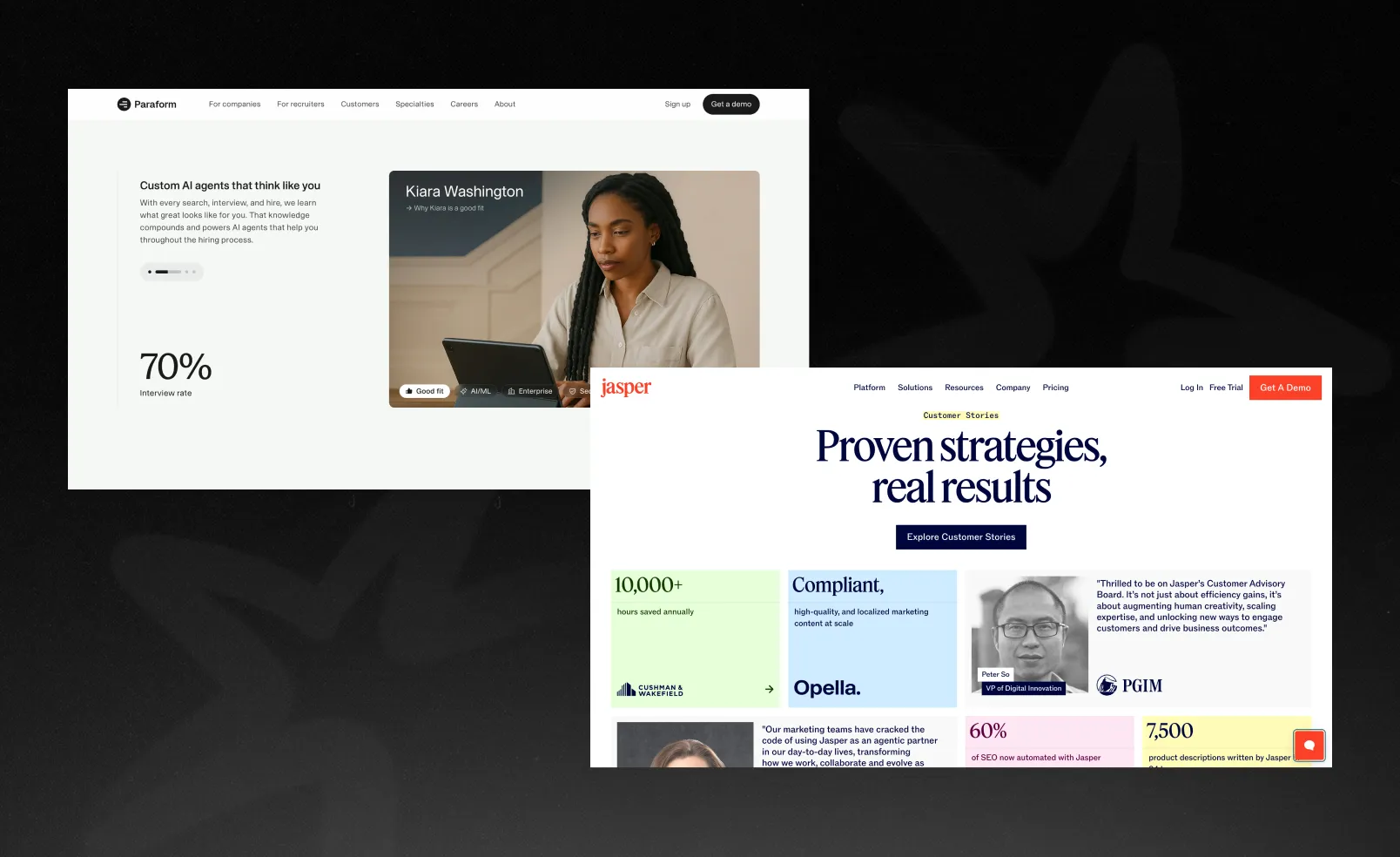
Social proof 2.0: stop collecting quotes, start proving results
Generic testimonials are wallpaper at this point. Everyone has them, but nobody really reads them. What works now is proof with substance: numbers, outcomes, and real context. Show revenue impact, time saved, growth metrics—ideally with screenshots or short breakdowns.
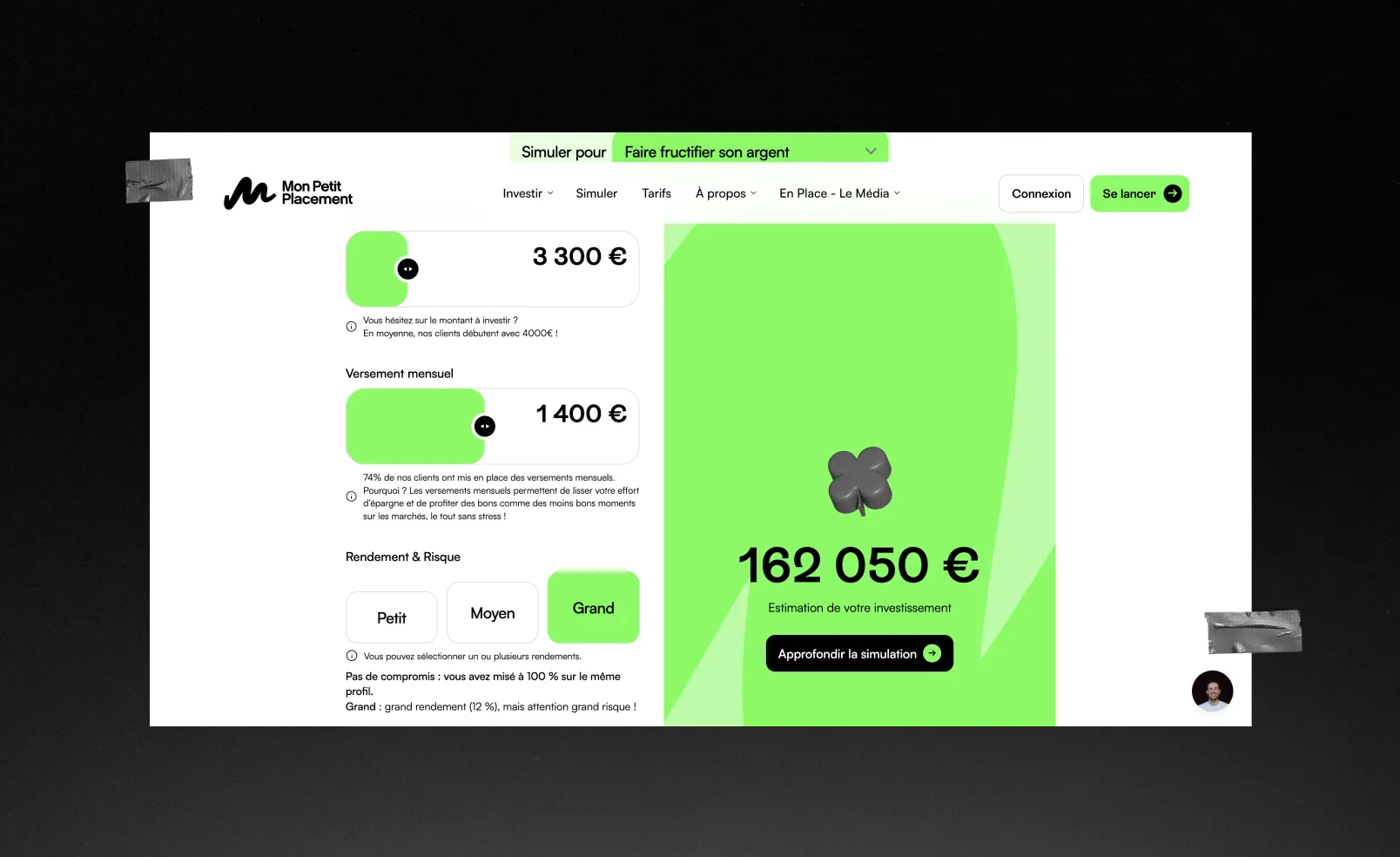
Show value upfront and let users feel it
Most SaaS sites delay value—users have to read, scroll, and imagine what they’ll get. A better approach is to bring value into the hero: ROI calculators or personalized elements that instantly show impact. Even lightweight interactivity shifts the experience from passive to engaging.
47% of enterprise buyers wish it was easier to calculate ROI, says the B2B Buying Disconnect Report by TrustRadius. Use this pain point as a growth tool for your business—and a chance to stand out among other SaaS.
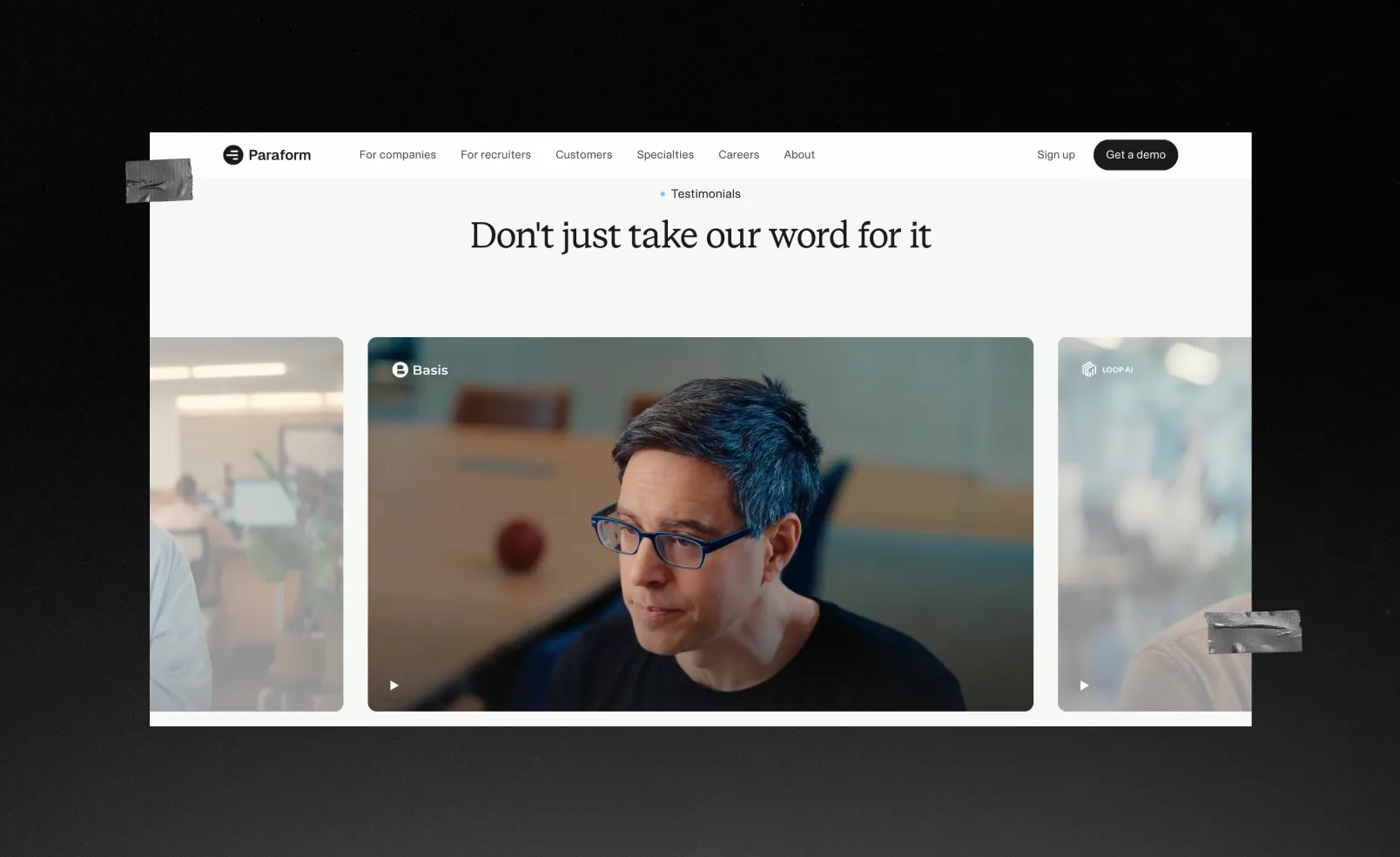
Use videos for trust, not as decoration
Video is one of the fastest ways to reduce skepticism. Short, focused clips of real customers explaining outcomes create a level of credibility that polished copy can’t match. It doesn’t need to be overproduced or overly used—even 3 videos beat 10 long paragraphs.
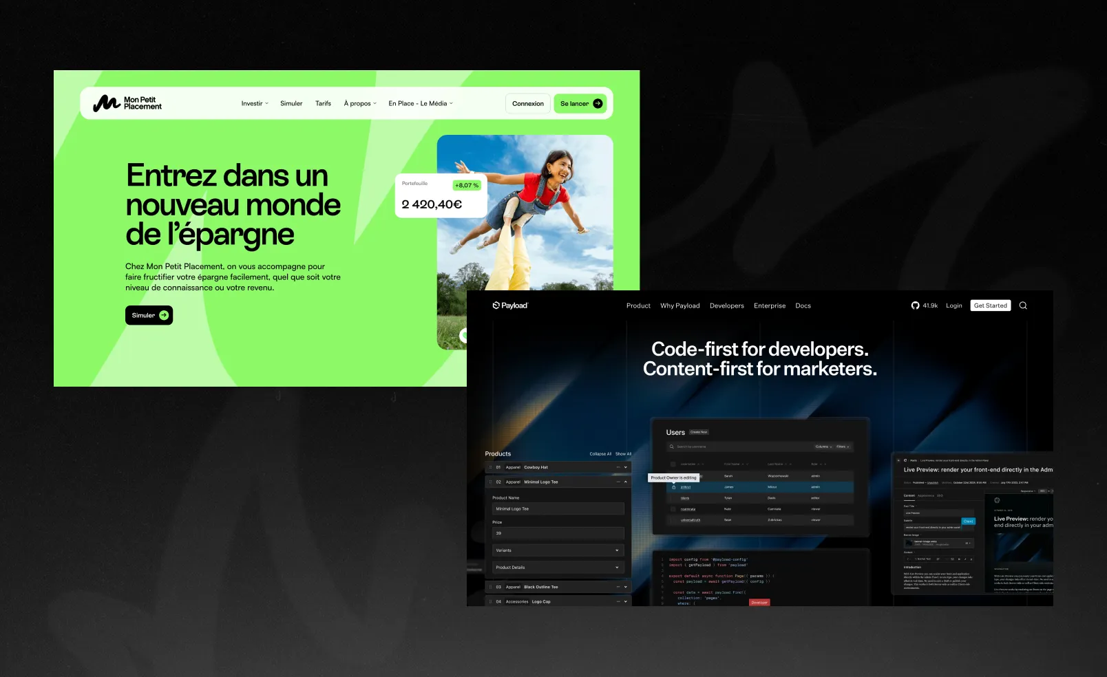
Bold visual identity is the way to stand out
Most SaaS brands play it safe visually, and that’s exactly why they blend in. You don’t need to go crazy, just be intentional. Strong typography, distinctive gradients, subtle 3D, and a well-crafted dark mode can create a recognizable look.
Take Snowbit’s branding as an example. For a cybersecurity platform, Qream ditched visual cliches and the stock vibe of what everyone imagines around this industry—shield and lock icons, overwhelming dashboards, and light-to-deep blue shades. Instead, we gave it a stable, grounded color palette, combined with tech-inspired typography and glass-like 3D icons.
What to do next—a simple framework
If sameness results from a system, you can fix it by changing how decisions are made.
Start with clarity, not design. Define your key point or vibe in one sharp idea. If your positioning is vague, your design will always drift into something generic, no matter how polished it looks.
Then look at your site like a stranger would. Strip away the logo in your head and ask: could this be anyone? Do I immediately understand the value? Is there anything I’d remember tomorrow? Most teams realize here that they’ve been designing from the inside out—optimizing for completeness instead of perception.
Before adding anything “creative,” remove what’s unnecessary. SaaS sites tend to overload with navigation, features, and explanations to look more comprehensive. In reality, that just weakens focus. Cutting 30–50% of the noise often does more for differentiation than adding another layer of design.
From there, focus on creating one memorable moment—not the entire site, just one thing that actually makes someone stop. It can be a strong hero interaction, a catchy visual, a sharp piece of copy, or a proof section with real numbers. Don’t forget to use the moves we suggested—and boom, you look like one in a million.
The last thought
Most SaaS websites today feel like they were built by developers for developers. They focus on what was done, how it works, and what features exist. But the buying decision is often made by a manager or a founder who doesn’t care about your stack—they're impressed by outcomes and trust.
Sites that actually win say: “We solve this specific problem—and here’s proof.” That shift sounds small, but it moves you from describing a tool to owning a position.
If you’re a new product, this matters even more. You don’t have brand recognition to fall back on, and playing it safe is a disadvantage. So break through the noise, be understood instantly, and give people a reason to remember you.
Right now, you don’t compete with big players whose products are better. Your competitor is every new SaaS company that adds another drop in the sea of sameness. And when everyone looks and sounds the same, you choose what you want to be—different or similar.
