Bridging the trust gap for indoor saunas through web design
The product that makes home relaxation easy
Fitosauna builds compact, plug-and-play steam saunas designed for apartments, bedrooms, and other indoor spaces. It’s easy to install, use, and maintain—simple moist-heat therapy for relaxation and daily well-being.
They came to us with a mission to become the default choice for indoor steam saunas in Europe. And it could be done with a sleek digital experience.
The challenge: skepticism killed conversion
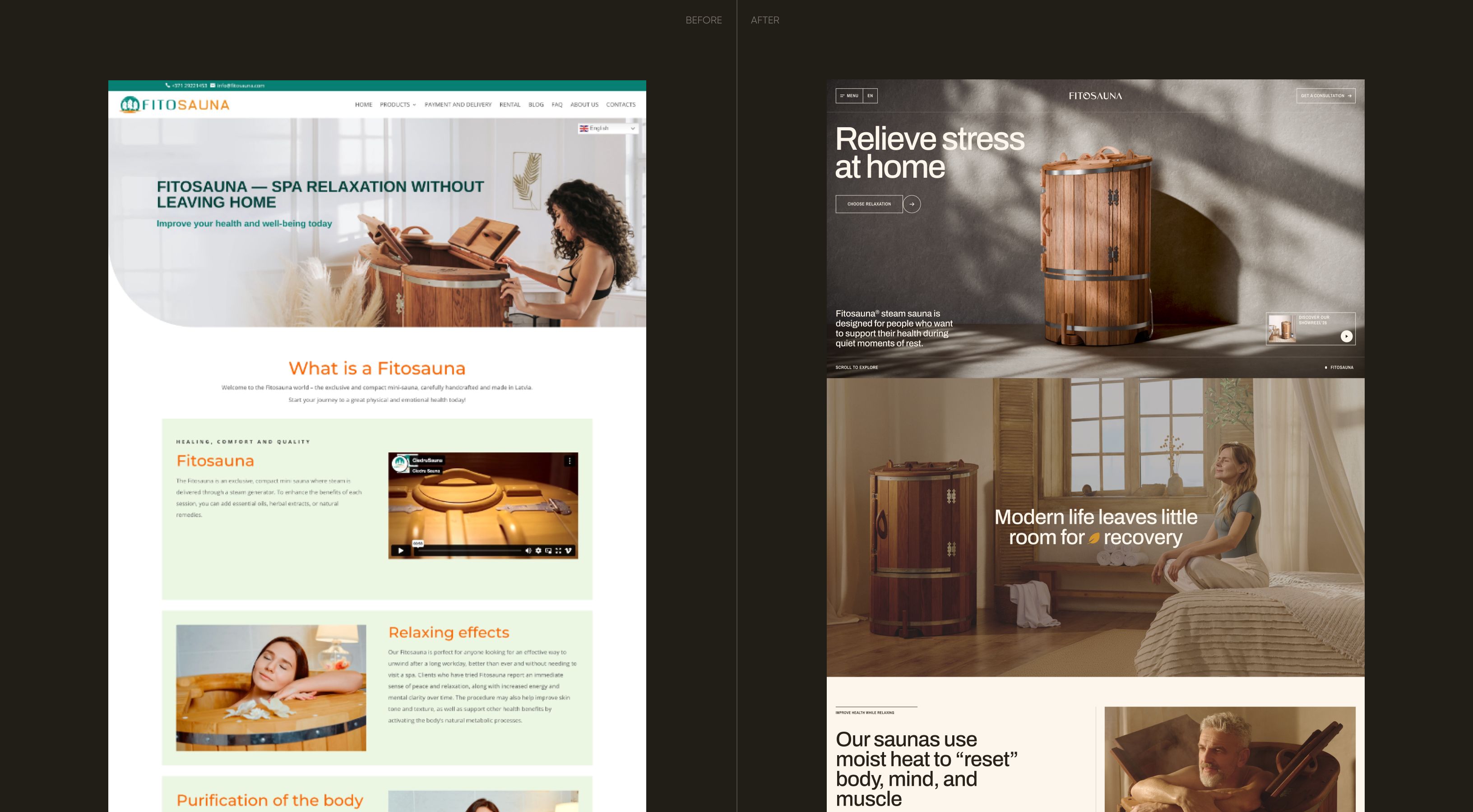
The old website was quite low-converting, but the real blocker wasn’t design only—it was belief. People didn’t trust that a steam sauna could safely work indoors, and concerns remained even after explanations. Add to that a massive education gap and cheaper alternatives everywhere—Fitosauna had to work harder to justify itself.
In Scandinavia and the Baltics, users are solution-aware, but in the rest of Europe, not even close. That meant shifting from “here’s our product” to “here’s why you need this in your life” on the website pages.
Finding the right angle for visual direction
We explored two directions, aka UI concepts. Both were to recreate the sauna warmth and recovery vibe—but only one could win.
Concept #1
Image-based
This one was all about emotions. Big photos and interactions make it feel alive—every action triggered a response, making the experience more engaging. But for adult Fitosauna’s audience, it was a bit too flashy and complex.
Concept #2
Product-driven
The concept leaned into clarity and minimalism. It makes the product feel well-engineered and trustworthy. It focuses mainly on the product, showing not only models but also their usage. This concept resonated more, giving the client exactly what they wanted.
Strip down the overwhelming UX
We rebuilt the page structure from scratch. The goal: guide users fast, answer objections early, and never lose the lead.
We simplified the narrative and focused on what drives decisions on key pages: the home page for trust and overview; the product page for details and proof; the landing page with a conversion-focused flow.
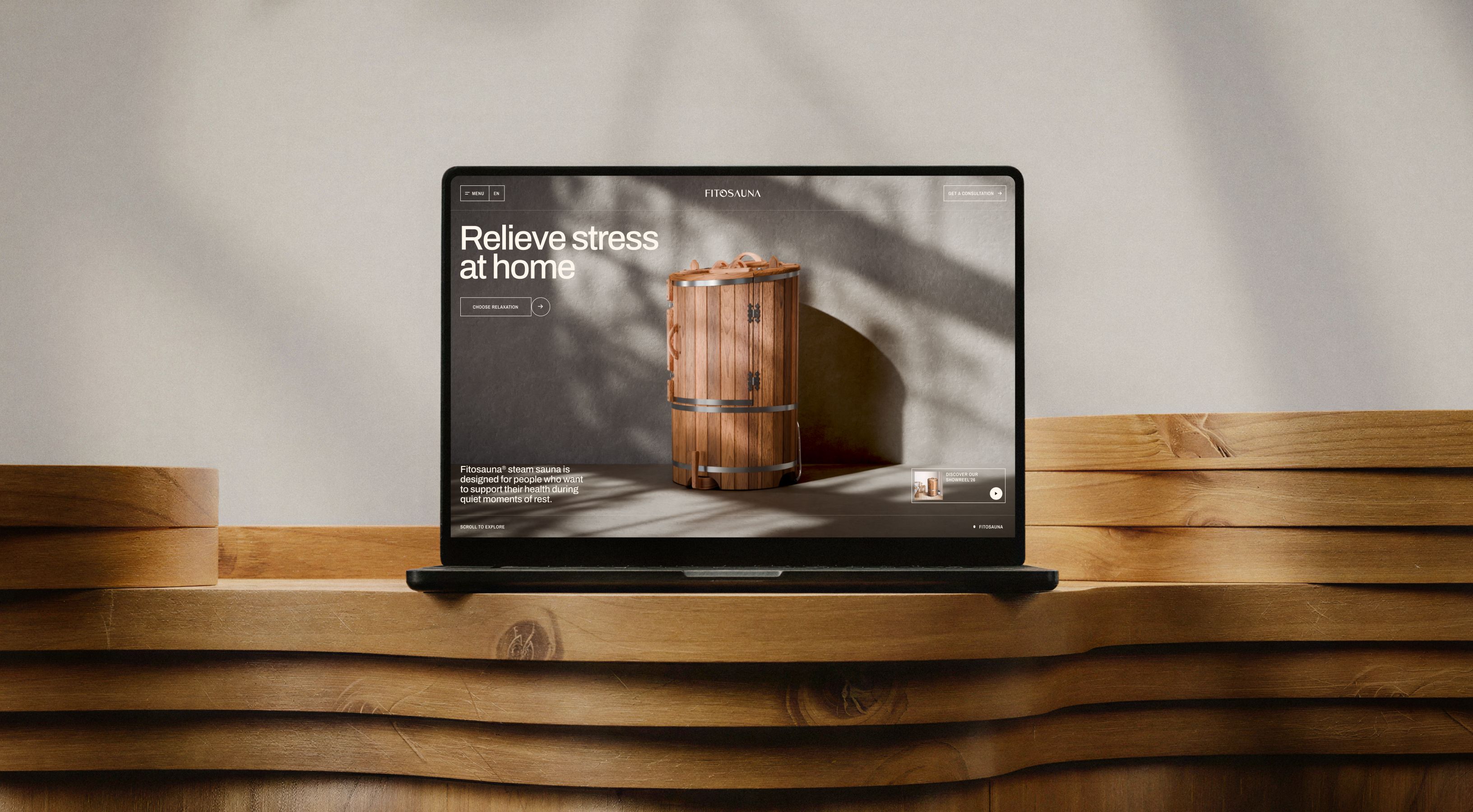
A dynamic hero section that captures attention
Instead of just showing the sauna, we answered the biggest doubt instantly: “Can this really work indoors?” in the first screen.
We built a layered 3D-like hero using video elements. Background and product move independently, creating depth and interactivity without heavy 3D load. It feels dynamic, modern, and demonstrates what a sauna looks like.
A CTA section that feels engaging
We ditched the boring “button in a block” approach. The CTA section appears in a non-standard way—with a headline that splits and moves apart, pulling more attention. It makes the next step clearer and leaves zero chance that the user misses the action.
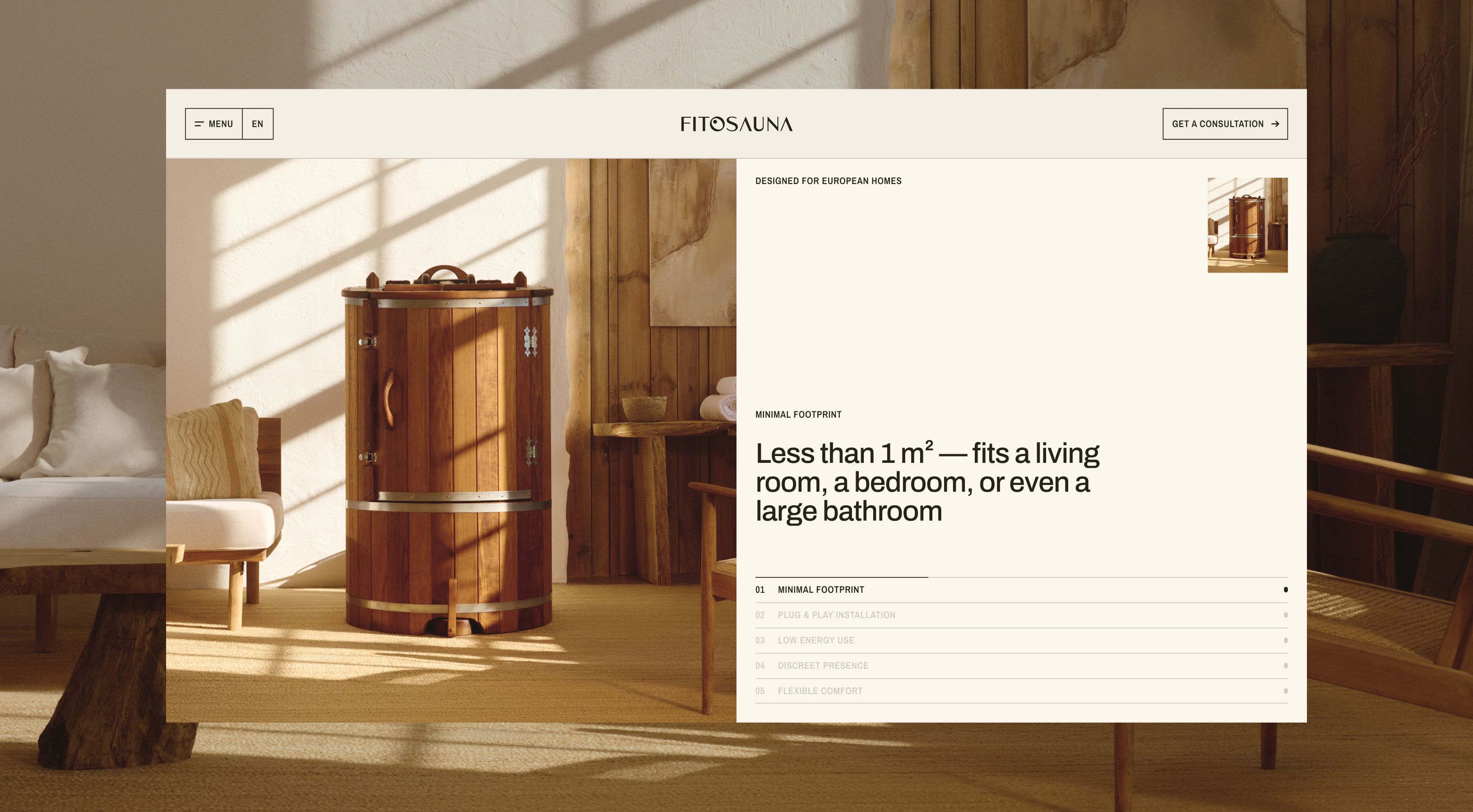
Product page that doesn’t overload
It’s hard to get the user interested with a wall of text about features. We broke everything into digestible chunks—each feature gets its own moment. Users scroll, explore, understand, and move on without cognitive overload.
Visually, we also created a warm atmosphere: lines that echo the wood, rounded shapes inspired by sauna lids, and soft tones that make you feel relaxed already. It’s a true mood setter through UI.
Subtle animations to drive engagement
Of course, we added motion—but it knows its place. Scroll-based animations and soft content reveals don’t bring complexity, just enough moves to guide attention and make the experience feel smooth.
On the About Us page, we went further: 3D elements slightly rotate and shift, giving depth to the product story without overwhelming the user.
Solutions that are built to scale
We designed and developed 3 core pages on WordPress. “But the whole website seems revamped,” you’ll say.
Well, from that part, the client took over, using our pages as templates for sections. They added more pages themselves, based on the blocks and visuals we created. We continue to review the design to make it truly crème de la crème—but the foundation is already flexible.
I find the whole process impressive. From the kick-off and brainstorming meetings to the later stages, they manage everything excellently.

Toms Leme
Founder
The project in numbers
7
Creative people involved (UI/UX Designer, Design Lead, 3D & Motion Designer, Copywriter, Graphic Designer, Developer, PM)
3
Core pages delivered (Home, Product Page, Landing Page)
1
Development solution used—made in WordPress
Recognition: