Challenge accepted: Valerann’s full website revamp in just 2 months
Roads are complicated—the website shouldn’t be
Valerann is a traffic intelligence company doing genuinely important work. Using AI and real-time data from sensors, connected vehicles, and infrastructure systems, they help transport operators see road conditions clearly and act faster.
We’ve been working with them for over 3 years, evolving their brand identity and aligning their visual language across videos, socials, and presentations. So when it came time for the website, we stepped in to level things up.
Looking the part without losing the plot
Valerann works with the government—that means their website needs to convey professionalism and credibility. The brief was clear: no startup buddy vibes, no tech-bro flashiness. So we figured minimalism, no decorative color accent, and zero visual clutter were the key.
But a tight timeline, a tighter budget, and a product that literally saves lives made the pressure real. We had to be flexible and fast.
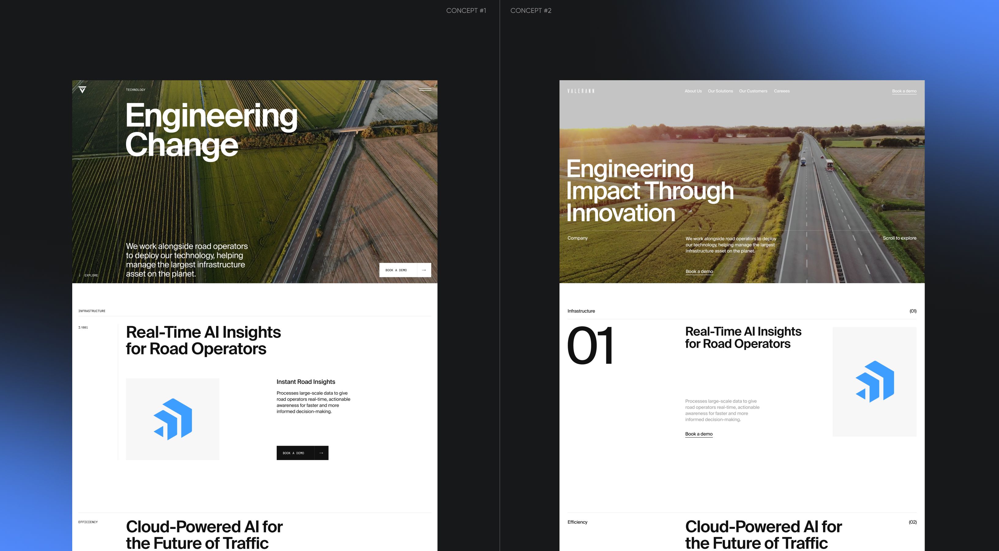
Two concept directions, but one clear vision
We came to the table with a defined design direction: Corporate Editorial. Built on typography as a structural system, strict grids, and disciplined hierarchy, it communicates precision before a single word is read.
Rather than presenting a single final layout, we showed two directions—same structure and typographic system, just different element arrangements. Both gave Valerann genuine creative input, not just a rubber-stamp moment.
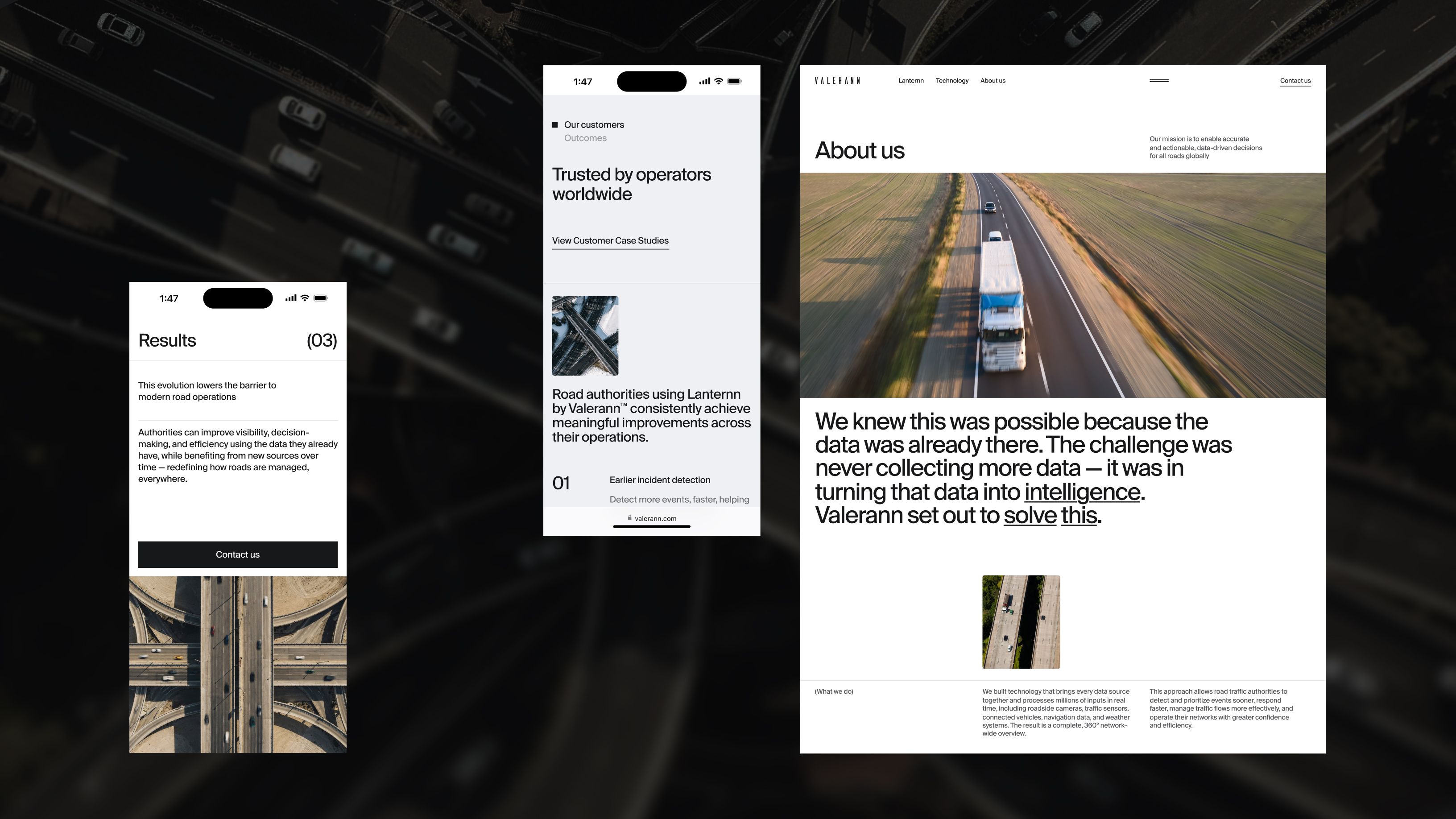
The product brings order to roads, so do we
Valerann’s platform helps manage real roads, so we designed with roads in mind. Clean lines, uncluttered surfaces, and a layout that mirrors the clarity their product delivers to operators. Everything breathes thanks to white space—nothing fights for attention.
And since their client base is basically government, we leaned hard into whitespace as metaphor—a nod to the white-collar world they operate in.
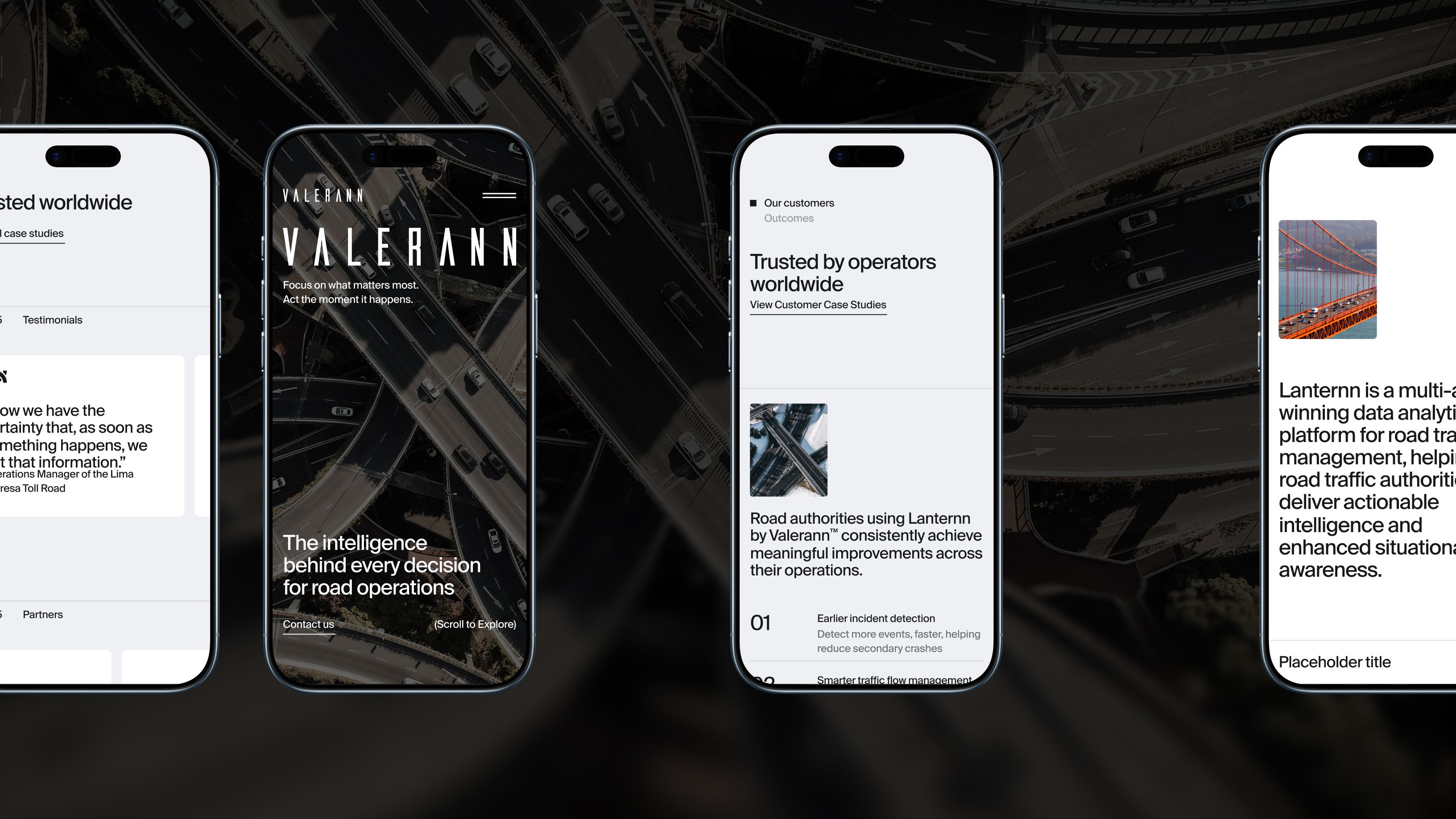
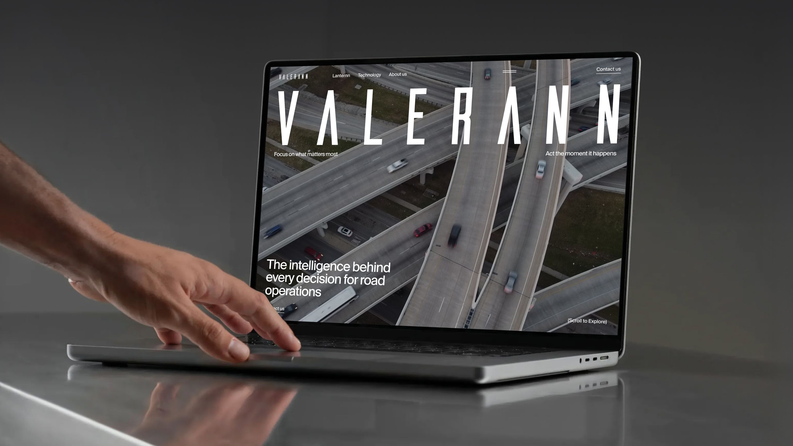
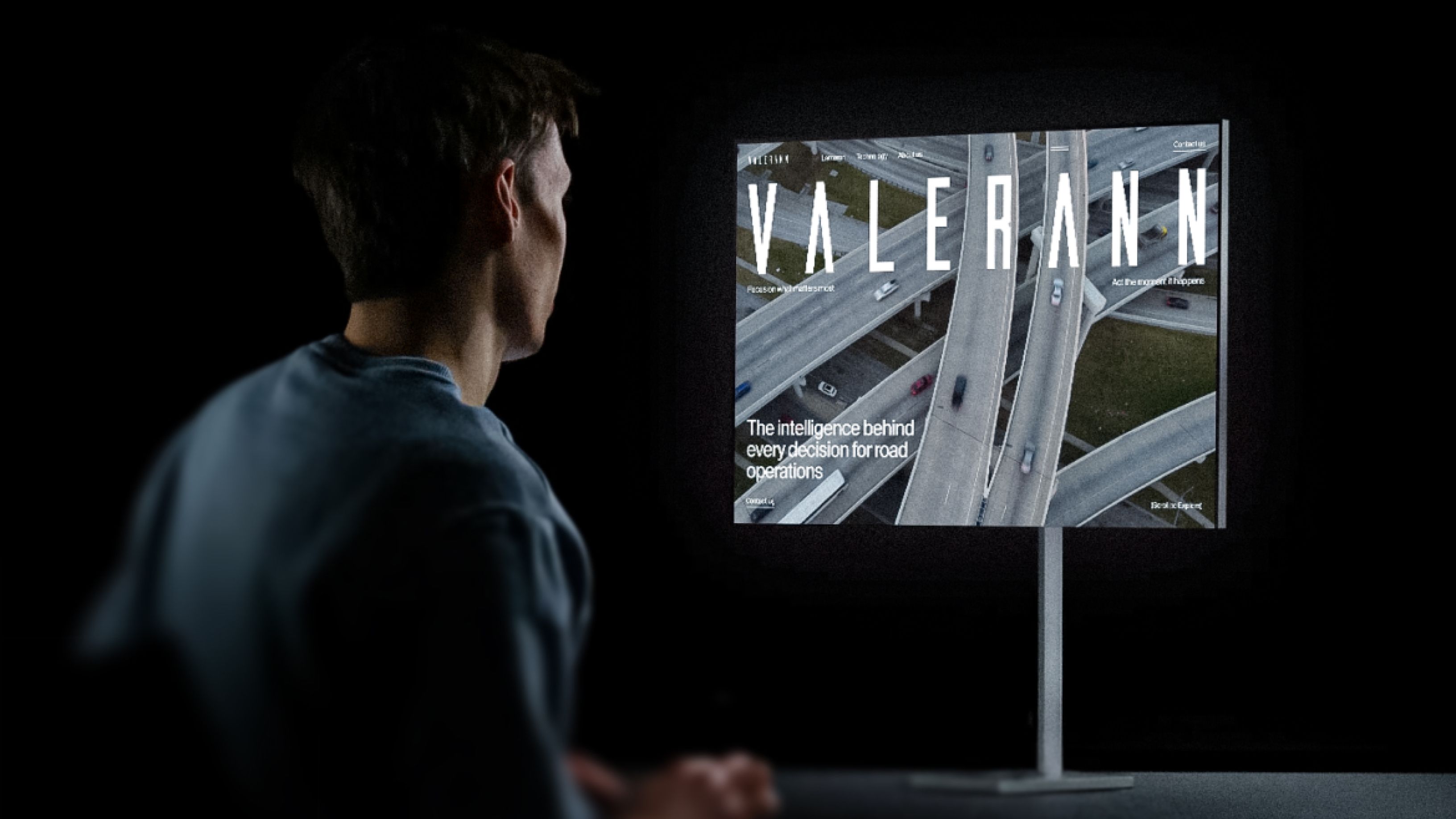
Making the right first impression
The hero section breaks convention: the Valerann logo runs full-width across the screen. Bold enough that you’d rarely see it on a B2B site.
Throughout the site, we added subtle video content that’s aesthetically connected to Valerann’s world of roads, replacing static animations with moving images that don’t feel distracting.
The product video that doesn’t beg for clicks
Nobody likes an explainer video that ambushes them. We designed the product video to appear on scroll—it reveals itself naturally as the user moves through the home page. No desperate calls to action, just a sophisticated piece of communication that earns its moment.
Production that supports scale
The project scope covered 9 pages—Home, About Us, Technology, Blog, and more—developed in Webflow in under a month. A tight team of UI/UX, motion, graphic designers, and a developer, all working in sync to hit a two-month finish line.
The site looks great—you drove us to change our look and feel by listening to what we wanted

Olga Gonzalez
VP of Marketing
Project in numbers
35K
Impressions on the website after relaunch
2
Months to cover UI/UX, motion, and dev
9
Website pages in the scope