TL;DR
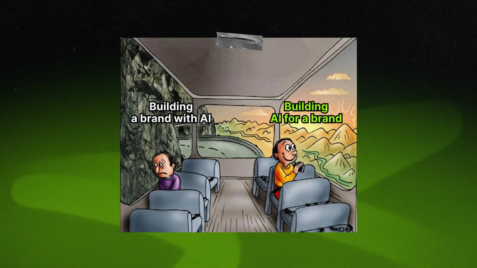
The AI brand identity examples that stand out in 2026 are the ones built on a clear position. Most AI companies ended up with the same look: dark navy or soft beige, rounded sans-serif, and a soft gradient somewhere in the background. That sameness costs real money, because when every brand in a category looks interchangeable, buyers stop comparing and default to whichever name they already recognize, or whichever quote is cheapest. So the ten examples below didn’t ask what an AI brand should look like. Instead, they figured out what the company actually stands for first, and let the visuals follow from that.
The advice for AI brand identity is everywhere by now: avoid gradients, skip the sci-fi fonts, humanize your brand. It’s solid advice on its own, and it shows up in nearly every roundup of AI brand identity examples you’ll find. The tricky part is that a lot of AI brands followed it in good faith and still ended up looking remarkably close to each other anyway.
Brand identity—the visual and verbal system that tells people who a company is. It used to be one of the clearest ways an AI company could stand apart. Call it AI blindness: everything blurs together until the brain just tunes it out, the exact same way it learned to tune out banner ads.
Some brands still break through and they’re what this list is about.
Why most AI brands now look the same
It happened for a pretty simple reason, and it shows up in almost any batch of AI logo design examples from the last few years. Most AI startups launched under identical pressure: ship before the funding window closes, look “AI enough” to read as a category member, and skip the brand strategy nobody budgeted time for.
So teams reached for the same shortcuts, and each one made sense on its own. Dark mode reads as serious. A gradient reads as intelligent. Minimalism is cheap to execute and hard to get visibly wrong. But when a few hundred companies make the same reasonable choice at once, you get one cookie-cutter blur.
That blur has a real cost, and it’s one nobody puts in the budget. Call it the elephant in the room. Creative Bloq (2026) put it plainly: once a category looks identical, buyers default to familiarity and price, because sameness reads as replaceable, not safe. Swapping navy for beige was never going to change that. What actually helps is starting from a completely different question.
Handling AI startup branding that still blends in with everyone else? Let’s sort out the positioning.
10 AI brand identity examples that actually stand out
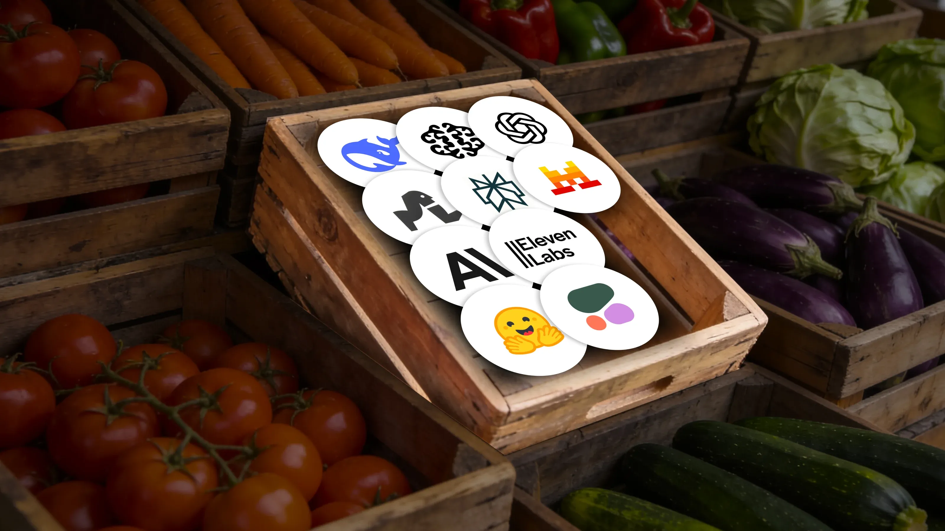
Some of the best AI brand identities on the market right now didn’t get there through a better logo. They got there by picking a fight with the category’s assumptions, and the ten examples below show exactly what that looked like in practice.
1. DeepSeek
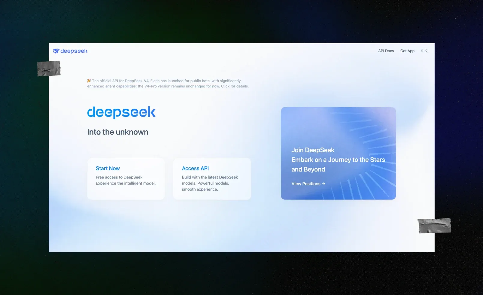
Circular abstractions are so standard in this category that any real departure from them stands out immediately, and DeepSeek went about as far from the norm as a company can go: a blue whale, paired with a rounded, slightly broken-up sans-serif wordmark that carries the same unpolished, friendly energy. In a sea of circles and gradients, a literal animal reads almost defiant, and even the color plays against type: instead of the flat, corporate navy the rest of the category defaults to, DeepSeek went with a warmer, brighter blue that reads more approachable than authoritative.
That choice lines up with the position DeepSeek has actually staked out in the market: a leaner, open-source challenger to the big incumbent labs, not another polished giant trying to look serious. A friendly whale does visually what the company’s pricing and openness already do strategically. It signals “we’re not trying to look like Silicon Valley’s next serious giant,” which is exactly the point.
2. Ideogram
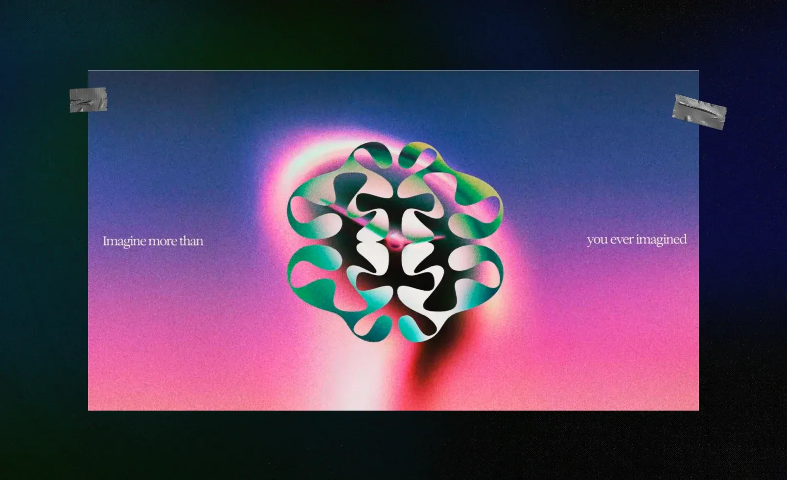
Ideogram’s logo is a brain shape built entirely from negative space, with the platform’s “I” cut right into the folds. It’s a departure from the usual AI logo playbook of circles and gradients, and it reads as a direct answer to the “AI replaces designers” story that most image tools lean into without thinking twice.
The choice to leave the brain’s detail to negative space, instead of drawing it out in full, reinforces that same message: judgment and taste are still a human job, and the tool is just faster hands.
3. Jupi
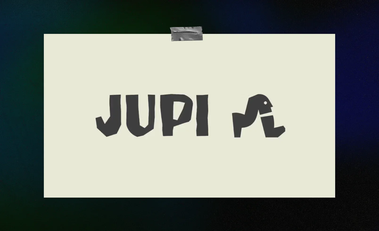
Jupi builds a “decision OS” for growing teams, and its brand looks nothing like the category norm. Instead of the polished, machine-smooth look most AI brands reach for, its visual world leans surreal, with bent proportions, soft color, and a figure that reads more like a gallery piece than a machine-learning conference badge.
Surrealism signals judgment and taste, which is the exact opposite of “generated,” and that fits a product whose whole pitch is better human decisions. Looking hand-made isn’t a stylistic flex here. It reinforces the same claim the product is making, just drawn instead of written.
4. Perplexity
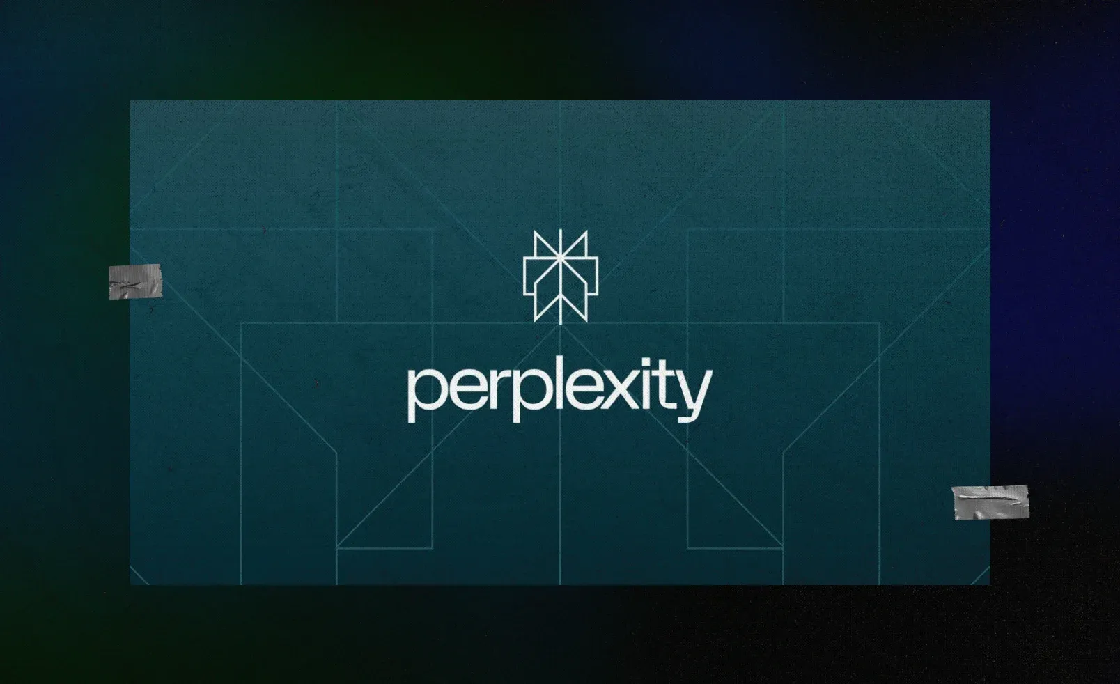
AI chatbots used to have the same credibility problem: a confident-sounding answer with no easy way to check if it’s actually true. Perplexity built its whole product around fixing that, showing a numbered source next to every claim instead of asserting things outright. Showing sources is basically the entire pitch to anyone who doesn’t want to trust an AI blindly, and the logo makes that pitch visible before anyone even opens the app: an asterisk, the same mark writers have used for centuries to point a reader toward a footnote.
That’s what makes this the cleanest example on this list of form following function instead of trend. The mark previews the one promise the whole product is built to keep.
5. ElevenLabs
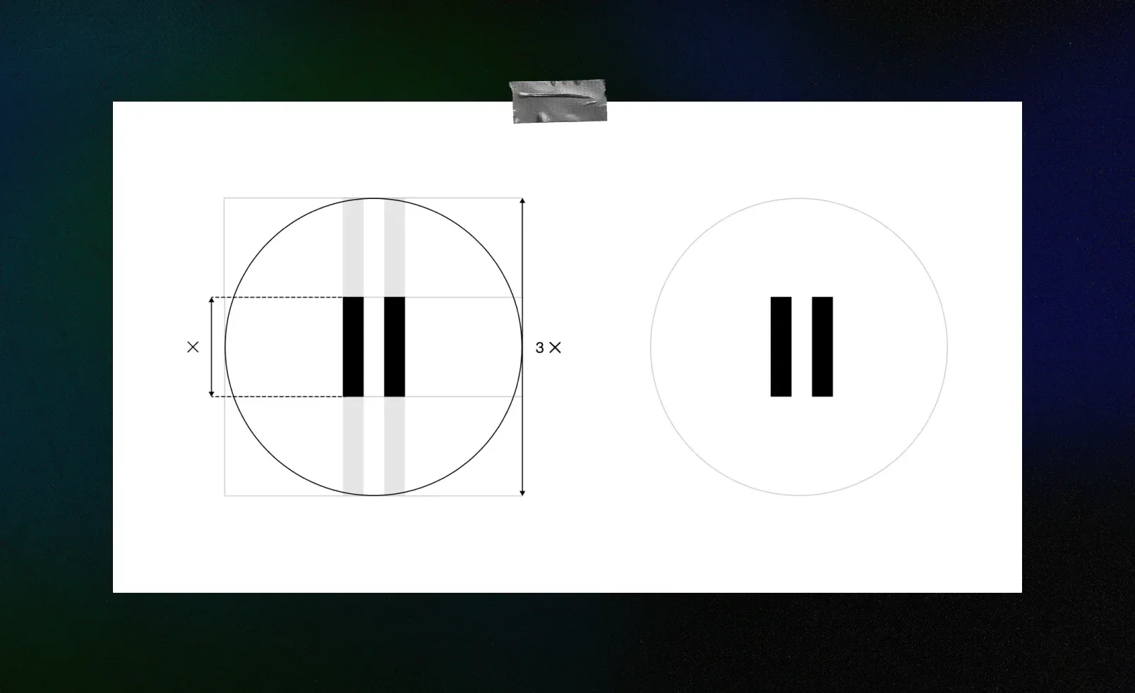
ElevenLabs’ brand doesn’t shout, and the logo is the clearest example of that. It’s just two vertical lines, minimal enough to sit quietly as a favicon, but look closer and they carry a double meaning: the number eleven from the company’s name, and the pause icon from every audio player you’ve ever used, a literal diagram of the product hiding inside a mark this simple.
The rest of the site backs up the same instinct: a whisper-thin display typeface and a warm, near-white canvas that reads more like a research paper than a typical tech homepage. A voice company that stays quiet visually is putting the emphasis where it belongs, on what the product actually sounds like. The logo’s restraint and the site’s restraint are the same decision, made twice.
Seeing your brand’s reflection in any of these five?
A lot of teams don’t need a new logo. They need someone to name what’s actually different about them first, then build the visuals around that.
6. Anthropic
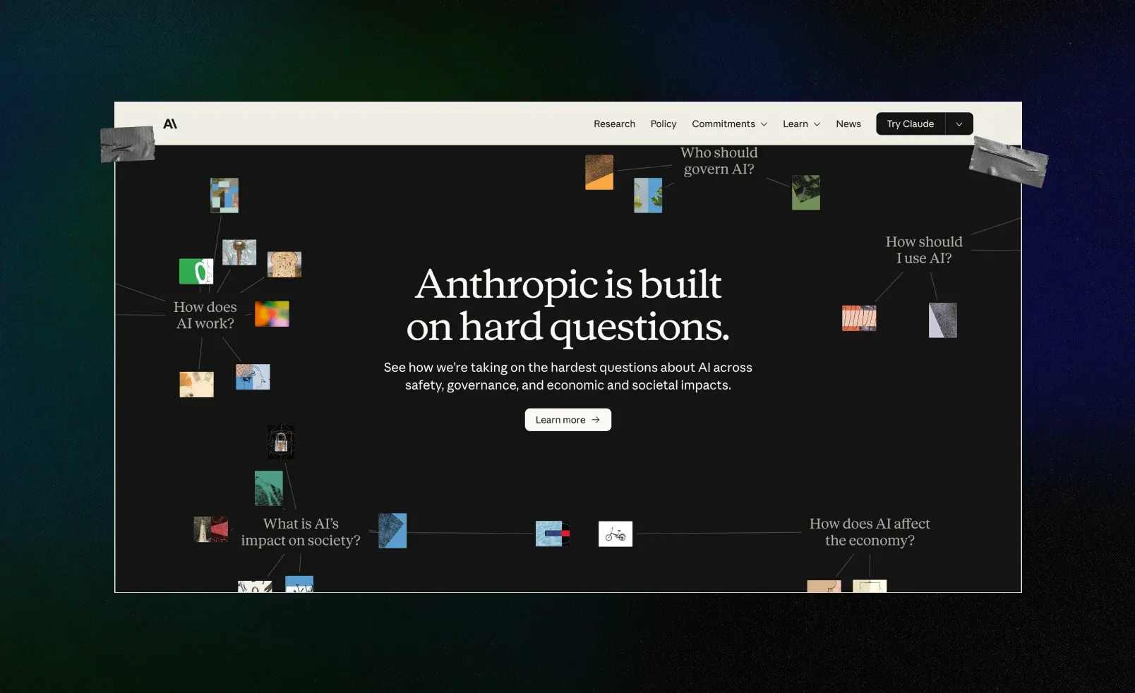
Anthropic’s brand runs on the same three words as its model behavior: helpful, harmless, and honest. Rather than leaning on sci-fi imagery or elaborate AI visuals, the site stays informative almost to a fault, dense with actual writing and explanation instead of anything decorative competing for attention. Internally, the goal was staying “unvarnished,” meaning no corporate gloss hiding what’s underneath.
Values usually live on an About page nobody reads past the first line. Anthropic built that same instinct into the whole site instead, choosing substance over spectacle everywhere you look.
7. Hugging Face
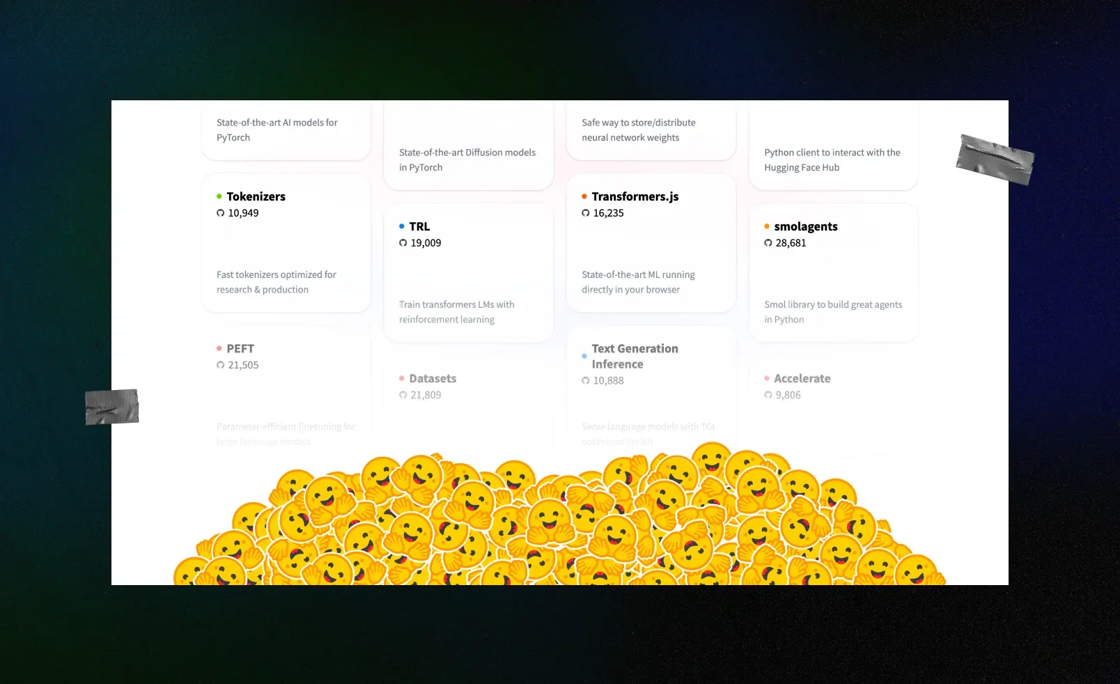
Hugging Face built its whole identity around an actual emoji: 🤗. In a field full of company names built from acronyms and lab jargon, choosing a literal hug as a brand is a deliberate signal, not an accident. The company describes itself as “the collaboration platform for the machine learning community,” built to help people “learn, collaborate and share their work to build an open and ethical AI future together.”
Machine learning research can be genuinely intimidating to newcomers, and a mascot this warm extends a different invitation than the cold, clinical seriousness most of the category defaults to. It’s less “come use our tools” and more “come learn with us,” which shows up in everything from the emoji itself to the community-first language on the site.
8. Cohere
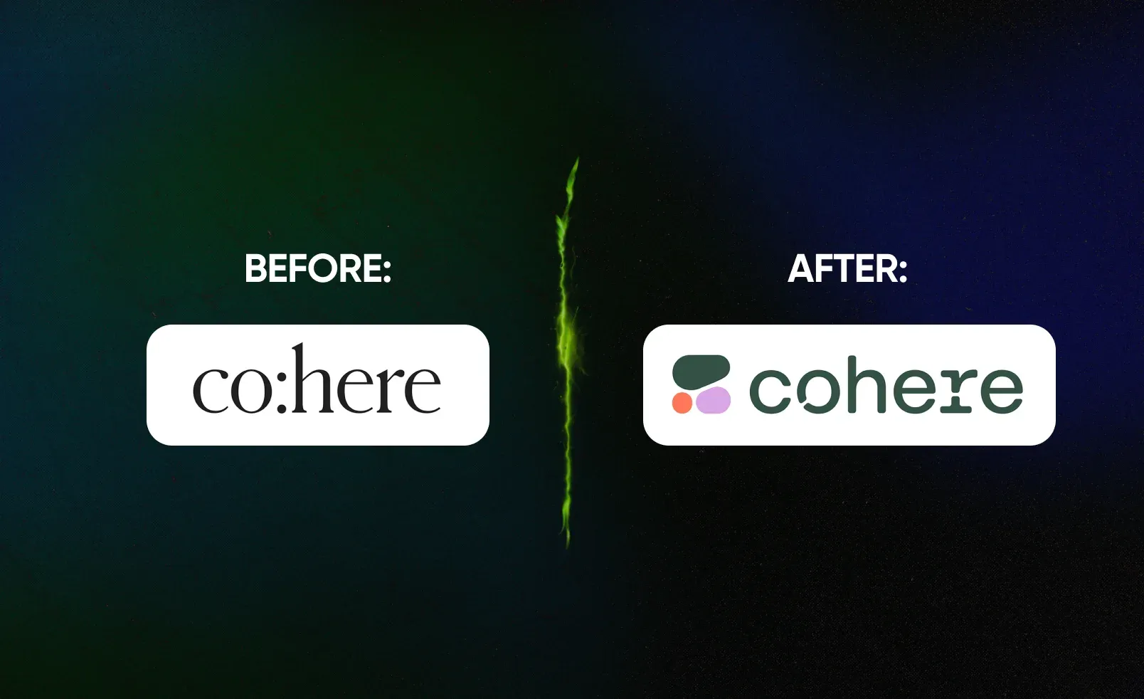
Cohere’s original 2019 logo was a plain text mark with a colon built into the name, co:here, a nod to its coding and language roots. The 2023 rebrand replaced it entirely with a cell-shaped symbol built from an irregular, honeycomb-like pattern, the same kind of shapes found in giraffe coats and dragonfly wings, paired with a new custom wordmark. The company describes the concept as “new nature,” meant to reflect “the ever-evolving nature of language” itself.
That’s a real repositioning, not just a fresher logo. Cohere sells enterprise NLP, and moving from a literal, coding-referenced wordmark to an organic, biological system signals a different pitch: language understanding as something alive and evolving, not just another piece of software.
9. OpenAI
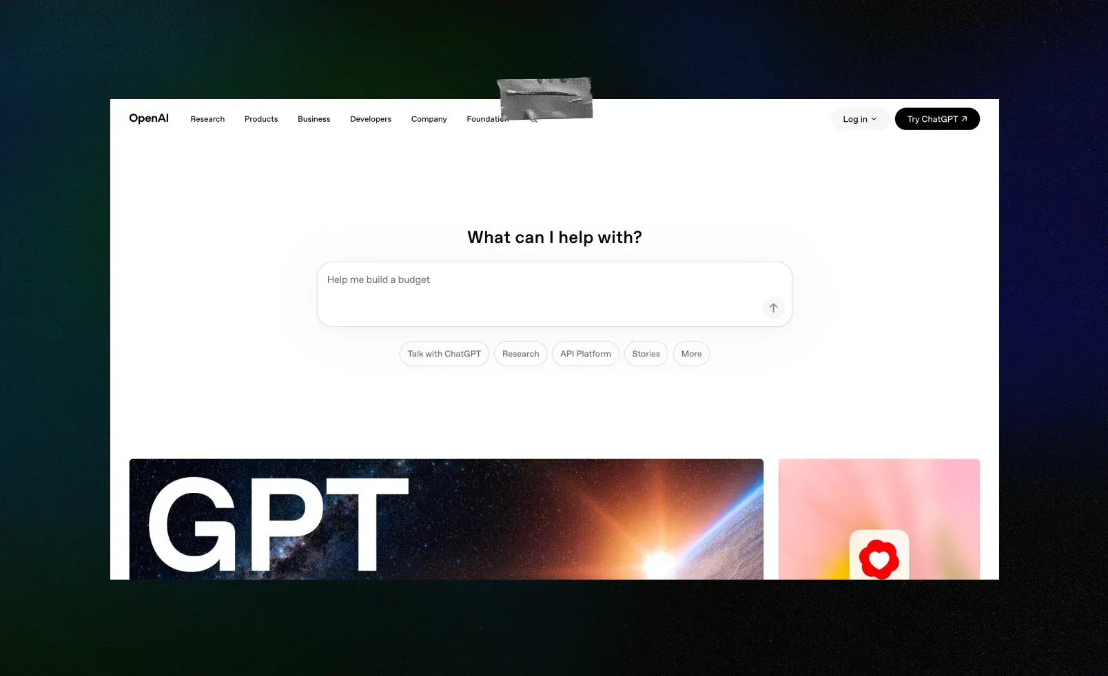
OpenAI’s 2025 rebrand centers on a small, pulsing dot the team calls “the point.” It appears at the exact moment a response begins, marking the instant the interface shifts from waiting to actually generate an answer. The homepage follows the same logic: the first screen doesn’t try to hold your attention with a pitch. It moves you straight toward asking a question, which is the whole point of being there.
This example works differently than the rest of the list. ChatGPT has more than 900 million weekly active users as of 2026, more than any other AI product by a wide margin, so OpenAI’s redesign didn’t need to announce a new position the way a challenger brand does. Instead, it focused on refining one specific moment of interaction, which is a legitimate choice for a brand that has already won the recognition fight. The job shifts from introducing who you are to polishing how the product actually feels to use.
10. Mistral
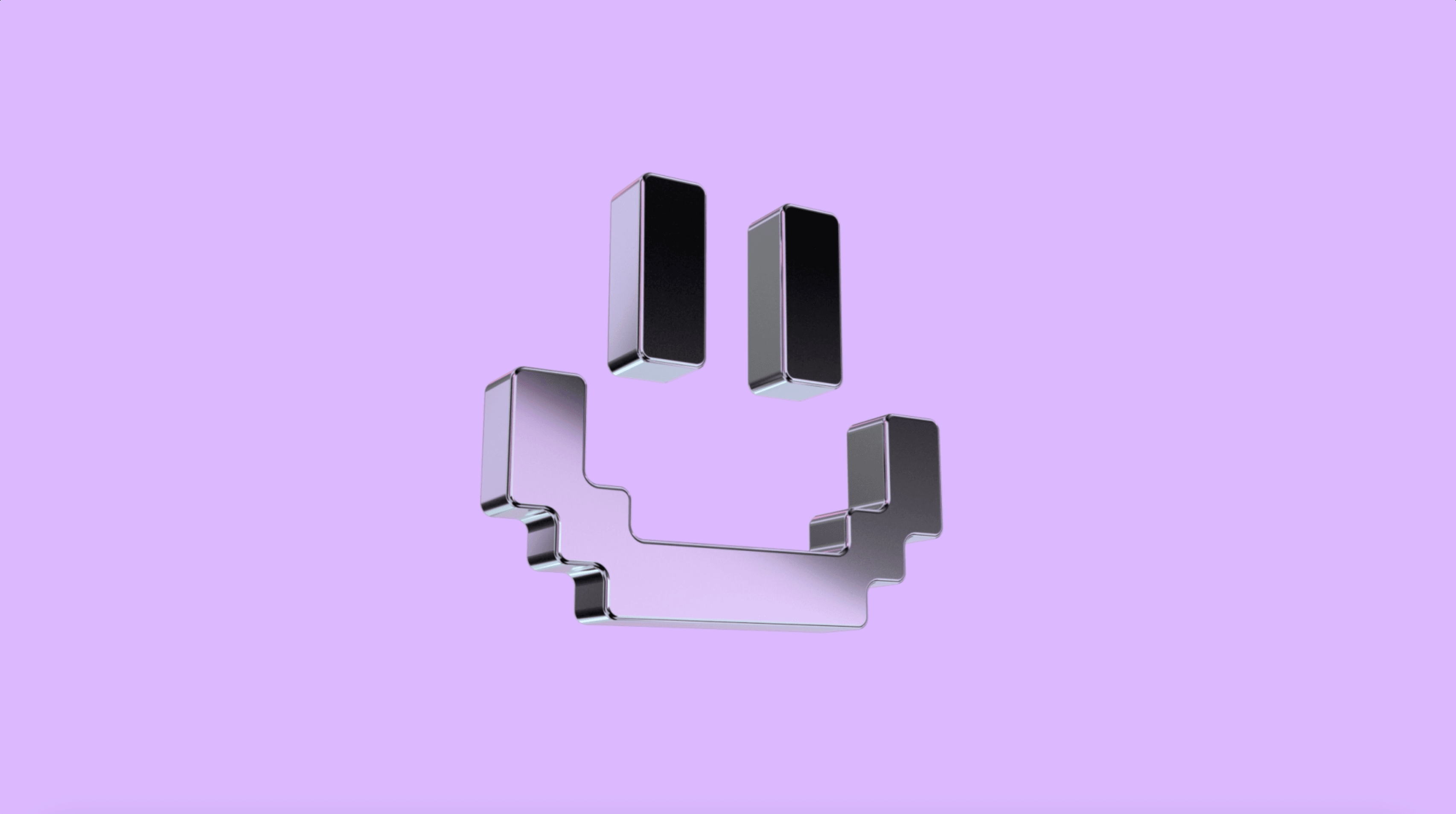
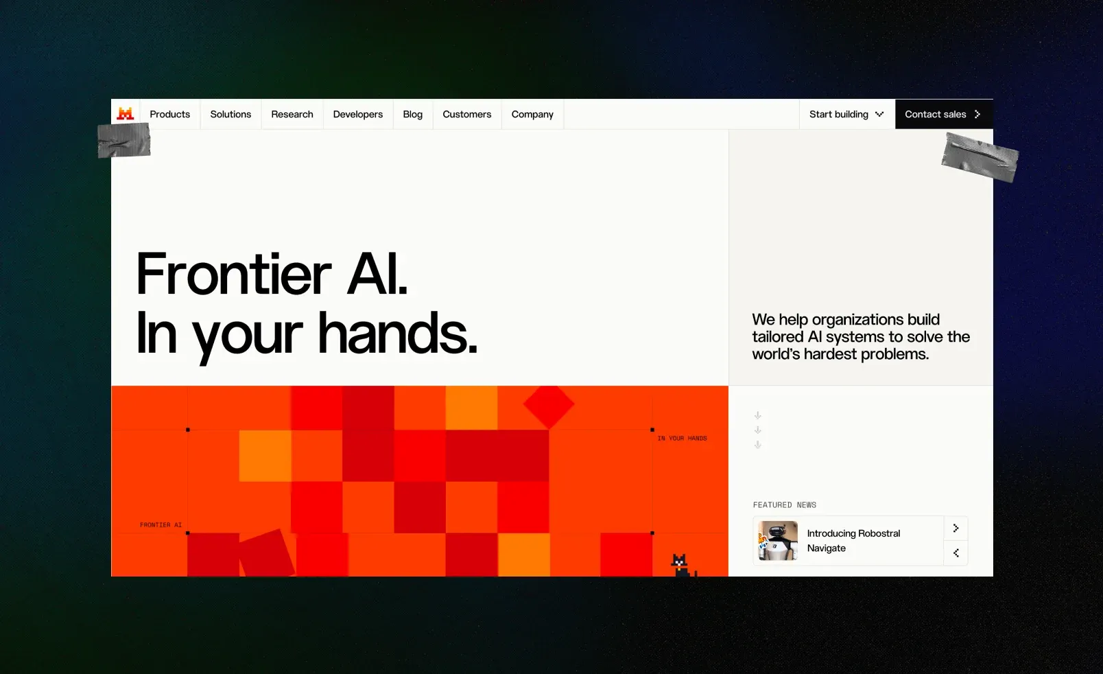
Mistral’s logo is a pixelated letter “M,” built from small modular blocks in warm orange, red, and yellow tones, with a cat’s face hidden in the negative space. The company describes the cat as a nod to its “unexpected but crucial role in the early development of machine learning.” The blocky, modular construction does real work of its own: it echoes Mistral’s actual product, an AI platform built around customizable, modular models rather than one fixed system.
It still earns its spot on this list with an asterisk. Mistral’s public explanation covers the cat, but not the broader positioning: it doesn’t say who the brand is for or what it stands against, the way the other nine examples do. A strong visual system and a stated position are two different things, and this is a case of having plenty of the first without fully building out the second.
The patterns worth taking with you
From branding AI and tech companies themselves, Qream's team keeps noticing the same four moves behind the identities that actually hold up. Steal the thinking, not the visuals.
Turn the function itself into the form.ElevenLabs proves this well: instead of inventing a metaphor, it turned a literal product fact, the pause icon, straight into the mark itself.
Let your values shape the approach before the category does.Anthropic did this by asking what helpful, harmless, and honest actually look like, not what the category usually looks like, and building the whole site around that answer.
Calibrated distinctiveness works. Random weirdness doesn't.Weird for weird’s sake reads as unfinished, plain and simple. Every brand on this list is unusual in a way that traces straight back to one sentence of strategy, not a personality quirk bolted on afterward.
Restraint is a position too.Not every AI brand needs more character to stand out. Sometimes the smartest move is to read the room and dial it back instead. We’ve seen this firsthand with Valerann, a traffic-intelligence platform that works with government clients. Their brief was direct: no tech-bro energy, nothing that looked like a typical flashy startup. So we went the other way, with a strict editorial layout, disciplined grids, generous white space, and zero decorative accents. For an audience that has to trust you with public infrastructure, restraint sells harder than hype.
A logo is not a strategy.Mistral is proof that a strong, well-made visual system can exist without a stated position behind it. Build both on purpose. Don’t assume one gets you the other.
Quick recap: what each brand got right
Save these AI branding examples for the next time someone on your team asks for “something like OpenAI, but ours.”
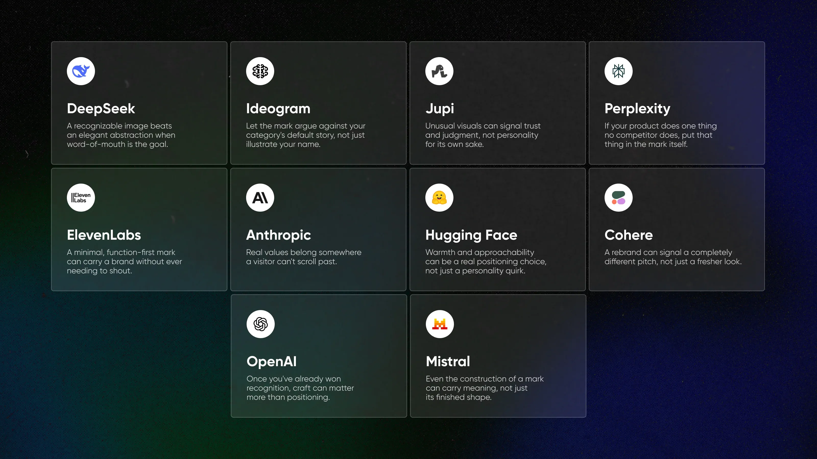
DeepSeek
Approach: turned the safest possible category into the most literal possible mark, a blue whale.
Steal this: a recognizable image beats an elegant abstraction when word-of-mouth is the goal.
Ideogram
Approach: built its logo around one simple instruction: don’t look like everyone else.
Steal this: let the mark argue against your category’s default story, not just illustrate your name.
Jupi
Approach: replaced the usual gradient-and-orb look with surrealism, on purpose.
Steal this: unusual visuals can signal trust and judgment, not personality for its own sake.
Perplexity
Approach: turned its one real differentiator, citing sources, into an asterisk.
Steal this: if your product does one thing no competitor does, put that thing in the mark itself.
ElevenLabs
Approach: built a logo that doubles as a UI element, the pause icon, and let the rest of the site stay just as quiet.
Steal this: a minimal, function-first mark can carry a brand without ever needing to shout.
Anthropic
Approach: let its stated values, not category convention, shape the whole site.
Steal this: real values belong somewhere a visitor can’t scroll past.
Hugging Face
Approach: turned an actual emoji into its entire brand identity.
Steal this: warmth and approachability can be a real positioning choice in an intimidating category, not just a personality quirk.
Cohere
Approach: replaced a literal, coding-referenced logo with an organic, biological system.
Steal this: a rebrand can signal a completely different pitch, not just a fresher look.
OpenAI
Approach: refined a single UX moment instead of announcing a new position.
Steal this: once you’ve already won recognition, craft can matter more than positioning.
Mistral
Approach: built a modular, pixel-block logo that visually echoes its own product, customizable AI built in pieces.
Steal this: even the construction of a mark can carry meaning, not just its finished shape. Just make sure you also state the broader position, which Mistral hasn’t fully done yet.
How Qream approaches AI brand identity
Qream treats brand identity as a decision problem before it becomes a visual one. What does this company actually believe, who does it need to convince, and what should restraint or boldness say to that specific audience? Valerann’s editorial calm and Jupi’s surrealism both pass that test just fine. They simply answer to different rooms.
Building an AI brand that blends in?
That’s the lens we bring to branding for AI startups and established tech companies alike: full-cycle brand identity and web work, built around a position first and execution second.
A good AI brand identity communicates a clear position, meaning what the company believes and who it’s for, not just a visual style. The strongest AI company branding examples use color, shape, or interface choices that would fall apart if the underlying strategy weren’t there. The logo is simply a consequence of the position, not a substitute for it.
Start with the sentence you want a stranger to repeat back about your company, before you even open a moodboard. Ideogram’s identity reads like it came from exactly one instruction: don’t look like every other AI company. Whatever the real brief was, that’s the sentence the result actually answers.
Repeated across hundreds of companies at once, the same reasonable shortcuts turned into a single blur instead of hundreds of distinct brands. Dark backgrounds, purple gradients, and soft sans-serif type were each a reasonable shortcut on their own. Most AI companies reached for them under identical pressure: ship fast, look “AI enough” to read as a category member, and skip the brand strategy nobody budgeted time for.
Yes, if the goal is to be chosen for a reason other than price. That reason doesn’t have to be a bold personality, though. Some, like Valerann, win by being the calm, disciplined option in a room full of hype instead. But every AI company still needs a reason a buyer can put into words, and that reason has to show up somewhere visual.
Written by

Qream co-founder | Design and product direction
Leads Qream's creative and product direction, connecting brand strategy, experience design, and business goals. Reviews content where design strategy, UX/UI, customer experience, and brand execution are central.