TL;DR
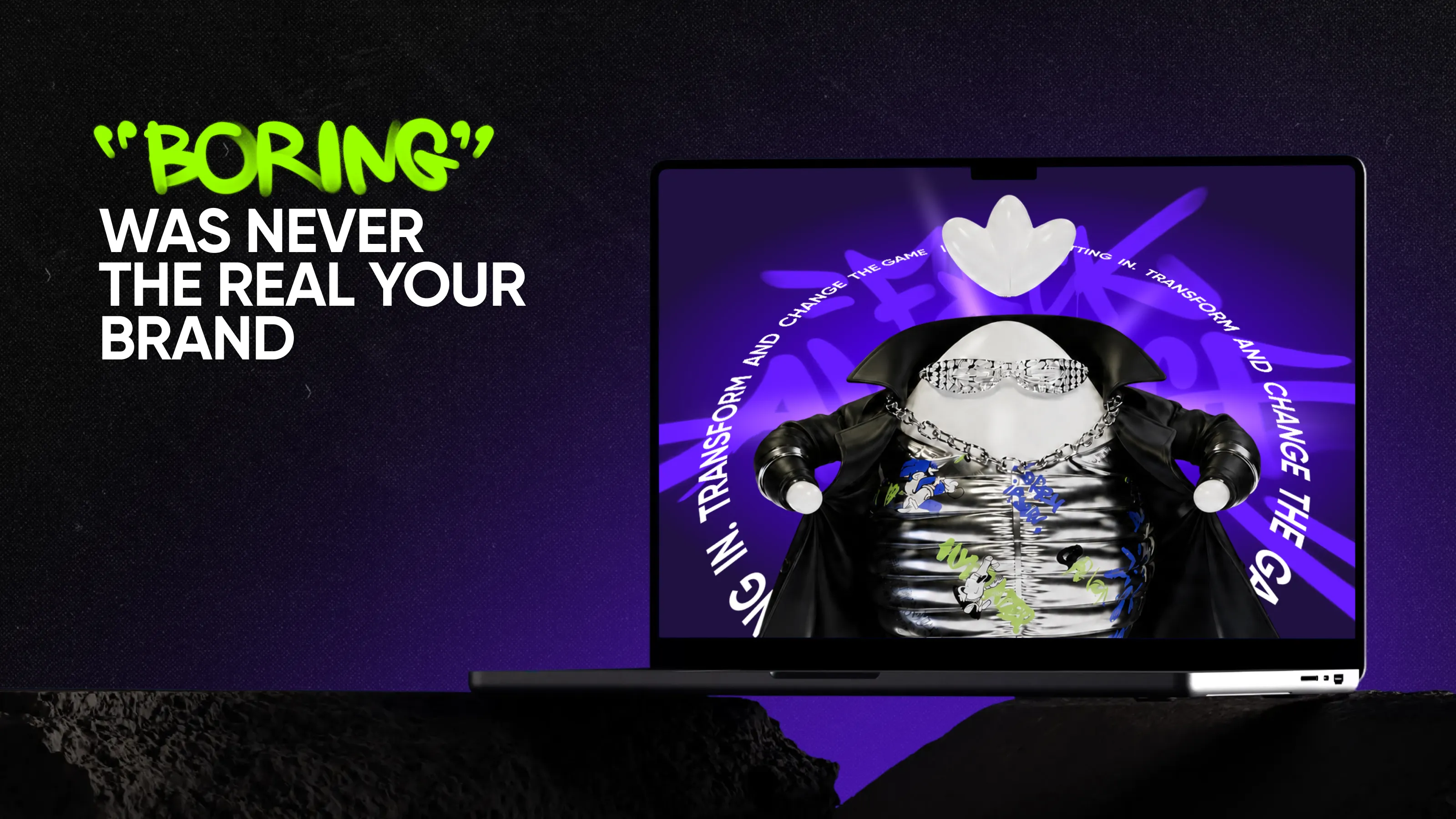
It’s no coincidence that SaaS brands can seem boring—some of them are boring because a “safe” approach seems reliable in an industry with established norms and styles. In reality, playing it too safe can be the riskiest move of all. A clearly defined target audience profile, content tailored specifically for them, an authentic communication style, and a unique selling point—these are what transform a forgettable product into a memorable brand.
A client once told me they wanted their SaaS brand to "stand out, but not too much." That's the whole industry's problem, in six words.
A lot of SaaS brands end up wearing the same outfit: a blue gradient, a friendly-but-forgettable tagline, a stock photo of someone high-fiving someone else in a glass office. None of it is wrong, exactly—it's just safe enough to disappear the second you close the tab.
Of course, everyone wants to have a high-quality brand, but they don’t always realize that, step by step, they’re straying from their unique path: a founder who tells the design team to make it look more like the safest, most recognizable name in the category, because that's what a board member suggested. A marketer who mutes the copy because a competitor's site looks “more enterprise.” A design review that trims anything with real personality down to “safe for procurement.” Each decision makes sense on its own. Stacked together, they build a brand that's technically correct and completely forgettable.
That's the part worth sitting with: the safe choice isn't actually the low-risk one. In a category this crowded, blending in is the only outcome you can't afford.
Branding SaaS and fintech companies at Qream, I keep seeing the same pattern: the brands that actually break through are the ones willing to commit to a personality, not just a positioning statement. Three deliberate moves make that happen:
- Give it a personality—a persona it consistently sounds like.
- Give it a tone of voice—rules for how it talks, especially when something goes wrong.
- Give it a mascot, if the story earns one—a visual shorthand for both of the above.
Give your brand a personality
Brand personification means the same character shows up whether you're writing the homepage, answering a support ticket, or telling a customer their plan just got more expensive. Strip the logos off your homepage and three competitors' homepages: could anyone actually tell which copy belongs to which company?
That question sounds simple, but the research isn't. A 2024 peer-reviewed study in Advances in Decision Sciences, surveying 568 consumers, found that personifying a brand measurably increases purchase intent—mainly by making people like the advertising itself first, which then earns the sale. The same thing happened with Creem, a fintech client I'll come back to shortly: the moment their brand read as an actual personality instead of a value prop, everything else got easier.
Find a tone of voice, on purpose
Tone of voice is the deliberate set of choices: warmth, directness, humor—that make a brand sound like itself in every channel, from the homepage to a support ticket. Here's the exercise I run with almost every new client: write the same bad-news message twice.
Every SaaS company eventually has to send a server-outage apology. Here's the same message, written two ways.
Safe: “We are currently experiencing a service disruption. Our engineering team is investigating the issue and will provide updates as they become available. We apologize for any inconvenience.”
With a voice: “We broke it, and that's on us. Here's what's happening right now and what we're doing about it. We'll keep you posted as we go.’”
Same information. Only one version sounds like a person wrote it and actually meant it. That distance—between “on brand” and “on autopilot”—is most of what I get paid to close.
Yes, a mascot can work in B2B
The usual objection: B2B buyers are supposedly all spreadsheets, no feelings. Gartner's 2024 research tells a different story: buyers move through a real emotional range during a purchase, from excitement to frustration, and the report's own conclusion is that this factors into the decision too—alongside price, features, and everything else on the scorecard.
That emotional room is exactly where a mascot can do real work, even though it's never the deciding factor on its own. And when a mascot idea actually holds up, it tends to come from one of two honest places.
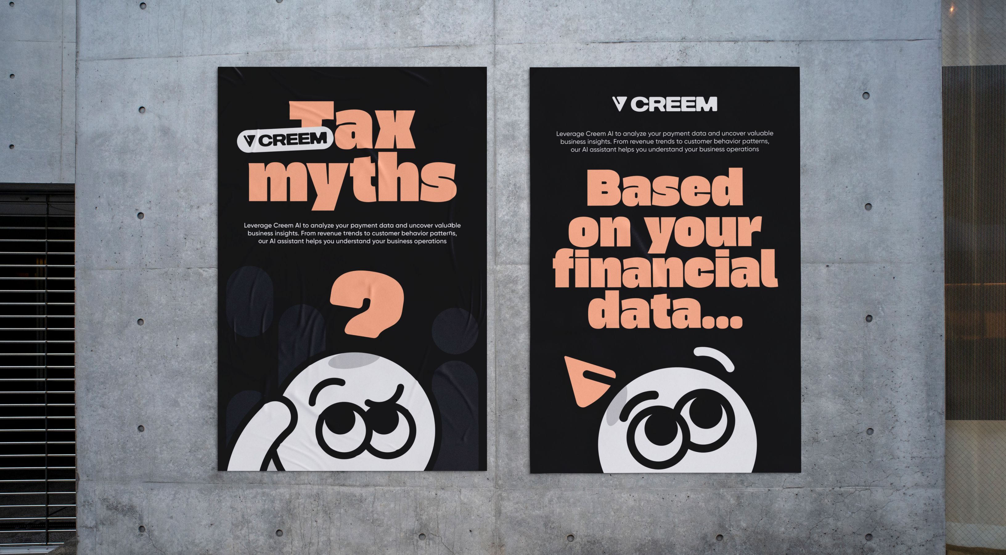
01. It echoes the name. The mascot just makes literal an association people already hear in the brand name. Take GEICO: the whole mascot came out of a joke people were already making, that “GEICO” sounds like “gecko.” We did something similar with Creem, a payments platform, on purpose—their name already sounded like “cream,” so we built a mascot that reads as pure ice cream at a glance, with a full emotional range, from delighted to visibly melting.
02. It has nothing to do with the name—and that's fine too. Our own mascot at Qream isn't a pun on our name either. Chubiq started as a sketch and stuck around because he already felt like us: self-described as equal parts chicken and egg, not remotely bothered by the contradiction. There's no wordplay connecting him to the name. He simply belongs.
Either path works, and neither has to happen at launch. What doesn't work is skipping the reason: a mascot slapped on as decoration, with no story behind it, looks exactly like decoration.
Does a mascot actually work for a serious B2B SaaS branding? Yes, if it's deliberate: a mascot builds recognition and warmth without costing credibility, which is why it shows up at companies from payments platforms to cybersecurity firms.
Independent research backs this up. When System1 Group tested every Super Bowl LIX ad in 2025, spots built around a brand character scored a 3.4-star rating for long-term effectiveness, versus 2.9 stars for celebrity-driven ads—and nearly a quarter of viewers in those celebrity spots couldn't even recall which brand was advertised.
When restraint is the right call
Not every category should sprint toward a cartoon. In trust-critical categories—security, fintech, healthcare compliance—going too loud too fast can undercut the seriousness buyers need to feel.
Fintech is exactly that kind of category, which is what makes Creem worth walking through: proof that even there, a mascot can be genuinely playful and still land, if the thinking behind it holds up.
Inside the rebrand that made it work
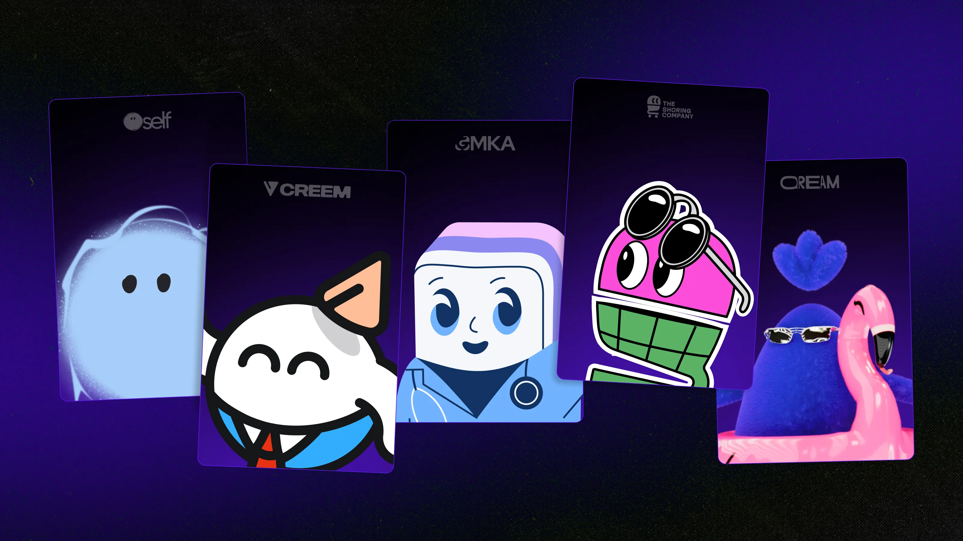
Creem is a Merchant of Record platform: infrastructure that lets other businesses accept payments globally without owning the tax and compliance headache themselves. Part of their audience is small and mid-sized, modern SaaS teams—companies that relate to this kind of voice more than a corporate one. So instead of defaulting to safe fintech blue, the goal was a brand people would describe as approachable, cool, and community-driven: finance that feels as smooth as ice cream.
Fintech brands tend to treat “trustworthy” and “fun” as opposites, when really you just need one idea strong enough to carry both—and for Creem's audience, approachable was the more trustworthy choice.
We built the mascot as a full character system, not a static logo. It smiles, panics, rolls its eyes, and melts on the 404 page, applied inside their own dashboard and product screens, not just their marketing.
The moment it went into the product instead of just the pitch deck, it stopped being decoration. That's the difference between a mascot and a logo with a personality problem.
The result: a fintech brand that still reads as trustworthy, but no longer disappears into the category.

Start with one honest move
You don't need a mascot to have a personality, and you definitely don't need a full rebrand to stop being boring. Persona and tone of voice do most of the actual work—a mascot is just the most visible version of that same decision, not a requirement.
The real shift isn't “professional” versus “fun”—plenty of serious categories genuinely need to stay buttoned-up, and that's fine. The real difference is deliberate versus accidental: whether someone actually decided what your brand sounds like, or left it to whoever wrote the last homepage update.
You might decide a mascot isn't right for your brand—plenty of good brands skip it. What you can't skip is deciding, on purpose, what your brand actually sounds and feels like.
Your SaaS brand doesn't have to sound like everyone else's
We help SaaS companies build a brand with an actual point of view—persona, tone of voice, and a mascot when the story earns one.
Written by

Qream co-founder | Design and product direction
Leads Qream's creative and product direction, connecting brand strategy, experience design, and business goals. Reviews content where design strategy, UX/UI, customer experience, and brand execution are central.