The core problem: who does the translation work?
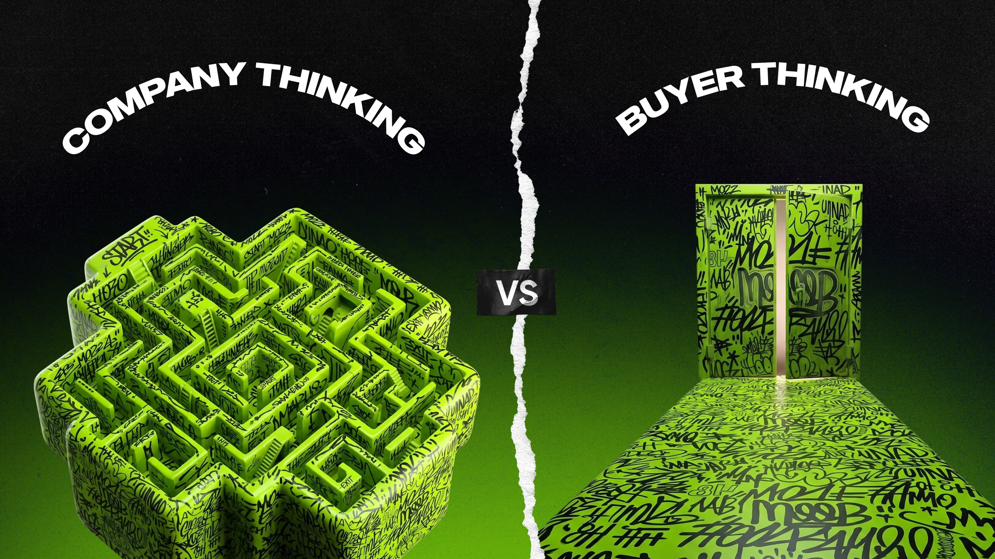
There are two ways to structure a website: based on how the company sees itself, or based on how the customer perceives their problem.
Most manufacturing companies’ websites default to the first approach. It’s simply easier that way. The navigation mirrors the organizational structure, the homepage starts with the company’s history, and product names follow the internal SKU logic. From the inside, this seems natural and intuitive, but that’s where the main mistake lies.
The customer doesn’t have that internal perspective. They don’t know which of your four divisions manufactures the component they need, or that “Series X” is your name for what they call a “variable-speed drive.” They come to you with a problem and expect a quick solution.
When your website is designed with you in mind, the customer is forced to do the “translation” themselves. They have to study your taxonomy before they can find an answer. Most won’t bother. They’ll leave and find a competitor whose website meets their needs.
The alternative: you take on this “translation” work yourself—organizing your website around the buyer’s journey, their language, and their decision-making process. There is no other alternative.
Five structural shifts: org-chart site—buyer site
Navigation: departments vs problems
Should a manufacturing website be organized by product division or by application?
Definitely by area of application, because buyers are primarily looking for solutions to their problems, not by your org chart.
A website structured according to the company’s internal organization—Products / Divisions / Heavy Industry / “Compact” Series / About Us / Our Companies—assumes that the customer already knows which division of your company manufactures what they need. But that’s not the case. An engineer looking for a component for a conveyor system doesn’t know whether the part they need belongs to your “Drive Solutions” division or the “Industrial Automation” business unit. This is your internal classification system, not their mental model.
The result: they click around, hit a dead end, and leave. Not because you don’t offer what they need, but because finding it required learning your company's anatomy first.
The buyer version flips the logic. Navigation is organized by application, industry, or use case, the way the buyer would describe their own problem. Not “Drive solutions division,” but “Conveyor & material handling.” Not “Compact series,” but “Motors under 50 rpm.”
The buyer searches by what they need to solve. Your site should speak that language at the front door. The internal product names and SKUs can live one layer deeper, once the buyer has already confirmed they're in the right place.
In practice, it looks like this:
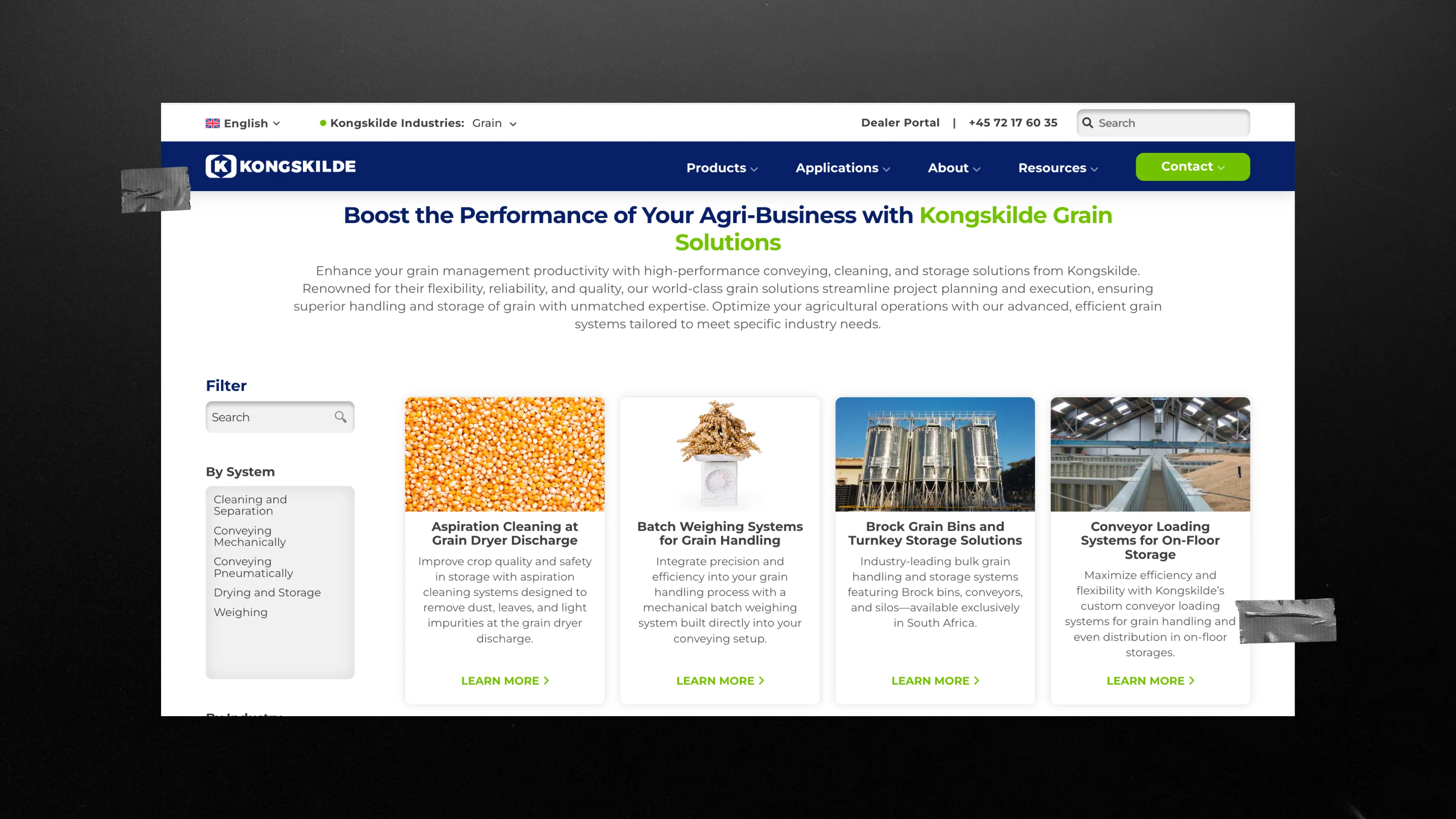
- Kongskilde renamed all “Solution Pages” to “Application Pages” and rewrote their content, using the customers’ language instead of the company’s internal product classification. This step significantly simplified navigation and search on the website.
First screen: "who we are" vs "what you can solve here"
What should be highlighted at the top of a manufacturing company’s website?
The problems you solve.
A homepage that starts with the company name, year of founding, number of employees, or mission statement doesn’t fulfill its main mission. What is that mission? The fact is that within the first five seconds of visiting your page, a customer asks only one question: Am I in the right place to solve my problem? The main section must answer exactly that question.
This is an argument in favor of decision-making architecture. When a buyer can’t immediately see the relevance, they don’t scroll down to find out—they simply leave. The “Back” button is just one simple click. It’s just as easy to close the tab and open another, more relevant one, rather than trying to figure out puzzles and searching for answers to your questions for hours.
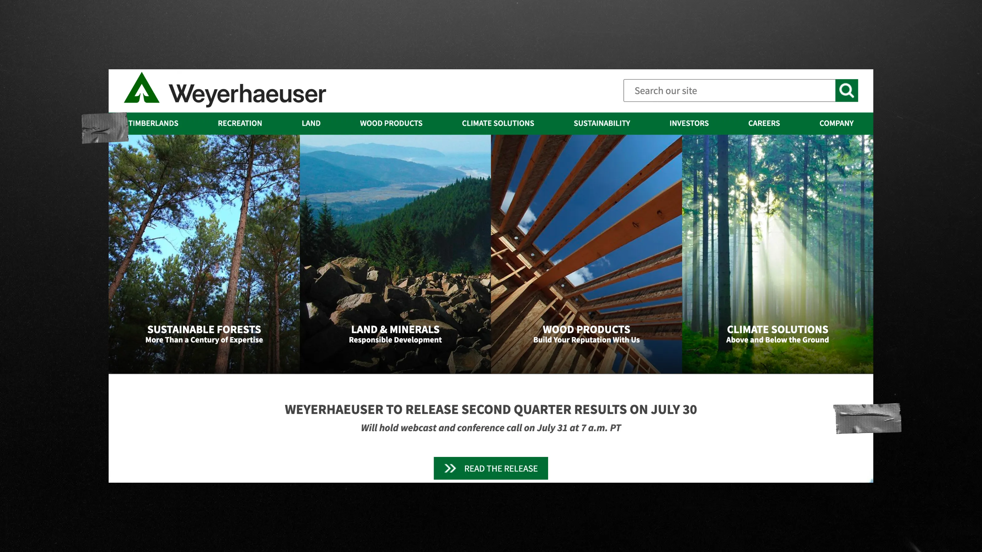
Mighty Citizen, a UX audit agency, analyzed a similar case in its well-known article “We Got It Wrong: How to Write Better Hero Text.” Weyerhaeuser, a Fortune 500 company, had a homepage with no explanation of what they do. When the authors asked readers “Guess what they produce?”, most of the audience didn’t answer. It turned out that Weyerhaeuser is formally registered as a “real estate investment trust” rather than a forestry or wood products company, even though that is exactly what they do.
What might a version for the buyer look like?
“Weyerhaeuser manages the most sustainable, versatile resource on earth: forests. We're experts at using trees to make products people need”—this would help answer questions that are significantly more important to the buyer.
Your homepage says much more about you than you might imagine. The question is whether what it says matches what your buyer needed to hear.
Language: your terminology vs their search terms
Should a manufacturing website use internal product names or buyer search language?
Search terms used by customers should always come first, with internal terminology as the second priority.
The names of your product lines, the terminology used by your engineering team, and the SKU naming conventions that make sense only within your company remain invisible to the buyer, who searches using their own words.
And that’s a huge structural mistake. Shift ONE Digital, a B2B marketing company that works with industrial enterprises, puts it plainly: when navigation uses internal terminology without a clear connection to what buyers actually need, engineers waste time clicking around the site, trying to figure out if you offer a solution for their specific application. They leave, just leave, without even realizing that you had the product they needed.
Here is a real-life example:
- In the Wild Creek Web Studio case study for a B2B manufacturer in the industrial sector, the agency explicitly identified striking a balance between technical jargon and user-friendly content as one of the main challenges, since the specific nature of the products required simultaneously satisfying experts while remaining accessible to beginners. Content optimization (along with other SEO measures) helped the client significantly increase organic traffic over the course of a year.
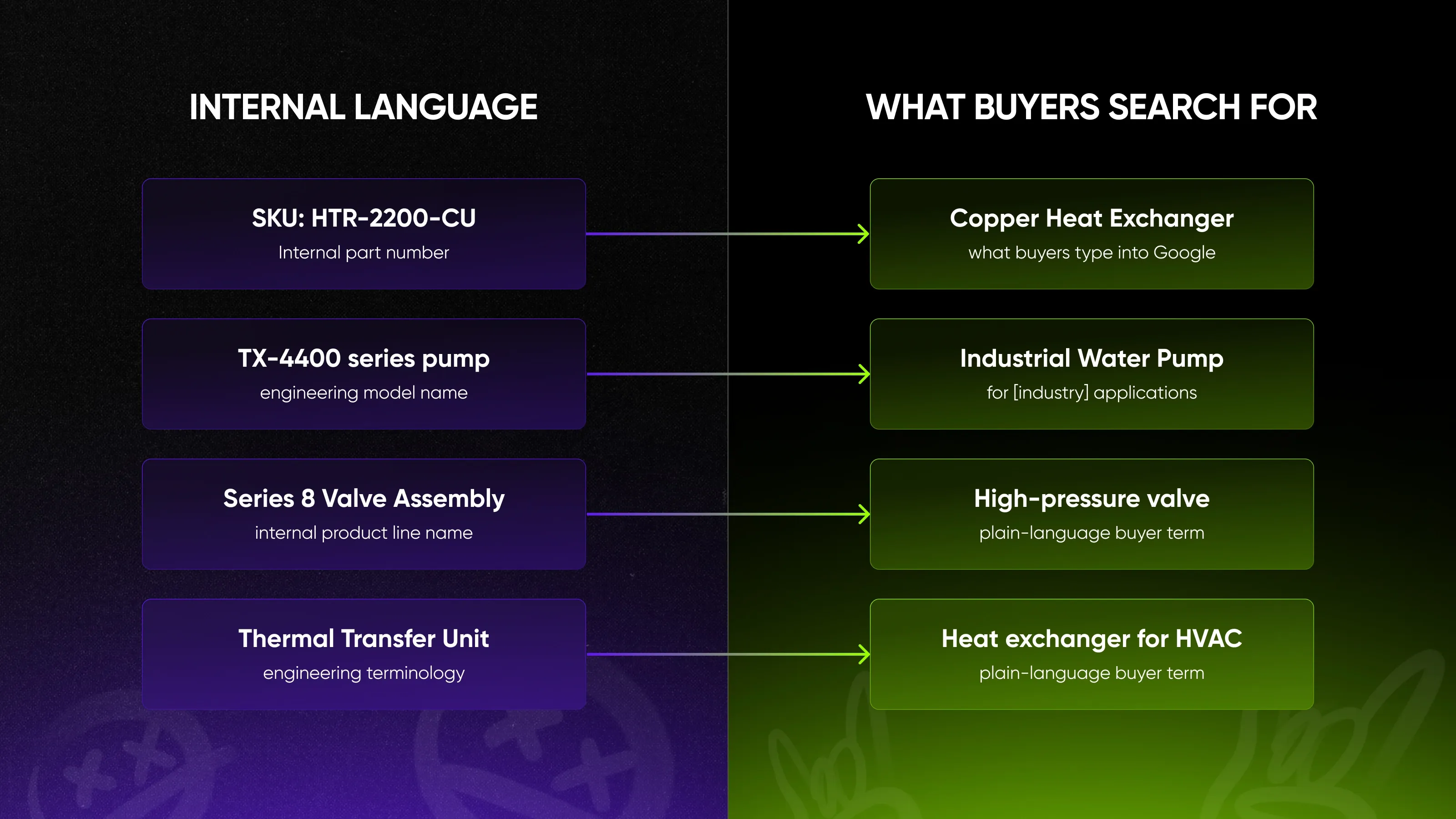
So, speaking the buyer’s language opens doors for you that remain closed to those who still use confusing jargon and ignore their audience’s needs and problems.
Path to Information: gated vs self-serve
Should technical specifications be gated behind a contact form on a manufacturing website?
Nope. Gating specs removes you from the shortlist before the conversation starts.
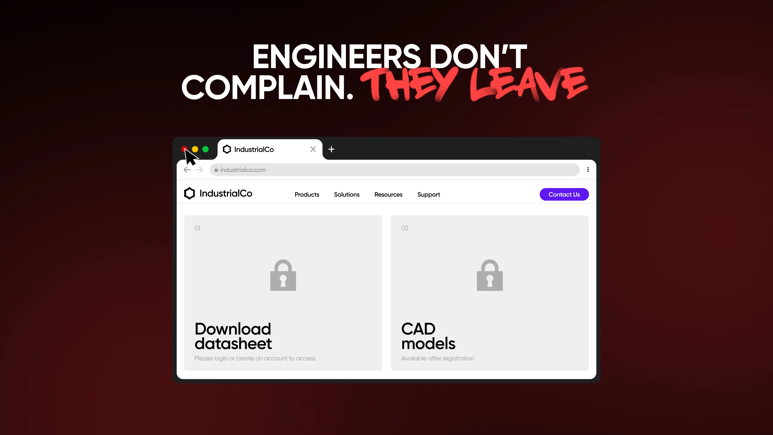
The phrase “Contact us for specifications”, as the only way to access technical documentation, implies that the buyer wants to speak with the sales department even before deciding whether you are a suitable candidate. But an engineer who is evaluating five suppliers simultaneously needs technical data sheets, certifications, CAD files, and dimensional drawings, and these must be available immediately, on a self-service basis, without any obligation to engage in a conversation with the sales department, for which he is not yet ready.
Limiting access to this information doesn’t protect your sales process—it simply stops it. The buyer creates a shortlist based on technical specifications, and if your specifications aren’t available, you won’t make the list. The conversation you’re trying to protect doesn’t happen until after the shortlist has been created, so you simply never get to that point.
And these aren't just hypothetical assumptions. Here's how engineers describe their experiences on forums:
“Why do Manufacturers websites all suck? I have been trying to find the specs for a SCADAPack 32 on Schnider Electrics website just to find panel mounting information and how the IO cards actually connect to the processor.” — r/AskEngineers, (2024)
Or:
“As someone who builds prototypes with many parts from online retailers, sometimes I need to do the unfathomable and stray from McMaster to find what I need. But I often find myself just blindly visiting various websites and scrolling down to the datasheets of countless products before I find what I'm looking for.” — r/AskEngineers (January 2024)
These discussion threads contain hundreds of comments from experts describing exactly this kind of experience working with industrial suppliers' websites. The path to information is very rocky.
The buyer's version works the other way around: technical data, specifications, and CAD files are openly available, organized by product, and filterable by parameters. The buyer independently assesses suitability and determines whether your product meets their needs, without involving your sales team. Then they contact you, and only to move forward, because they’ve already decided that you’re a good fit.
The conclusion is simple. An engineer who can’t find the technical specifications won’t call to ask for them—he’ll simply close the tab. Hiding documentation behind a contact form doesn’t create a sales conversation; rather, it provides an excuse to leave. The solution is to remove the form as a standard barrier between the buyer and the information needed to make a decision.
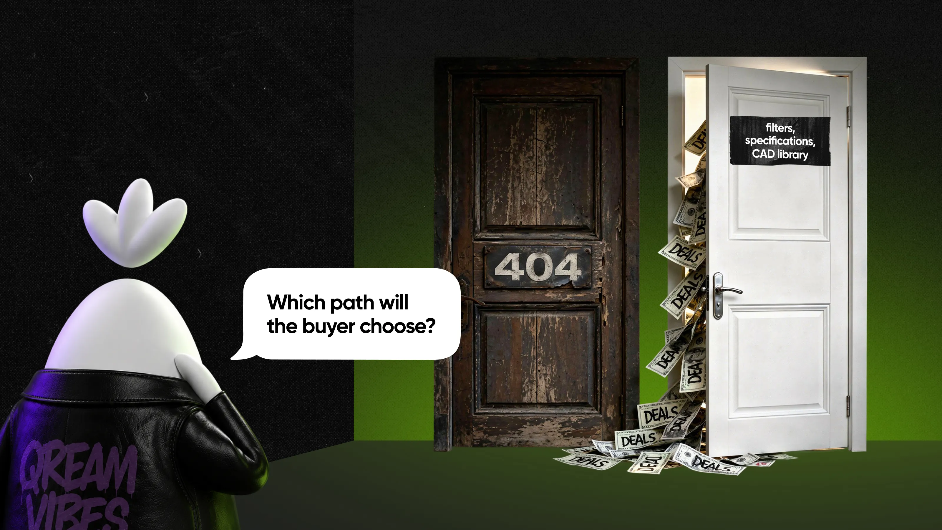
Find out more about why your CAD library is a better sales rep than your contact form
Segmentation: one entry point vs role-based paths
Should a manufacturing website have one homepage for all visitors?
Nope. A single, one-size-fits-all entry point forces different audiences to go out of their way to find the information that's relevant to them.
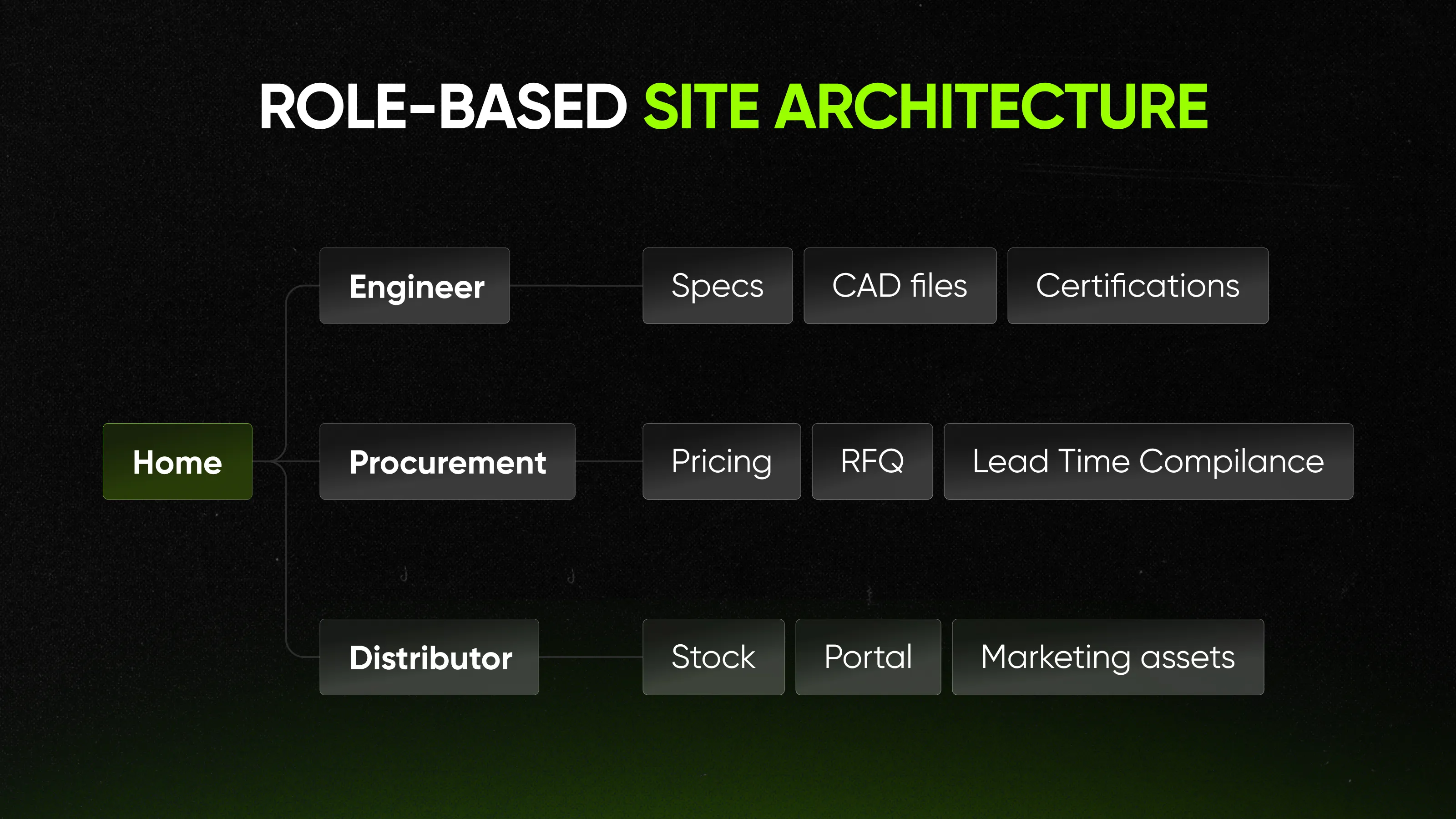
An engineer evaluating a drive unit has different questions than a procurement manager comparing suppliers, and both have different priorities than a distributor looking for information on prices and product availability. A single homepage that tries to appeal to all three at once clearly fails to meet the needs of any of them. It’s not that the content is wrong, it’s that the order in which the information is presented doesn’t meet the needs of each audience.
When all three end up at the same general entry point, each of them has to filter the information on their own to find what’s relevant to them. Most won’t bother doing this. They’ll find a provider who’s already done the work for them.
Kongskilde Industries solved this through site architecture. From the homepage, they immediately offer two separate entry points: industrial and grain—each with its own navigation, its own case studies, and its own content. For more details on how this works at the website architecture level, see the guide to designing industrial B2B websites.
The principle
Your organizational chart makes sense only to you. It was created by people who already know the answers.
But the buyer doesn’t have that internal perspective; they don’t know your divisions. They’ve never heard the names of your product lines and don’t know which division manufactures the components they need. They come to you with one thing: their problem. The website’s job is to meet them right where that problem lies and guide them to a solution—not to force them to first learn about your company’s structure.The five factors listed above serve as a diagnostic tool. Analyze your website using them and ask yourself honestly: Whose logic does the website follow, yours or the customer’s? The answers will clearly show who bears the burden of interpretation and who carries it.
To gain a broader understanding of how industrial brands fail and succeed, start with our industry overview

Written by

Qream co-founder | Design and product direction
Leads Qream's creative and product direction, connecting brand strategy, experience design, and business goals. Reviews content where design strategy, UX/UI, customer experience, and brand execution are central.