TL;DR
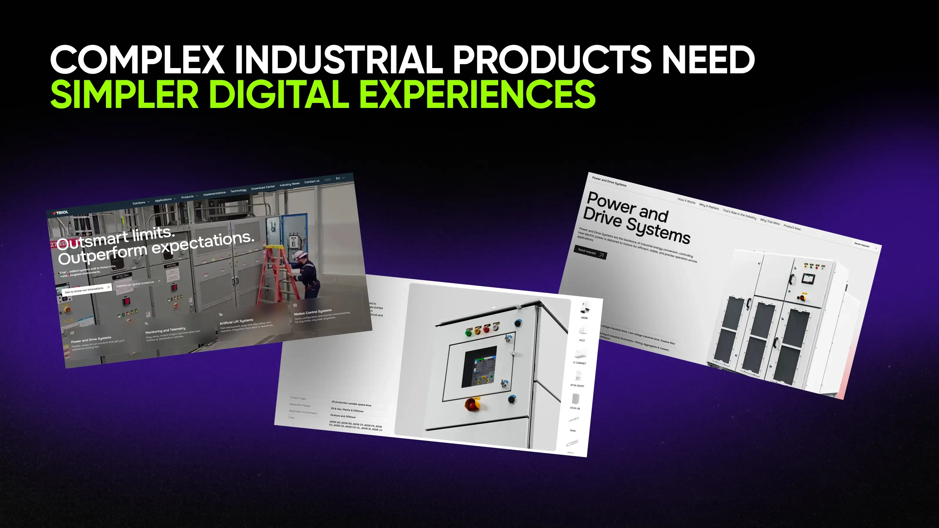
Triol manufactures specialized equipment across multiple industries, product families, and technical applications. Their website didn’t lack information, but it was too difficult for users to find what they needed without getting lost.
Instead of reorganizing content around internal product logic, Qream rebuilt the experience around customer decision-making. With simplified navigation, improved filtering, and edited product visualization, the new design system made Triol look like the market leader.
Most manufacturing companies have a perception problem, and we’re ready for that talk.
Even with technically sophisticated products and impressive engineering, the whole thing breaks when you visit the website. You get endless dropdowns, technical diagrams assembled from PowerPoint-era graphics, generic product renders, and navigation that looks suspiciously similar to every competitor’s.
After a while, even genuinely innovative companies start blending together. That’s the situation Triol didn’t want to face.
Turning machine complexity into UX clarity
When it was time to revamp the website, Triol didn’t lack structure. In fact, as a manufacturer of equipment, they already had a clear understanding of the product ecosystem, categories, and content architecture. But the whole experience still felt like a traditional manufacturing website—functional but not memorable.
Following a standard route is becoming a bigger problem across the industry. Today’s buyers compare vendors long before they talk to sales. They evaluate expertise, innovation, and credibility through digital experiences. When every company presents itself the same way, it becomes harder to communicate what makes the business different.
So the goal of the Triol website project wasn’t to simplify the technology. It should be complex, duh. But we had to make that complexity easier to navigate, understand, and far more compelling to explore.
Qream approached the Triol website’s challenge from two directions:
- First, we redesigned the UX structure so that users could navigate a large ecosystem of products, solutions, and technical content without feeling lost.
- Second, we rebuilt the visual language around custom illustrations, improved 3D assets, and created a more distinctive presentation system that made the products feel as advanced as the engineering behind them.
How we simplified the UX so users stopped searching and started finding
Triol’s ecosystem contains multiple product families, industry applications, technical documents, and solution types. The problem was how users had to navigate through it.
Finding the right machine may require opening the menu, navigating to products, selecting a machine category, entering that category, and then locating the specific model for a particular application. Every step made sense internally—for users, it created friction.
That’s why we repacked everything by a new UX principle: give users the context they need when they need it.
Many industrial websites attempt to demonstrate expertise by immediately exposing every detail. Instead, we focused on revealing information progressively. Each step in the experience answers a specific question before introducing the next layer of complexity—this helps organize information around decision-making.
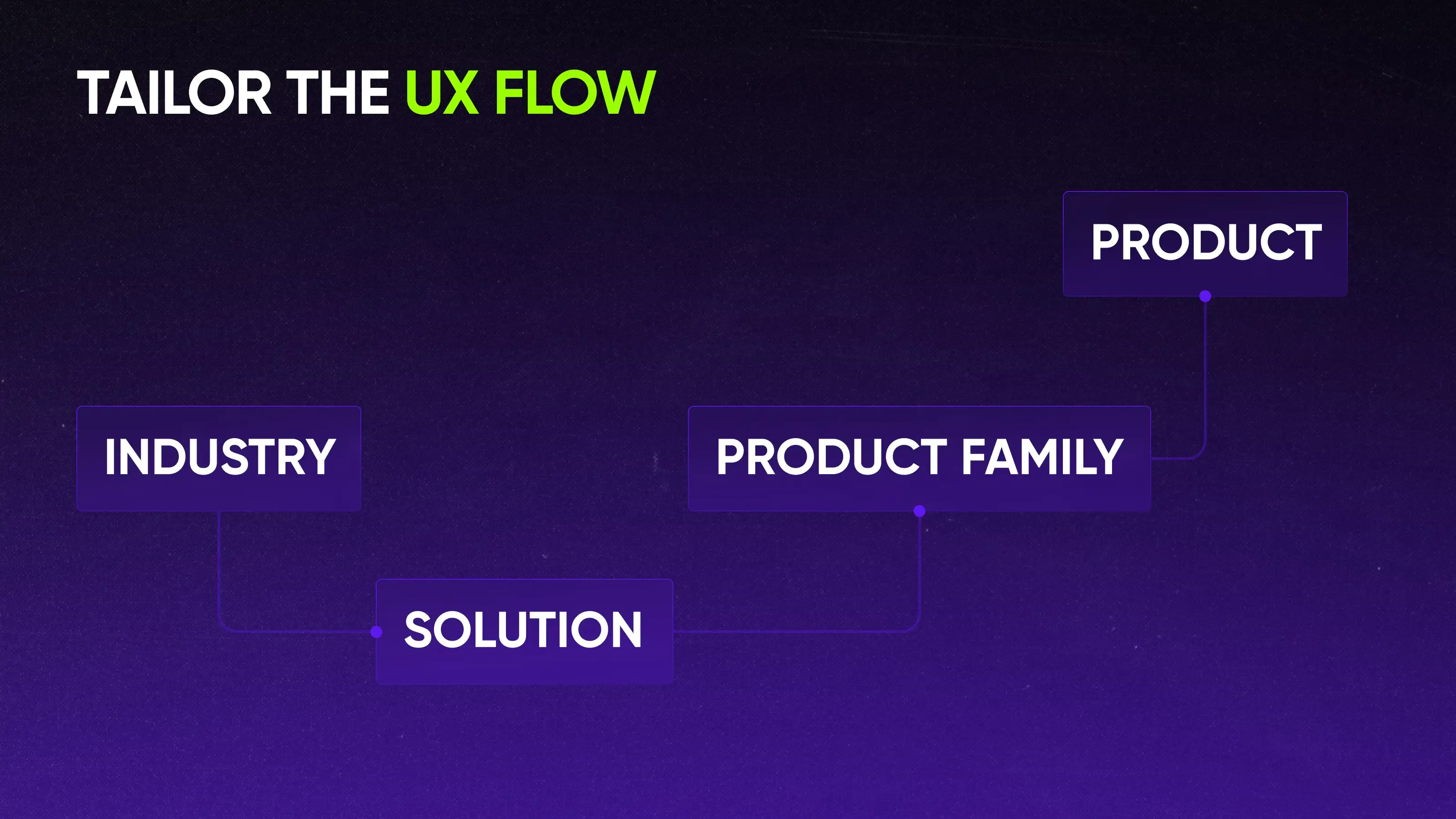
In our new scenario, users can choose how they want to explore the products. They can begin with the environment they operate in and choose what machines fit their industry. Another way is to land on the solution page and then discover product categories. Either way, each flow aligns with different customer journeys and search needs.
Let’s dive deeper into 3 UX decisions that made the overall experience sleek.
UX decision 01. Tailoring navigation around user intent
The original navigation reflected the complexity of the product ecosystem: multiple layers separated users from the content they pursued. So we twisted it around into a much more accessible navigation system.
We didn’t want to force users to visit a series of menus, so we brought key pathways together by introducing visual cues directly inside the menu.
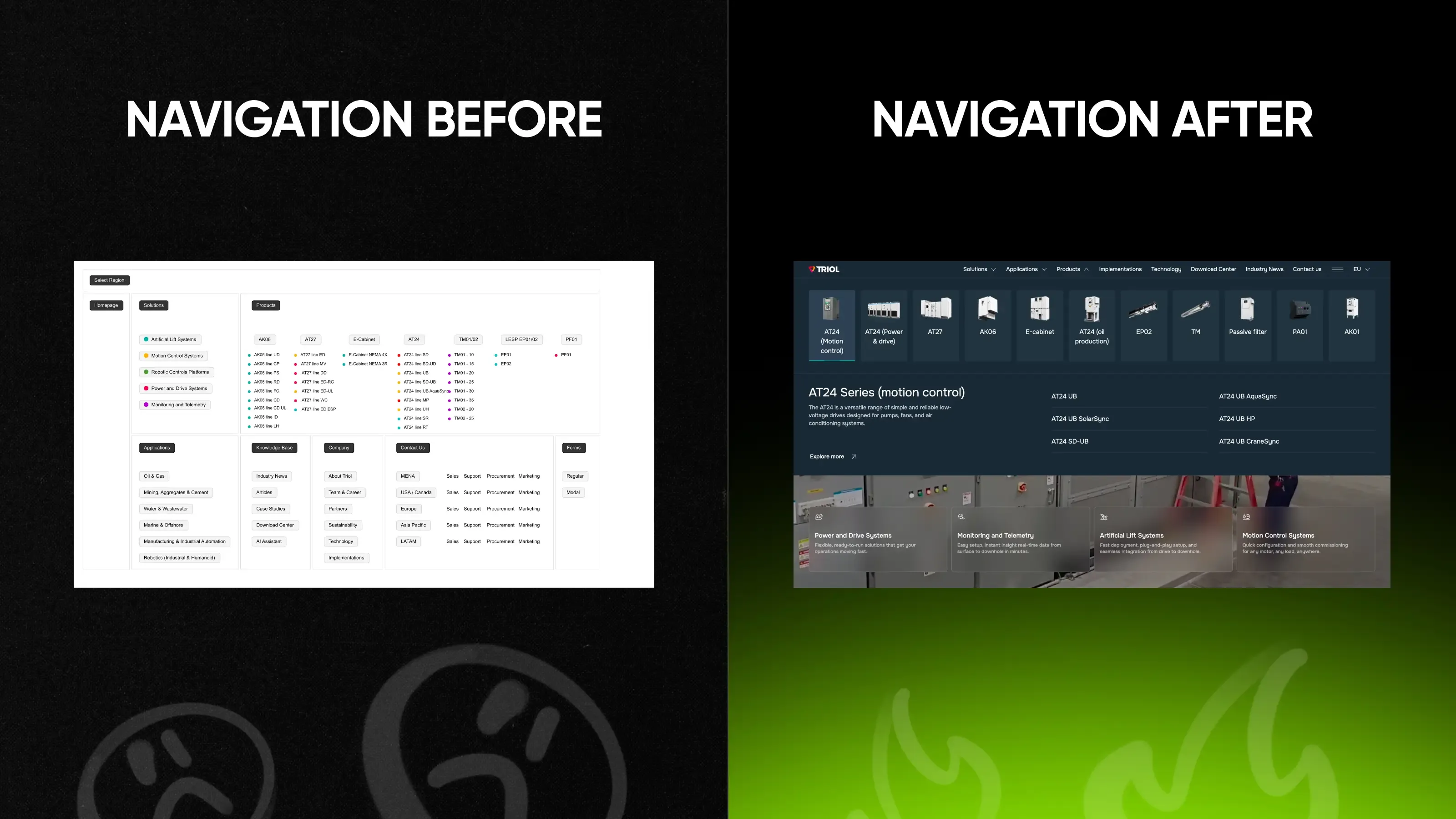
Rather than displaying only category names, we paired navigation items with product images to help users understand what they were looking at before clicking. For highly specialized industrial equipment, names alone don’t provide enough context—images reduced uncertainty and helped users orient immediately.
UX decision 02. Rebuilding product discovery around comparison
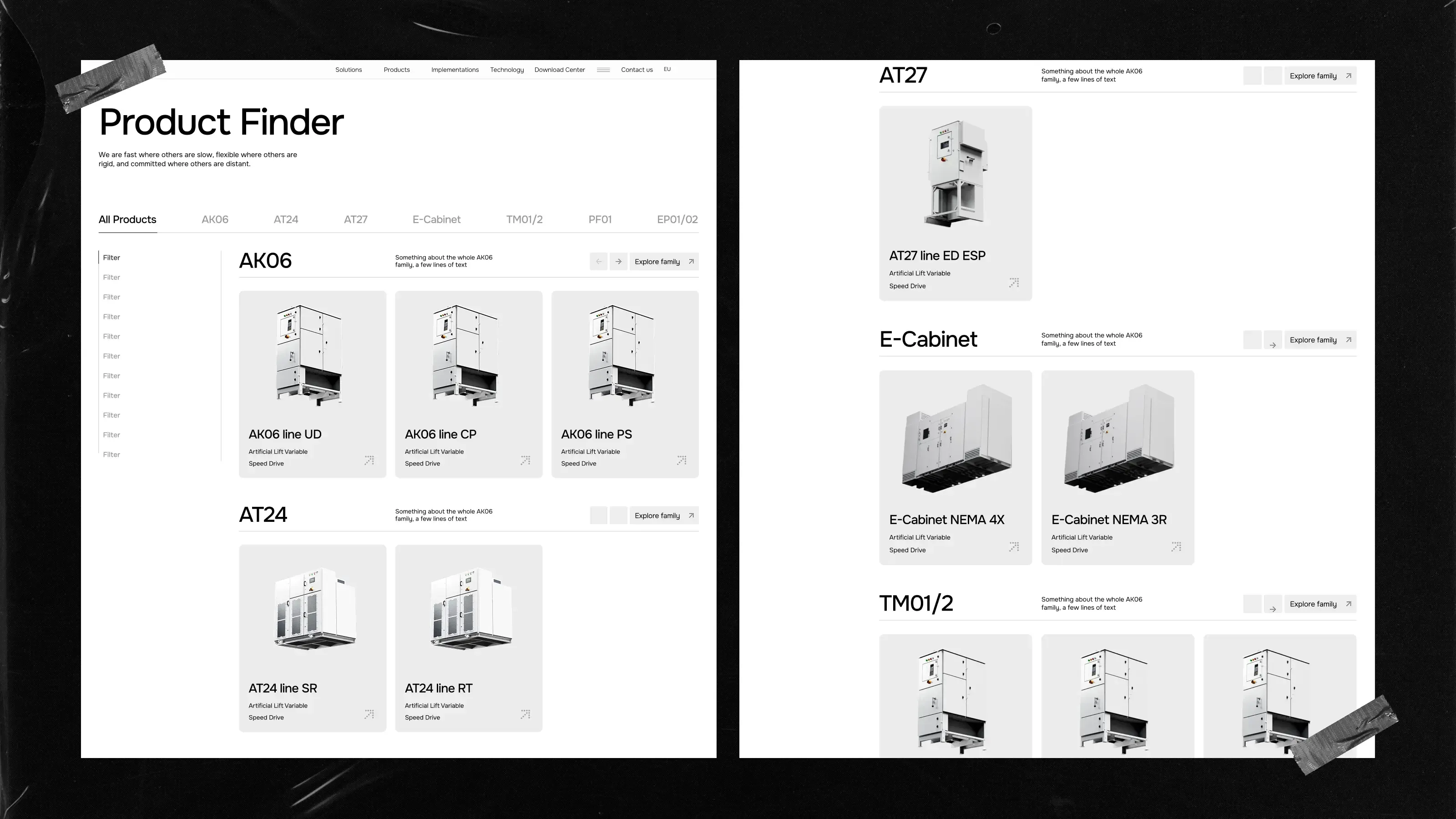
Imagine how many filters we’d have to include if we went the standard way. “Enter your industry, choose the category, then the subcategory, then the model type…” How many unnecessary interaction loops?
Users would open a product card only to reveal another card and then continue navigating deeper into the catalog. We replaced this approach with a tab-based system. Instead of navigating through multiple screens, users can switch between product groups, compare models, and explore options within a single view.
Filtering tools help narrow results without forcing users to restart their search.
UX decision 03. Reorganizing resource navigation
The resource section suffered from a familiar problem for most manufacturing orgs: a lot of valuable content, but discovery depended largely on scrolling.
Users faced a long list of documents and resources with limited ways to narrow results. So we redesigned the flow and introduced filtering and categorization, transforming resources from an archive into a usable tool.
Instead of scrolling through an endless stream of content, users can identify relevant materials much faster.
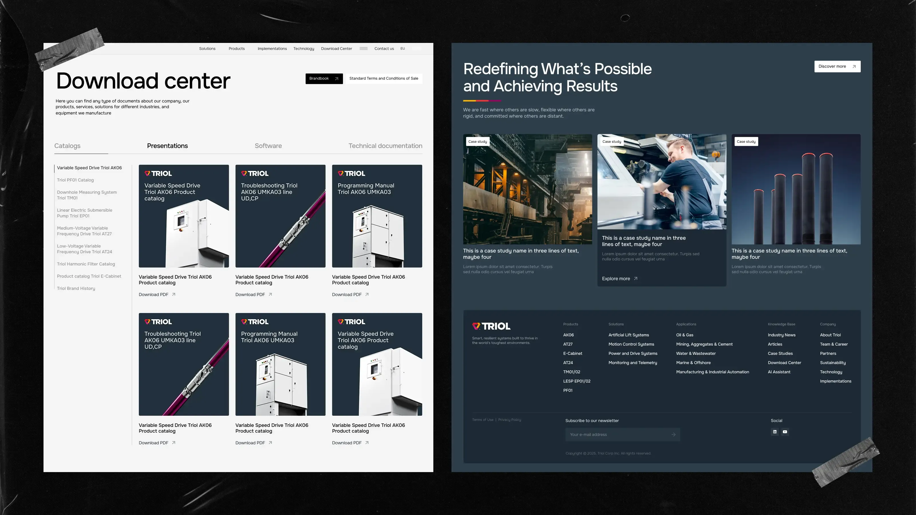
These decisions help users move through the Triol ecosystem more naturally: navigation became easier to understand from the first usage, and the new product exploration reduced friction.
We also designed several content modules as flexible components rather than page-specific solutions. This allows Triol’s team to scale across future pages while maintaining consistency and preventing users from feeling lost.
Next step: moving away from traditional product presentation
Triol already had product visuals & 3D renders. They looked similar to what buyers see across the manufacturing industry, though.
The existing renders felt flat and generic: they communicated products but failed to differentiate the brand. In a category where competitors present products in identical ways, visual language becomes a strategic tool. We needed a system to prove technical sophistication while remaining clear and accessible—3D and custom graphics made that happen.
Do what no one else dares in manufacturing
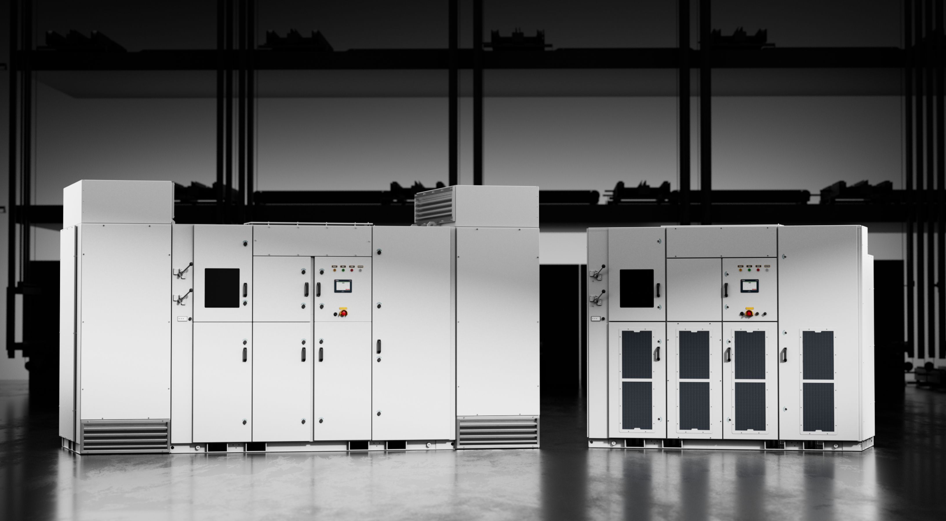
You can see 3D product renders, but there is barely any art direction behind them. For Triol, we focused on rendering quality, lighting, composition, and presentation to make them distinct.
One of the key design moves involved camera perspective. We intentionally used lower front-facing angles to emphasize the equipment’s scale and physical presence. Viewing large industrial products from below creates a stronger sense of size and importance.
At the same time, careful lighting introduced a subtle futuristic quality, a subtle reference to Sci-Fi aesthetics. The visual language remains minimalist—the atmosphere actually comes from light, shadow, and composition rather than decorative effects.
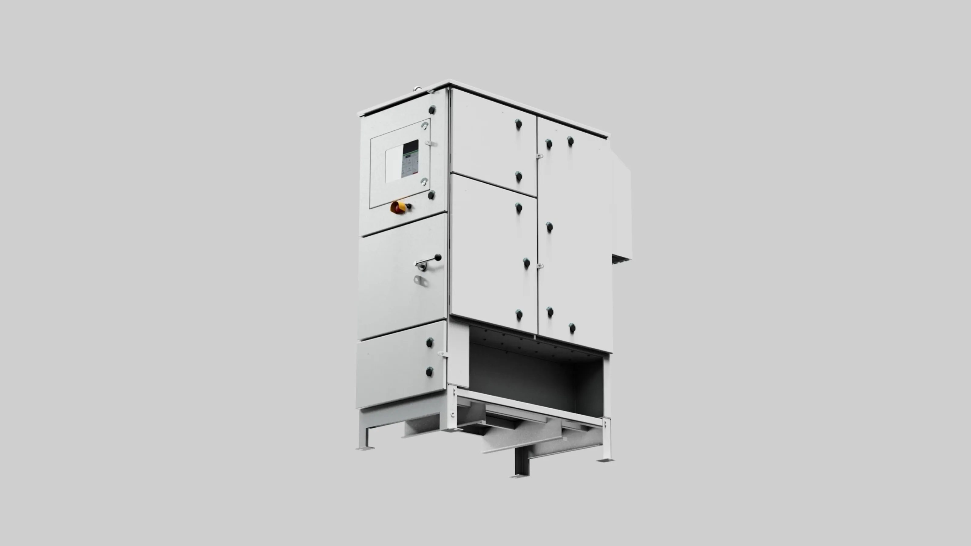
There was also a practical reason for relying on 3D. Triol manages a large and growing product portfolio, so creating and maintaining photography for equipment of this scale is more expensive, time-consuming, and difficult to update.
3D offers greater flexibility: new angles, animations, lighting setups, and interactive user experience make the difference.
From industrial product complexity to visual clarity: a new illustration system
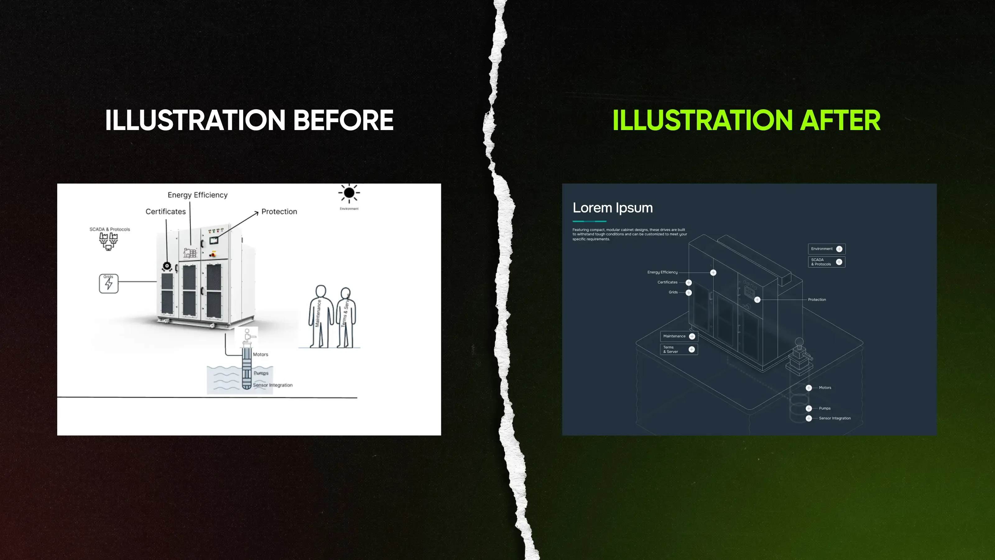
The existing materials that explained how things work relied on assembled diagrams and collage-style technical graphics. They showed environments, connected systems, and equipment relationships, but each visualization looked different—there was no unified language.
We needed a system that could handle diverse scenarios and set Triol apart from the rest of the market. That’s why isometric illustration entered the game.
This style shows relationships between equipment, infrastructure, and operating environments within a single coherent perspective. Complex technical ecosystems became easier to understand without sacrificing accuracy. For the web experience, they also add interactivity with tooltips connected to important elements.

We built every illustration around real Triol solutions. It can’t be assembled from stock imagery or generic technical graphics. A unified perspective system, line treatment, level of detail, labeling approach, and visual hierarchy connect every illustration.
Illustrations can support interactive experiences not only on the website but also in presentations, sales materials, and marketing campaigns—all without sacrificing clarity. And most importantly, others can’t replicate these assets.
From the user’s side, the introduced system also helps them understand products. The same visual identity creates a stronger perception of engineering precision, systematic thinking, and technical expertise. It’s like a never-ending story—users approach different scenarios yet perceive the same company behind those products.
Across approximately 25 custom illustrations, Qream established a new reusable visual language that supports the entire product ecosystem.
Complexity is a design problem—now you can solve it
Manufacturing products will always be complex, but don’t rush to remove it. Learn to organize it.
At Triol, we approached this challenge from two directions: the UX structure helped users navigate complexity, and the visual language helped users see the difference behind it.
Use this breakdown as a pro tip: give users the information they need in the easiest way (not your internal logic) and in the clearest possible form (yet not the templated one). This is how you apply boldness in the manufacturing industry.
Continue to the full breakdown
Discover how we redesigned Triol’s website in detail
By organizing information around customer decisions rather than internal structures. Users should discover the right level of detail at the right moment, rather than seeing everything at once.
Think about how engineers work—they rarely start with a spec sheet. They start with a problem: “Will this work in my environment?” or “Which option fits my application?” Specifications matter, but only after users know they’re looking at the right solution.
Start with the buyer’s context—industry, application, or use case—and progressively guide users toward solutions, product families, and individual products. Most visitors don’t arrive knowing a model number. They know they work in mining, oil & gas, water treatment, or manufacturing. Navigation should reflect that reality instead of expecting users to learn the company’s product hierarchy first.
Filtering reduces cognitive load. Users can focus on relevant options immediately instead of manually reviewing every available product. The closer they are to the needed info, the more likely they’ll take action.
A list of 30 products isn’t helpful if only 3 are relevant. Good filtering doesn’t remove information or value—it removes the work required to find it.
It’s a fresh way to make your products stand out. 3D offers greater flexibility, consistency, and scalability—enabling the creation of new angles, animations, close-ups, and marketing assets quickly while maintaining a consistent visual standard.
Presenting information according to internal company structures rather than customer decision-making processes. A company may organize products by technology, department, or product line, but buyers usually don’t think that way. They think in terms of industries, challenges, applications, and outcomes. When those two mental models don’t match, navigation becomes friction.
Because complex systems are easier to understand when their relationships are clearly visualized. Custom illustrations can show how equipment, infrastructure, software, and operating environments interact in a way that product photos cannot. They also create a distinctive visual language for the website, sales presentations, advertising, onboarding materials, and technical documentation.