TL;DR
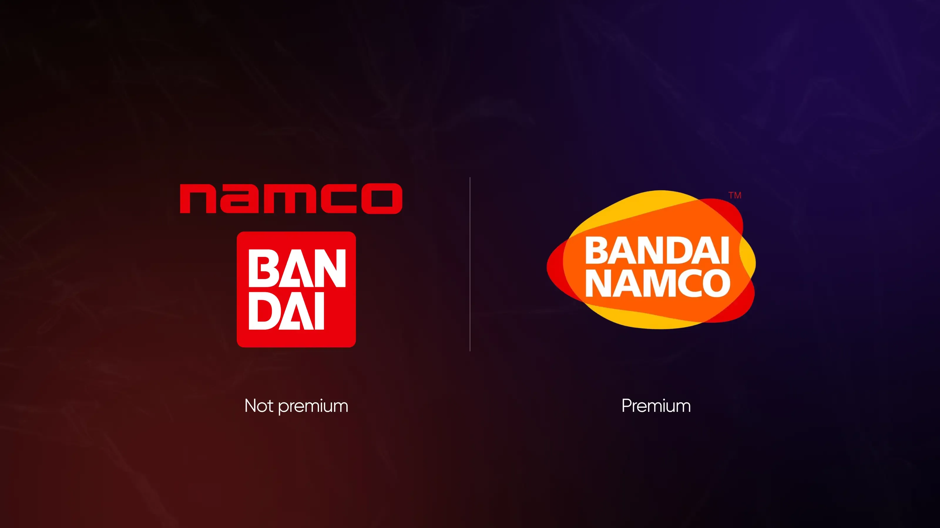
“Make it premium” is not a usable design direction. Premium can mean minimal restraint, visible luxury, obsessive craftsmanship, or cultural belonging—and each leads to a completely different visual system.
The strongest branding projects happen when clients define what premium should signal for their audience before design starts. Bring references, explain what specifically works (or doesn’t), and align on visual language early—otherwise even great design teams end up guessing.
You came to an agency asking for a premium brand. The moodboard was there, the references looked expensive, the visuals were polished—and yet the final result still didn’t feel premium to anyone, including you.
Not because the agency was bad or the design was weak. But because “premium” was never actually defined. So here we are with a practical guide for anyone writing a brief for a branding agency—and who wants a result, not an endless revision loop.
“Premium” in a brief is not a direction
Every time a designer or strategist sees the word “premium” in a brief, there’s a sudden urge to quit the industry, move to a farm, and start raising chickens instead. Not because the task is hard. But what follows is almost always a cycle of vague revisions with no clear finish line.
It's not your fault. It's not the agency's fault either. The problem is that “premium” is one of the most context-dependent words in any brief. For one client, it means clean typography and white space. For another, gold accents and deep shadows. For a third, it loosely translates to “I don't like it, but I can't explain why.”
The issue of premium design is that it masks the absence of a shared visual reference—and launches a project without a common definition of what success looks like.
Clients don’t need to know how to articulate what “premium” means—that's what designers are here for. The real problem starts when the design begins before anyone takes the time to define it.
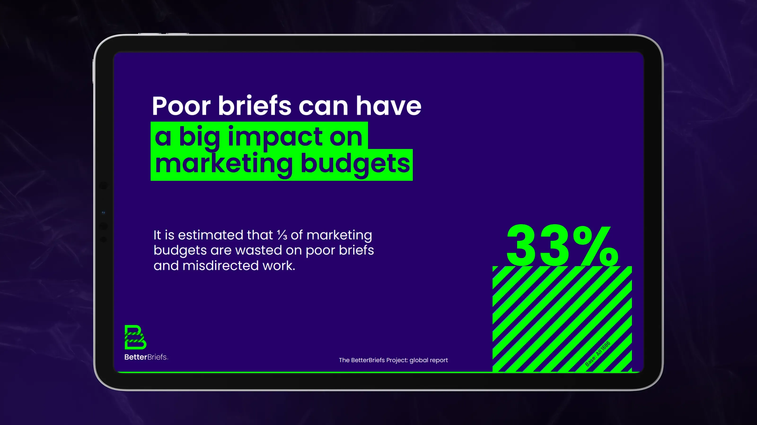
Also, The BetterBriefs research says that most marketers understand that rebriefing adds cost and wastes more time.
“Premium” actually means four completely different things
Most requests for a “premium feel” fall into one of four distinct directions. They look nothing alike—and designing for the wrong one produces work that misses entirely.
Type 1. Premium as a restraint
This type is built on the idea that wealth whispers. The brand removes rather than adds—no decorative elements without function, no color that doesn't carry meaning, and no copy that explains what the visual already says. The premium comes from the negative space: the room to breathe, the confidence of not needing to fill every inch.
It originates in luxury goods and architecture, where the product's quality speaks for itself, and the brand's job is to stay out of the way. In the digital world, it became the default language of tools that want to signal sophistication without explaining themselves—the “if you know, you know” approach to brand positioning.
The visual language: extended white space, restrained color palette (usually one or two neutrals with a single accent), clean geometric or humanist typography, no gradients or decorative effects. Motion is slow and deliberate when it exists at all.
The logic: if we don't need to decorate, we must be confident in the substance. Restraint signals that the product earns attention on its own terms.
References: Bottega Veneta, Apple, Whoop, Bosch Professional.
When to pick this: your product or service is genuinely excellent, your buyer is sophisticated and allergic to hype, and the category default is visual noise you want to stand apart from.
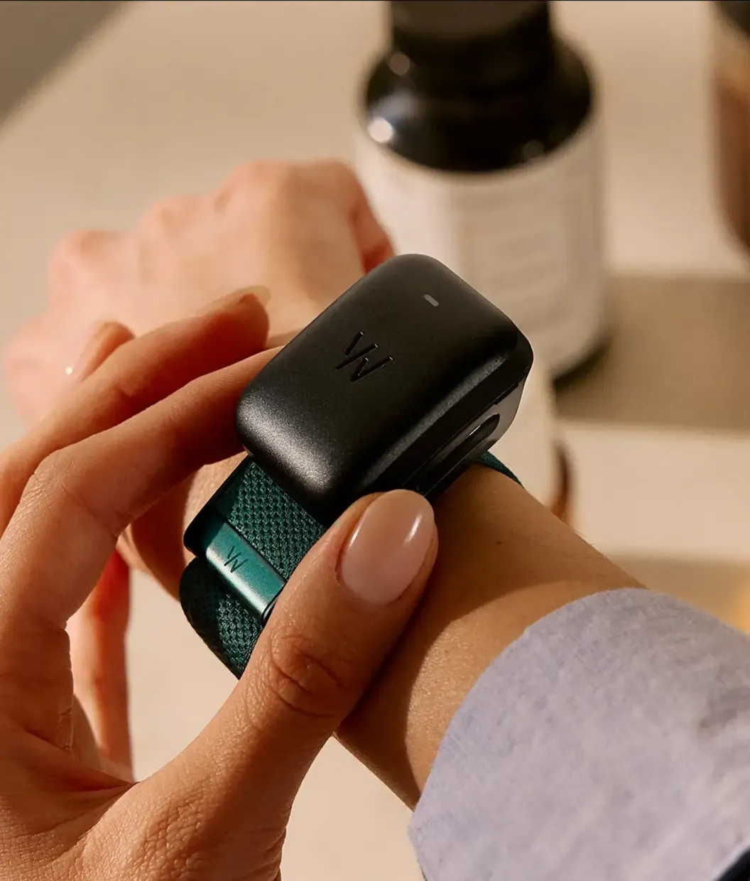
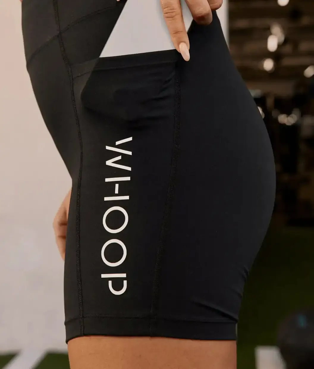
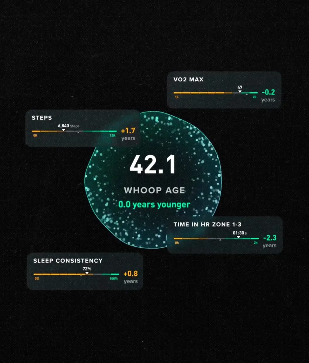
Minimalism, silence, generous white space. The premium is in what's been removed.
Type 2. Premium as a signal
This type is about legibility of status—the brand should be recognizable as expensive from a distance before anyone reads a word. It's built for buyers who need others to understand the value of what they've chosen. Restraint is not the goal here; visibility of quality is.
It has deep roots in banking, jewelry, and high-end consumer goods, where the packaging was always part of the purchase. The dark backgrounds, gold accents, and heavy serif typefaces are a codified visual language for “this costs more, and you should feel good about that.”
In tech industries, this type appears wherever the buyer needs to justify a premium price tag to a board, a CFO, or themselves. The brand does that justification work visually.
The visual language: dark (near-black or deep navy) backgrounds, metallic or warm-neutral accent colors, heavyweight editorial typography, structured layouts with clear hierarchy.
The logic: objects that cost more look different from objects that cost less—and the buyer wants that distinction visible. This is social proof for a purchasing decision.
References: Rolex, Wise, Edger.
When to pick this: your buyer is paying a premium and needs the brand to validate that decision—either to themselves or to stakeholders.
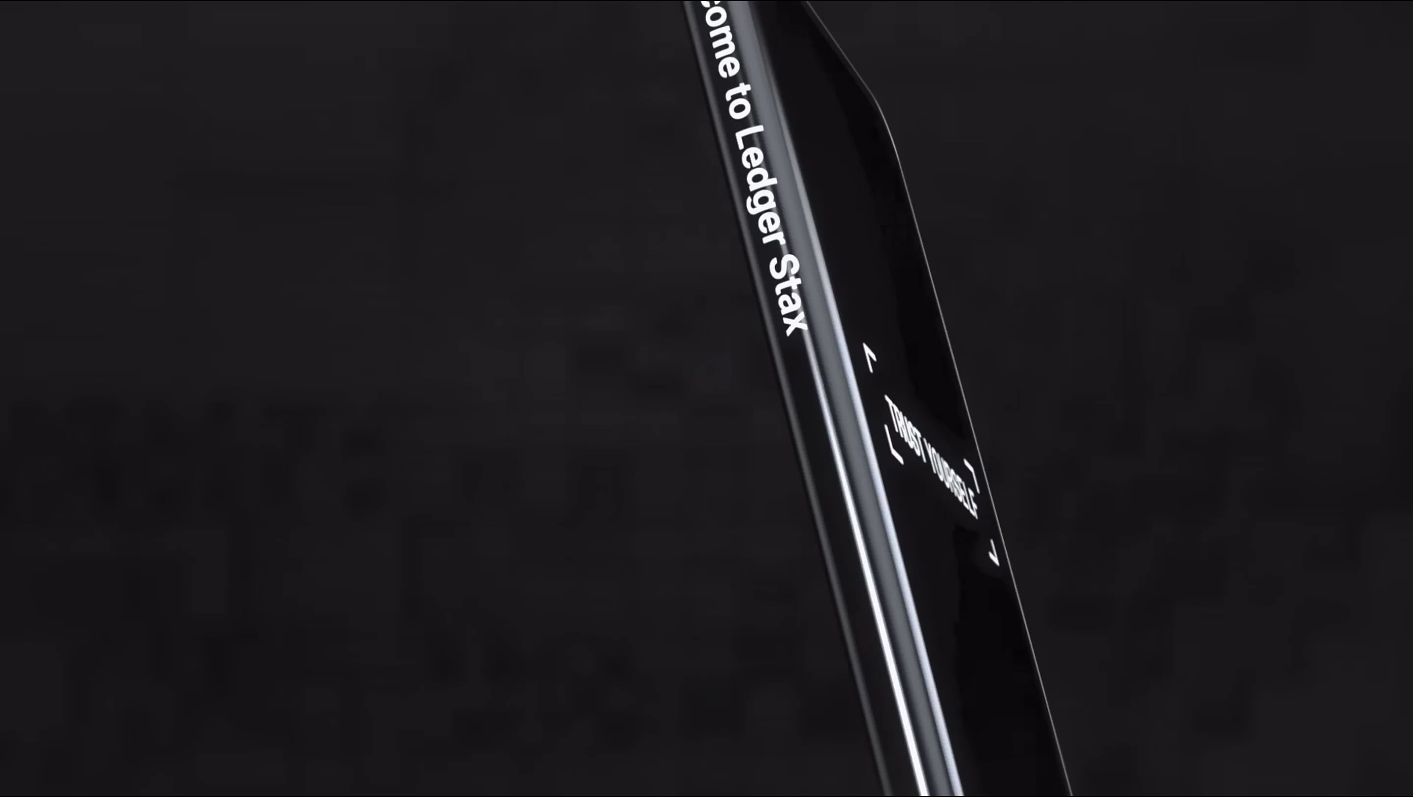
Gold accents, dark backgrounds, and editorial serif type. The brand should look like something people pay more for.
Type 3. Premium as craft
This type communicates investment in detail—the feeling that someone cared about every decision, down to the spacing between characters and the radius of a corner. It's less about the overall aesthetic and more about the resolution: there's no rough edge, no placeholder that stayed in, and no “good enough” anywhere in the execution.
It comes from the artisan tradition—cabinet making, watchmaking, haute cuisine—where the mark of a craftsperson is the absence of shortcuts. In digital contexts, it shows up in the quality of micro-interactions, the consistency of a design system across every touchpoint, and the care given to error states and empty states that most users will never notice.
The visual language: precise typographic hierarchy, custom or finely chosen type that doesn't feel like a default, considered motion design, impeccable consistency across all contexts, zero visual debt.
The logic: shortcuts are visible to the right buyer. When no shortcuts are visible, the buyer concludes that the same care went into everything they can't see either, including the product itself.
References: Hermès, Stripe, Vercel, Revolut, Leica.
When to pick this: your audience is detail-oriented (developers, designers, buyers in precision-driven industries) and notices what others miss. The brand's craft is evidence of the product's craft.
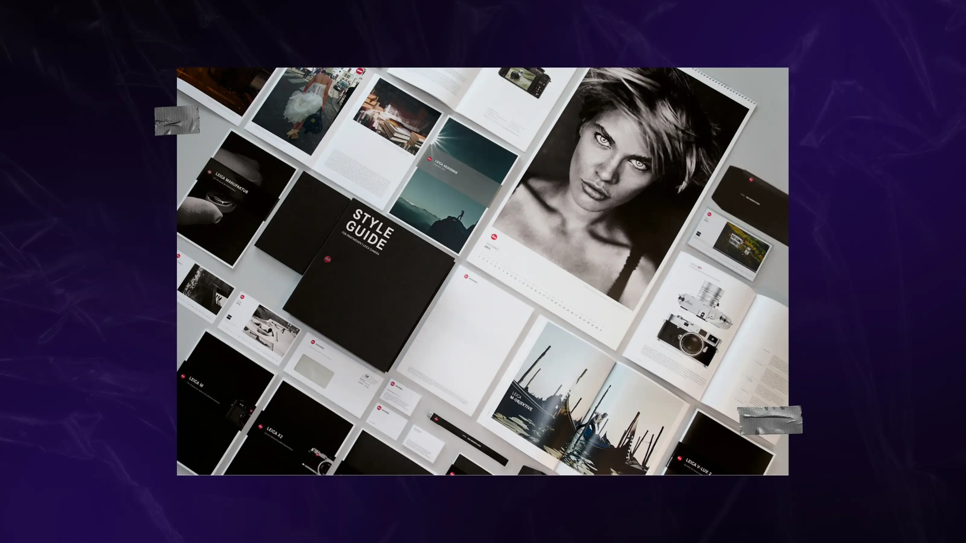
Detail, precision, the feeling that someone cared about every pixel. It can be minimal or rich, but it always reads like mastery.
Type 4. Premium as belonging
This type is about membership in a community that has taste. The brand isn't trying to impress everyone—it's trying to be legible to a specific group and deliberately invisible or even alienating to everyone else. The premium is a cultural signal. ”People like us use this.”
It originates in subcultural branding—streetwear, underground music, and insider professional communities—where exclusivity is about access to the right knowledge or values. The brand rewards the buyer with the feeling of being in the right room.
In tech industries, this type is increasingly common as categories mature and audiences fragment. The brand stops trying to be for everyone and commits hard to a specific archetype: the contrarian founder, the security-obsessed engineer, the biohacker with a lab setup at home.
The visual language: feels like an in-joke—there's a reference or a tone that lands precisely for the intended audience and confuses everyone else.
The logic: if the brand recognizes me, the product was probably built for me too. Community recognition is one of the fastest ways to build trust.
References: Supreme, Figma.
When to pick this: you have a defined audience that sees itself as distinct from the mainstream, and your growth model depends on word-of-mouth within that group.
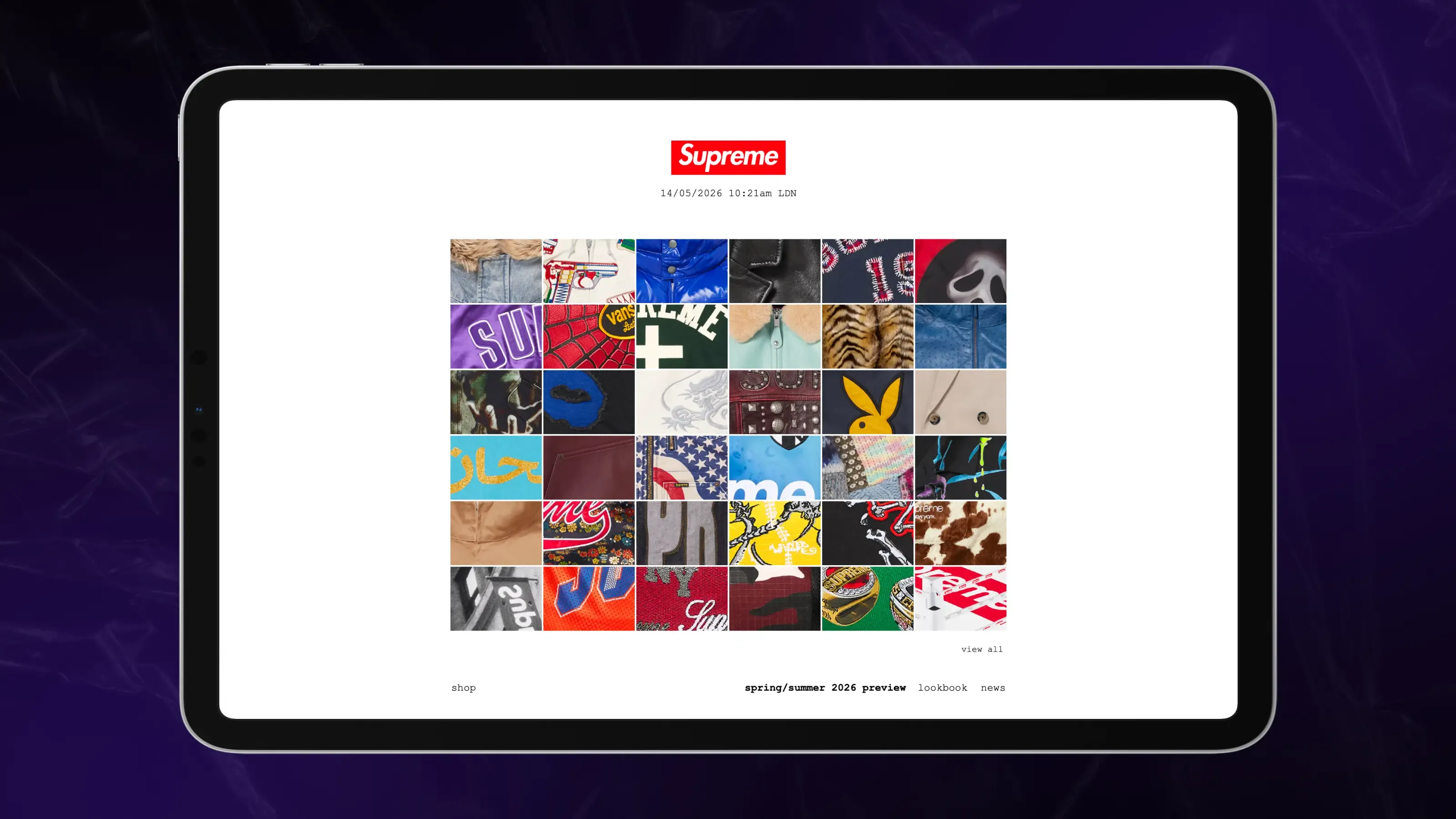
The sense of “You're one of us.” The brand speaks directly to a specific group and looks exactly the way they expect it to.
Four directions. Four different visual languages. If you haven't defined which one is yours, the agency will pick—and it's a coin flip from there.
How to brief “premium” so it doesn't become a sticking point
You don't need to become a designer to write a clear brief. You need to answer a few questions that convert abstract intent into something a team can actually act on.
Which brands do you see as premium—and why those specifically?Not necessarily in your category. Any industry, any product. Three to five examples tell the team more than a paragraph of description ever will.
Which brands do you absolutely not want to resemble?Negative references are often sharper than positive ones. “Not the mass-market version of this category” is highly directional information.
What does your customer look like at the moment they pay? Where are they? What else are they buying? What sits next to you on their shelf or in their browser tabs?Purchase context shapes what “premium” should mean for your brand specifically.
Do you want to look like the category leader, or do you want to look different from everyone in the category?These aren't the same thing. One path references the best. The other deliberately breaks from the norm.
A mood board does more than a technical spec
Most briefs are detailed about the function: how many pages, which formats, and which deliverables. Almost none of them describe the aesthetic with the same precision. But in a branding project, the aesthetic is the brief.
A moodboard is the only reliable way to sync vocabulary before work starts. When you show images and say, "This is the feeling I'm after"—you give the team a shared starting point that no amount of text can replicate.
Don’t just say: “I like this.” Explain:
- I like how the hierarchy immediately tells me where to look.
- I hate these gradients—they make it feel mass-market.
- I like how minimal the typography feels here.
Your references don't need to be polished or "correct." Instagram screenshots, product photos you've saved, packaging you kept—anything that carries the feeling. Fifteen minutes on Pinterest gives the team more to work with than an hour of verbal explanation.
And collect what you don't like, too. “I don't want this” is just as useful as direction.
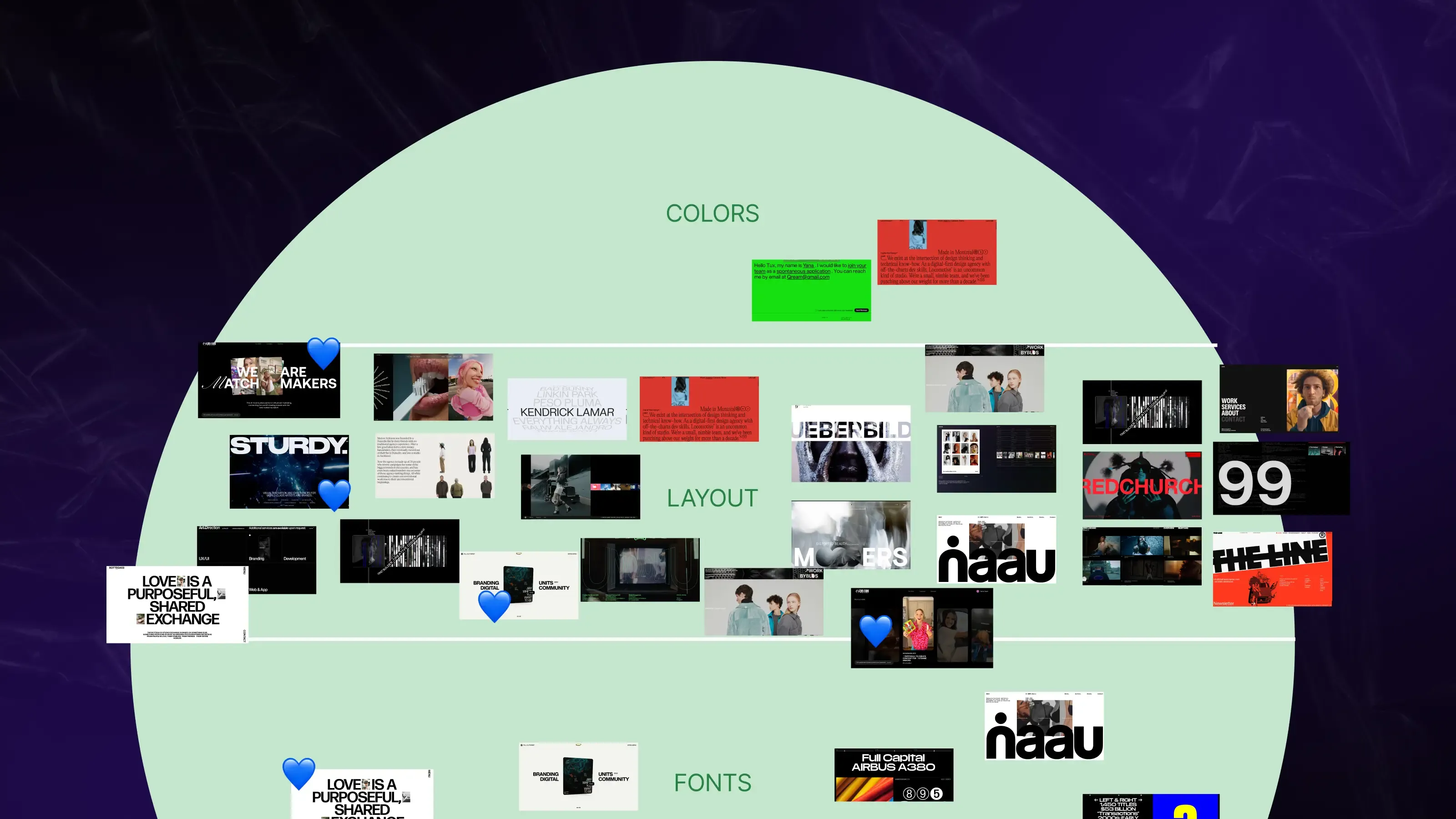
We always moodboard first—testing colors, type, layouts, and visual directions to find what clicks. Moodboard’s not the final concept. It’s how we find the direction that feels right for the client and stands out in the market.
What happens when “premium” is defined upfront
Projects where clients arrive with concrete references and a clear picture of their audience move faster and land better. Not because the agency becomes a yes-robot, but because both sides are speaking the same language from day one.
The first round of concepts hits closer to the mark, feedback becomes specific, and revisions become surgical instead of directional restarts.
More importantly, you end up with a brand that solves a business problem. Not one that “looks premium” by someone's subjective measure, but one that matches your customer's expectations and sets you apart from competitors who all used the same vague word in their brief.
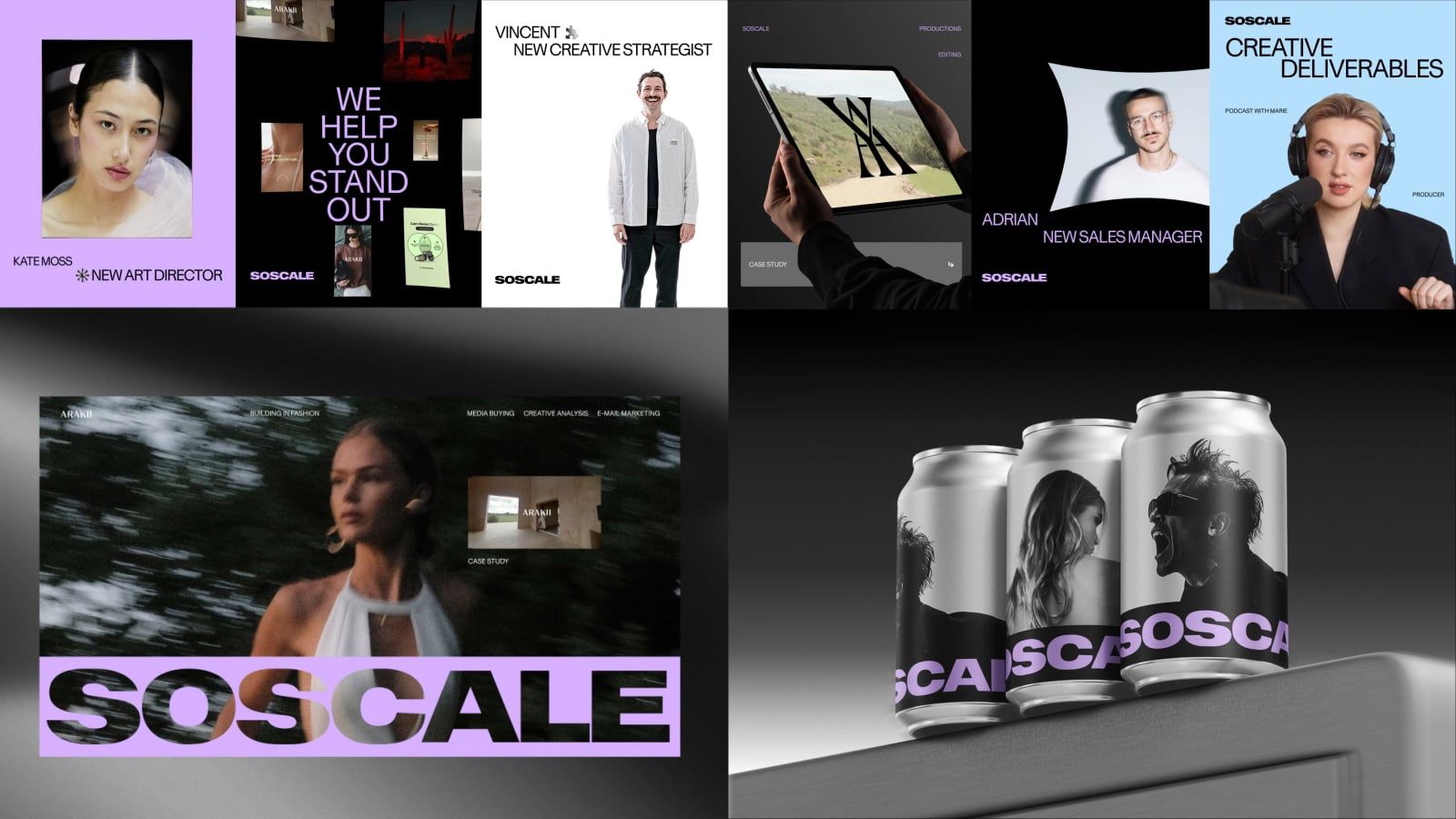
For Socscale’s new branding, we approached premium through the lens of craftsmanship—positioning them as the #1 Scandinavian agency through their obsessive care for content. We translated that mindset into a brand that feels intentional, precise, and premium in every detail. See how we crafted it.
No visual system can fix a vague definition
You can assume a design agency should automatically know what “premium” means for your brand. But no agency can define value for you if you haven’t defined it for yourself first.
Because premium is never just a visual style. It’s a business decision, a positioning choice, and a signal to a very specific audience. And until you understand what that signal should communicate, even the best design team in the world will be designing in the dark.
Written by

Qream co-founder | Business growth and strategy
Leads Qream's business development and commercial strategy, bringing experience across sales, customer support, and complex digital projects. Reviews topics around project scoping, agency engagement, strategic partnerships, and growth.